$YFI mimicking $BTC chart
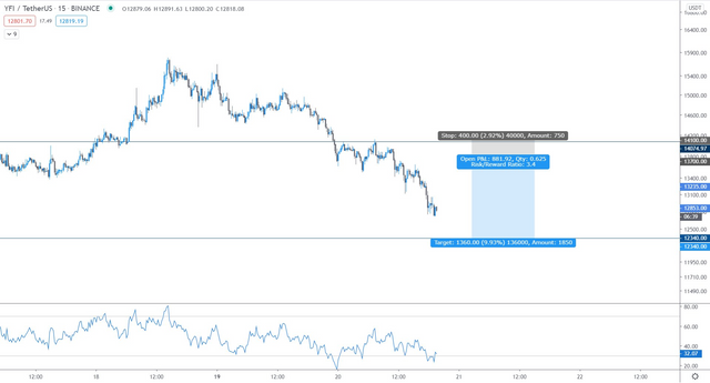
$YFI pretty much looking like the $BTC chart as far as it's upside and downside. If you look at the shaded boxes, so much blue and so little grey.
Those who are holding have to deal with what's about to come but if you bought BTC or YFI recently now might be a good time to flip for proft and buy back at the bottom of the blue shaded box.
Both charts seems to be correlated from what I've seen today. Maybe it's just a short-term trend but I'd be much more comfortable buying bitcoin rather than Yearn.