Ilustración con mouse - Efecto grime [ESP/ENG]
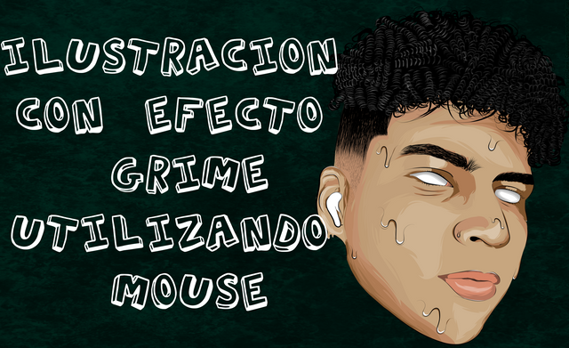


Algo bastante común entre los ilustradores, es el efecto grime, un clásico en el cual se pretende mostrar nuestra ilustración con la sensación de que se esta "derritiendo", como podría ser un helado por ejemplo, esto da un toque diferente y bastante atractivo, es muy utilizado especialmente por artistas musicales y gente de la comunidad gamer para sus avatars, en una ocasión hice una para un canal de youtube... Claro, fue en mi tiempos de "practica". No cotizaba mi trabajo en aquel momento puesto que apenas iba iniciando, hoy en día es la misma cuestión, pues voy iniciando en el mercado de venta de ilustraciones.
Something quite common among illustrators, is the grime effect, a classic in which we intend to show our illustration with the feeling that it is "melting", as could be an ice cream for example, this gives a different touch and quite attractive, is used especially by musical artists and people from the gamer community for their avatars, once I made one for a youtube channel ... Of course, it was in my "practice" time. I wasn't quoting my work at that time since I was just starting, nowadays it's the same issue, since I'm starting in the artwork sale market.


Hace tiempo, en mi inicios empleando illustrator para vectorizar hice un efecto grime de una foto propia, es un efecto muy facil de conseguir realmente, ha día de hoy es el segundo quee realizo en un rostro y creo que se ve bastante mejor que el de aquella epoca, especialmente por el mejor posicionamiento de luces y sombras, tema que he mejorado bastante. Es tan simple como agregar unas "gotas" en diferentes areas del rostro, intentando no abusar de ello pues puede quedar algo extraño.
Some time ago, in my beginnings using illustrator to vectorize I made a grime effect from a photo of myself, it's a very easy effect to achieve really, today is the second one I've made in a face and I think it looks much better than the one of that time, specially because of the better positioning of lights and shadows, a subject that I've improved a lot. It's as simple as adding a few "drops" in different areas of the face, trying not to abuse it because it can be a bit strange.
Para darle un poco más de estilo suelo agregar un trazo extra debajo de la gota, así mismo añado una linea blanca y sombra bajo los trazos de la misma esto para darle un poco más de volumen e igualmente, hacerlo ver con más estilo o profesional. No agregue iris a los ojos, los hice completamente blancos y agregue un sombreado para que no fuese muy plano.
To give it a little more style add an extra line under the drop, also add a white line and shadow under the drop to give it a little more volume and also make it look more stylish or professional. Don't add irises to the eyes, I made them completely white and added a shading so it wouldn't be too flat.

El degradado se realiza "pelo a pelo", cada trazo es hecho por un pincel propio para realizar: Cejas, barba y por supuesto cabello. Necesito mejorar un poco más la tecnica para degradar mejor el cambio de color cuando va bajando la opacidad del negro, aun así creo que luce bastante bien, quedo tal cual como lo tenia en mente mientras dibujaba.
The gradient is made "hair to hair", each stroke is made by a brush itself to perform: Eyebrows, beard and of course hair. I need to improve a little more the technique to better degrade the color change when the opacity of black is lowered, even so I think it looks pretty good, it looks just as I had in mind while I was drawing.
Para darle el toque final al trabajo, importe en photoshop la ilustración como un "objeto vectorial inteligente" para asegurarme de que no perdiera nada de calidad, una vez allí agregue color, textura y un texto para complementar el resultado final, además se me ocurrió una nueva idea para la elaboración del portafolio que llevo días armando gracias a esto, lo verán en unos días, aquí te dejo el paso a paso conjunto al resultado final:
To give the final touch to the work, I imported in photoshop the illustration as a "smart vector object" to make sure it didn't lose any quality, once there I added color, texture and a text to complement the final result, also I came up with a new idea for the portfolio that I've been building thanks to this, you'll see it in a few days, here I leave you the step by step set to the final result:

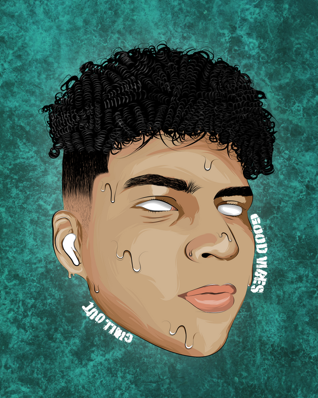


¿Cual propuesta te gusta más?
Which one do you like the most?
Para cotizaciones o para solventar tus dudas contactame por discord

buena la ilustrativo bro, la del fondo azul se ve mejor.
A la mayoría de mis amigos les gusto más esa también, gracias hermano, saludos!
también hago retratos en illustrator y otras cosas, si quieres pasate por mi blog y me dejas tu opinión.
Geniales ilustraciones. Felicidades y mucho éxito.
Muchas gracias <3