REPOST!! Effective Trading Strategy using Line Charts - Crypto Academy / S6W1 - Homework Post for @dilchamo

Question 1

I Prefer to define clauses like these in a way that it is easier understood, and so, therefore, we would be understanding what these two words being "line" and "charts" mean and what they come together to signify. The simpler word between the two stated before is "Line". A line is simply something that joins two points together. It is an element of drawing and this can explain why there is a line chart.
A chart simply put is a set of information portrayed in a diagrammatic form, using a graph, or other diagrams. Now there is one chart we would need to understand first, and that is the market chart or the cryptocurrency chart. What the chart in crypto looks like and serves in is a diagram that shows readings of two different very important values with respect to each other.
These two values are usually price and time. Now the charts used also usually portray the change in price over time of two commodities against each other. That is to say that these charts portray changes in value between pairs of cryptocurrencies. For example, a chart of ETH/USDT shows how much change is occurring in price over time between Ethereum and USDT. And we can not overemphasize the need to get the information portrayed on charts.
There are different types of charts that use different methods to portray price change with respect to time, but what we are told to concentrate on is the line chart, so let us head straight to it.
LINE CHART
The Line chart is a chart with a line that connects all closing price values of the market. This means that a lot of other details usually shown on other types of graphs is ignored on the line chart, with only the closing price on focus. Now, what is the closing price?. It is the price at which the market closes according to the time frame selected.
The price of commodities change spontaneously and as it does so, there is a price mark to which price is "closed" according to the time range. Now the line on the line chart connects these prices together to present a diagram that shows the general trends and some knowledge concerning price action.
The fact that the line chart does not show another type of price or other additional information makes the chart relatively easier to understand and decipher market trends and market resistance and support levels, which are very important trading tools for traders, especially the ones new to the market to be able to tell the direction of price.
Uses of line chart
☑ Makes it easier to spot market trends:
The Line chart makes noticing and reading trends much easier as it just consists of one line that joins all closing prices together to form the chart.
☑ Provides simplified chart that is easier to read:
Compared to the other more complex charts, the line chart has a simple layout, and so it is used to make reading the market direction easier
☑ It is used for long term trading decision making:
With the simplicity of the line chart, it is utilized by long term traders to make quick trading decisions after reviewing the chart.
Question 2
To answer this question, we should first understand what the support and the resistance levels are and why they are important. Every trader has to know what the support and resistance levels are and how to identify them.
SUPPORT LEVEL
Support Level is a price range, that the market always seems to bounce up from after it reaches it. It is a price range that causes a bullish direction of price. So we can say it supports the bullish trend and also supports the price to go up. It is important we notice the support level to be able to gain knowledge about entry targets when placing long trades.RESISTANCE LEVEL
Resistance Level is a price range, that the market always seems to bounce downwards from after it reaches it. It is a price range that causes a bearish direction of price. So we can say it resists the bullish trend and also supports the price to go down. It is important we notice the resistance level also, so as to be able to gain knowledge about entry targets when placing sell trades.
How to identify a support level on a line chart
The first thing to know when planning to identify a support or resistance level is the number of times that price bounces off that price range, either upwards or downwards. Now in the case of support levels, we are looking for a price range that price has bounced off upwards at least thrice
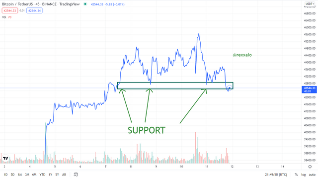
As seen above in the chart, I have identified a pretty solid support level that has shown three strong support price bounces. The "price bounces" of this level are upward because, at that price range, the selling force available in the market struggle became too weak to break through the buying force available at that area several times, therefore losing the tug of war for price and causing the price to go up.
How to identify a Resistance level on a line chart
So when identifying resistance levels on a line chart, one thing is peculiar about it. We should be looking for mounting top line structures at the same price range. That is to say, we should be looking for a price range where price has bounced off downwards at least three times, forming what looks like a series of hills or mountain tops
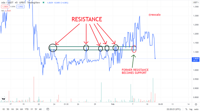
From the above screenshot, we can see that a formidable resistance level has been identified, and the price has bounced off this price range downwards multiple times. One thing to note also is that a resistance level can later become a support level and this is a way of taking advantage of the line chart as we can easily see market trends and notice resistance and support levels more quickly. With this knowledge, we can know that when the price has broken a resistance level, it would be looking to retest that point as a new support level
Question 3
Diagramatic differentiation
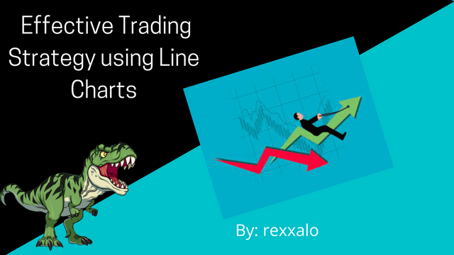
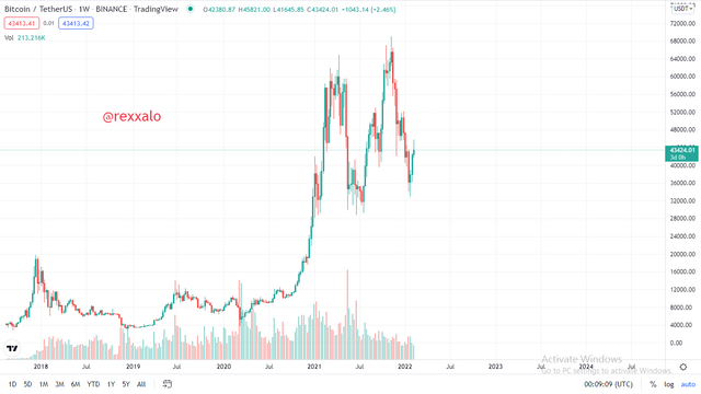
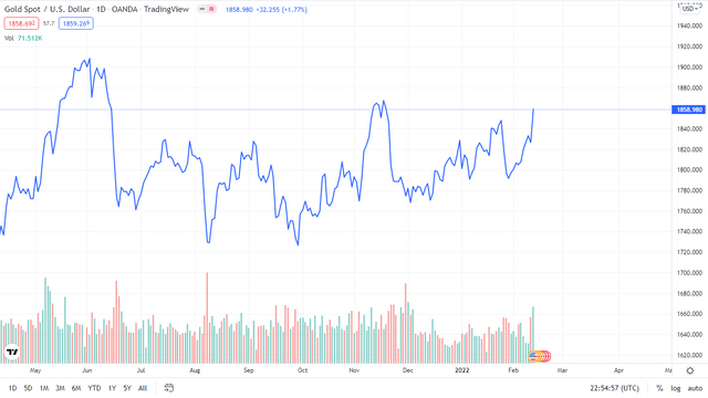
- LINE CHART EXAMPLE
For the two examples, I would be using the Goldspot/U.S dollar pair, and below, we can see the line chart in all its simplicity and monochromaticity, which makes it easier for someone who has no experience whatsoever with the crypto charts to at least comprehend.
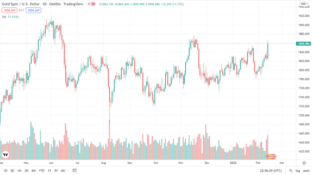
- CANDLESTICK CHART EXAMPLE
Below, we can see the candlestick chart, with the red and green candles, indicating the bearish or bullish strength, this is something that the line chart lacks, as the candlestick chart provides sufficient information to work with when analyzing the market.
| LINE CHART | CANDLESTICK CHART |
|---|---|
| It is easier to learn and understand for early traders | It is harder to read in comparison to line charts |
| Easier to notice trends between bullish and bearish trends | harder to notice trends in comparison to the line chart |
| Less noise on the chart which leads to a more accurate reading | more noise on the chart which leads to a less accurate tech analysis reading |
| With line charts, the trader is unable to identify wig fishing | The trader can identify wig fishing using a candlestick pattern |
| The line chart does not include market volatility information | The candlestick pattern shows the information on market volatility |
| Consists of only one line as the chart component | Consists of candlesticks that alternate between green and red. |
| Shows only accumulation of closing price | Shows open price, closing price, and other information on a candle. |
Question 4
First of all, I would like to say that the compatibility of an indicator with a chart is highly dependent on the trader and his point of view. The line chart is a simple chart, so we can go with simple indicators to work with it and maybe provide a little more information for the trader and add a little complexity to the chart outlook. I have chosen to use and explain my two favourite indicators which are the moving average and the Bollinger band.
Moving Average
The moving average line is a line that shows the average movement of price over a length of time and therefore provides a vague summary of price action, but when combined with the line chart as seen below, it proves to be more useful, as it serves as support and resistance once in a while, guiding the traders to make correct trading decisions.
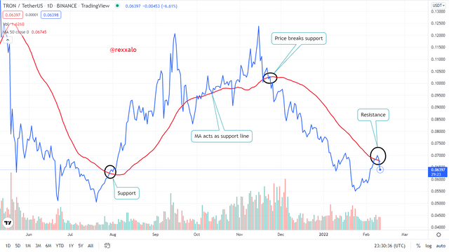
The above chart is from trx/usdt and in other time frames, it's general volatility is very low, but when exploited on a daily time frame, we can see that the line chart comes to life. This further sustains the fact that the line chart is good for long term trades. We can also notice that the moving average helps identify the trends even more which therefore increases technical analysis accuracy.
Bollinger bands
In my opinion, this is a better combination, as it is clearer and more decisive. The Bollinger bands consist of three lines, One that acts as the resistance at the top, the second one which behaves like a moving average line and the third one at the bottom that acts as a support line. This indicator is good because it highlights the support and resistance for a price calculated with the previous price action values of that same market.
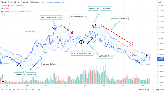
When combining the Bollinger bands with the line chart, we look forward to noticing when the line peaks out of the bands (maybe for fresh air) and when it does, we expect a strong change in trend direction as I have shown above in this daily TRX/USDT chart. Also, we notice that the middle line alternates as a support and resistance line and so it is important to take note of where trades are being taken in respect to this line.
Question 5
For this question, I would like to explore two ways in which we can trade trends and trend reversals. They are basically just noticing the shape of the market and making market entries, but I would like to emphasize on just two shapes. The double top or "M" and the falling wedge shapes. For these two shapes, one thing is constant. there is a former trend, and a new trend after the shapes take form. these shapes are formed by price battling around a price and trying to correct a trend
The double top strategy
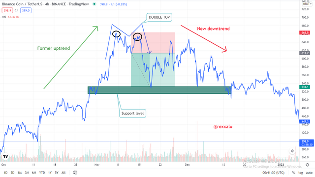
The above picture is one that shows the double top trend reversal shape. As noted in the screenshot, there was an uptrend formerly ruling the market, but it got exhausted around the price range highlighted in black and retested it twice before giving up and heading down. Now noticing that the uptrend is weak and there is no more life in it, we use a safe risk to reward ratio of 1:2 and start the trade from the former support of the weakened uptrend so that if it breaks that support, we can now know that the trend reversal is complete as it is shown above.
The falling wedge strategy
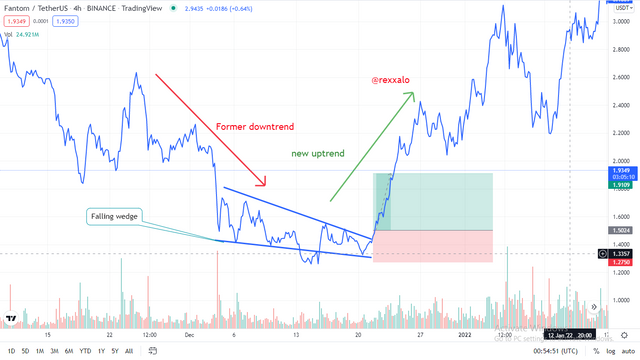
The falling wedge shape is formed also from a weakened trend, and therefore it is a sign that a trend reversal is close by. The corrections become smaller and tighter, and the resistance levels drop while the support levels rise as the trend weakens, forming a falling wedge as seen above. Noticing the falling wedge and the weakened trend, we can place a trade using a risk to reward ratio of 1:2 for a buying opportunity, as the former trend that is now weak was a bearish trend.
Question 6
Advantages
☑ It is easier to spot trends on the line chart than on other charts.
☑ Support and resistance levels are easily spotted
☑ It is an easy chart to read, especially for people new to trading.
☑ It serves as a noise-free chart, as information clutter is removed from the chart
☑ It is very compatible with certain indicators
☑ It is a good tool for taking long-term trading decisions.
Disadvantages
☑ The line chart lacks some vital information which is helpful for analyzing the market.
☑ It lacks details on the current market volatility
☑ It is very limited, as it's lack of information portrayed does not allow it to be compatible with some indicators
☑ The line chart hides "wigs" formed in price of a commodity on the chart and this might be detrimental to the trader making use of the chart.
CONCLUSION
the line chart is a simple and beautiful chart that is easy to use and can be used side by side with simple indicators, to make long term trading decisions quickly and make it easier to spot trends, support levels and resistance levels. It is not generally used by very experienced traders because of it's lack of vital information, but for new aspiring traders, it can be of great help.
I generally have an opinion that using only the candlestick to trade and analyze can be mentally exhausting because of the many information one would have to put in mind, and maybe once in a while, a trader should toggle between these two contrasting charts to look at a simpler view of the market.
It's nice to be back to the academy. special thanks to @dilchamo for the precise lecture, see you next week bye bye!