Candlestick Patterns - Steemit Crypto Academy Season 4 - Homework Post for Task 10
Hello family,
Below is my presentation.
 Made with iMarkup
1a) Explain the Japanese candlestick chart? (Original screenshot required).
b) In your own words, explain why the Japanese Candlestick chart is the most used in the financial market.
c) Describe a bullish and a bearish candle. Also, explain its anatomy. (Original screenshot required)
1a) Explain the Japanese candlestick chart? (Original screenshot required).
The explanation of the Japanese candlestick chart wouldn't be sufficient and satisfactory without pondering on the brief history of its introduction or invention. Therefore i will consider a brief history of the Japanese candlestick chart and then switch to its further explanation.
Brief history:
The Japanese candlestick chart was developed by a Japanese rice merchant known as Munehisa Homma during the 18th century due to the relation between the price, demand and supply of rice.
The rice market was being influence by the emotions and interactions between the sellers and the buyers which therefore led to the invention of the candlestick chart.
The Candlestick chart is noted to be originated from Japan and it existed over 100 years even before the West developed the bar and point-and-figure charts.
The ideology was popularised among Western traders by a broker called Steve Nison in the 1990s.
Further explanations:
The Japanese candlestick chart is the graphical display of the value of an asset in the market and the candlesticks are formed in daily basis or in few days based on the interaction between the traders of a particular asset.
It displays the opening, closing, high and low price points for each given period on a particular asset and it is the most populous and most utilized price chart in the financial market by traders and investors in terms of making technical analysis or trading decisions.
The Japanese candlestick charts are more reliable as compared to the other technical analysis tools because they provide adequate data through the display of the market's highest point, lowest point, opening point, and closing point of which a trader can hinge on in order to make a market or trading decision.
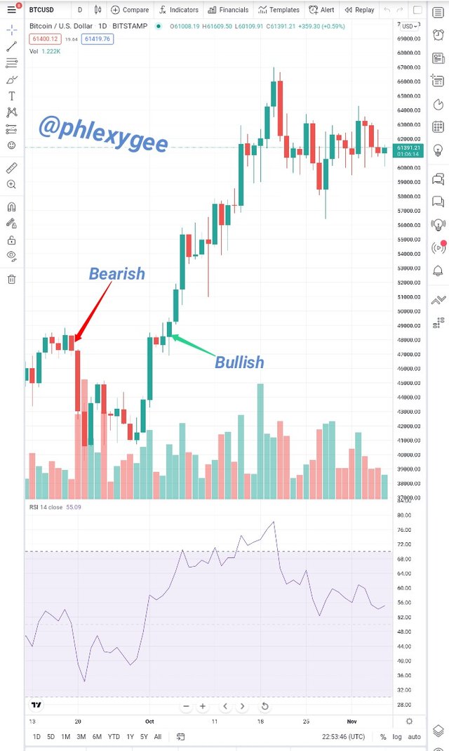
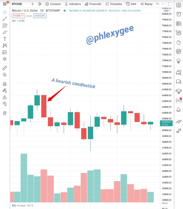
The above is a chart of BTCUSD pair of which I have indicated the bearish and bullish trend through the help of the red (bearish) and green (bullish) candlesticks.
The image displays the previous and current price of the asset therefore giving the trader the opportunity to open his or her position based on the data provided.

b) In your own words, explain why the Japanese Candlestick chart is the most used in the financial market.
The Japanese candlestick chart is mostly used worldwide in the financial market and below are some of the reasons why I believe have triggered for such trend.
The provision of adequate and reliable data; as mentioned earlier the Japanese candlesticks provides adequate and reliable market data in a pleasing manner with regards to the previous and current market price or trend.
Its compatibility with other technical analysis tools; the Japanese candlestick chart serves as a role model for all the technical analysis tools including the leading and lagging Indicators. Its compatibility with the indicators makes it more pleasing and comfortable for most traders to utilize. Therefore traders get the opportunity to employ their preferred Indicators on the charts just as I have applied the RSI Indicator on the first chart (screenshot).
The showcasing of the market controller; the Japanese candlestick has the ability of presenting who is in charge of the market, either it being the buyers or sellers through the display of the green and red candles.
Knowing the controller of the market also affects trading decisions and outcomes.
When sellers take control of the market it means the value of the asset will definitely depreciate whiles if the buyers take in charge the value will be higher.The provision of hint on future market prices; the previous price movements of an asset on the chart enable the traders to read and predict the future price of an asset in the market.
Traders usually do this by considering the shapes that often lead to either price continuations or reversals.
I consider this to be key reason why most people utilize and prefer the Japanese candlestick chart.User-friendly; the chart is easier to read through the help of the arrangements of the candlesticks and the price labeling of the assets with their corresponding dates. Also, additional tools can easily be added on the chart by the traders.
Its stylish interface; the stylish design and graphic representation of the chart on various platforms makes it more pleasing to the users. The availability of the various colors on the chart alone calls for some level of attention. Traders get the opportunity to configure the chart at ease.
c) Describe a bullish and a bearish candle. Also, explain its anatomy. (Original screenshot required)
Bullish Candle
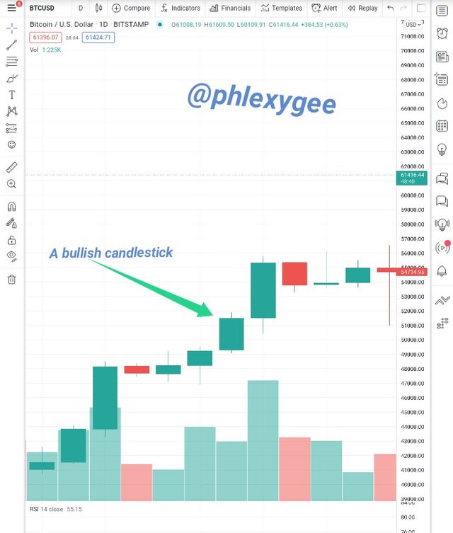
A bullish candle is a form of candle that is often present in an uptrend market position on a chart.
It helps the traders to become more informed about the uptrend of the market by displaying a couple of bullish (green) candles which indicates the high, close, open and low prices of an asset which helps the traders to open their trading positions or make their trading plans.
Bullish candles usually slope upwards due to an increase in the price of the asset.
A bullish candle is normally green in color and the open price precedes the close price unlike that of a bearish candlestick whereby the close price comes before the open price of an asset in the market.
The anatomy of a Bullish Candle
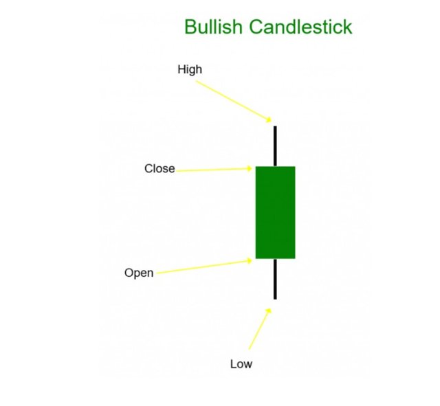
Beneath are the relevant components that make up a Bullish candle just as displayed in the image above;
- High
- Close
- Open
- Low
High; the high point of a bullish candlestick indicates the maximum or highest price at which an asset has been traded within a given period.
Close; the close point of a bullish candlestick represents the closed price of an asset in the market at a particular period of time. It actually indicates the last price of an asset recorded within a candle.
Open; the open point of a bullish candlestick indicates the opening price of an asset in a certain period of time. An uptrend usually takes place from here.
Low; the low point of a bullish candlestick represents the lowest price at which an asset has been recorded or traded over a period of time.
Bearish Candle
A Bearish candle is also a form of candle that is often present in a downtrend market position on a chart. It helps the traders to become more informed about the downtrend of the market's position by displaying a couple of bearish (red) candles which indicates the high, open, close and low prices of an asset which helps the traders to open their trading positions or make their trading plans.
Bearish candles normally slope downwards due to a decrease in the price of the asset.
A bearish candle is normally red in color and the close price precedes the open price unlike that of a bullish candlestick whereby the open price comes before the close price of an asset in the market.
The anatomy of a Bearish Candle
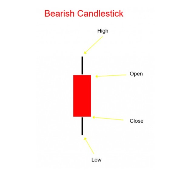
Beneath are the relevant components that make up a Bearish candle just as displayed in the image above;
- High
- Open
- Close
- Low
High; the high point of a bearish candlestick showcase the maximum price at which an asset has been traded within a given period.
Open; the open point of a bearish candlestick displays the opening price of an asset on a certain period. A downtrend normally proceeds from here.
Close; the close point of a bearish candlestick showcase the closed or end price of an asset in the market at particular period of time. It indicates the last price at which an asset was traded.
Low; the low point of a bearish candlestick represents the minimum price at which an asset has been traded over a period of time.
All the above unsourced images are screenshots taken from www.tradingview.com and www.epitometrading.com
Conclusion
My regards to Munehisa Homma for his innovative ideas that led to the introduction of the Japanese candlestick in the 18th century which has brought some level of relief and confidents on the part of crypto traders.
The candlesticks seems to be smaller in sizes but they are mightier in trading due to the relevant information they provide.
The Japanese candlestick chart is a good initiative which aids traders to make their trading decisions of which most of them come out in flying colors, therefore it should be embraced and properly utilized.
Thank you Prof. @reminiscene01, @nane15 and @dilchamo for your indefatigable contributions towards the development of this noble community.
#club5050 😀
#club5050 to the moon 🌒.
Am proud to be part.
😉