Gridcoin wallet rebranding preview
You have probably already noticed that gridcoin is in the process of rebranding. After all the social media channels and the website (thanks @cm-steem) have been redesigned there is only the wallet left. We still have some testing and polishing to do but I want to present a short preview of the new design. A big thank you to @joshoeah for providing all the new images and icons, as well as for his advice on color schemes for the wallet. The work on the GUI will continue after this release. We are in the process of replacing all the remaining icons with new ones and improving the apperance on high DPI displays.
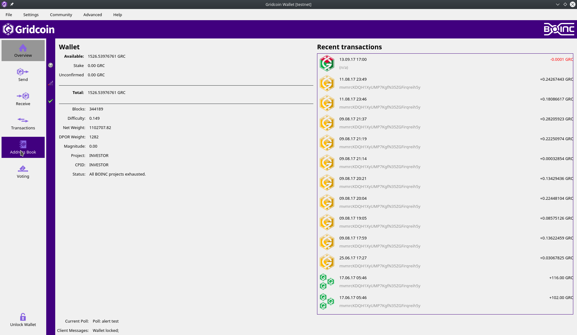
Light color scheme
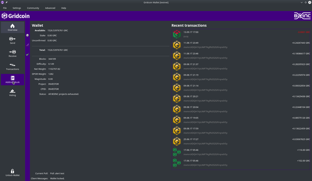
Dark color scheme
A couple of words from me on this:
The current purple shown is rather dark, but this will be improved before release - unfortunately, I'm not technically minded enough to tinker with the colour scheme in the wallet myself, as I'd usually like to do, so it's hard to know what the final result will be until it's been changed by @skcin :)
I'd like to add that @skcin has done a fantastic job implementing the new icons and colours - particularly with modifying the wallet so that different colours can be displayed on the light / dark schemes. This is so important for ensuring usability no matter which theme you pick and makes changing things in the future a lot easier!
I like when you are not MIA. <3
It's looking good. I like the dark theme best. I think the purple may be a little dark though.
My OCD would also like to see the padding between the lines of the Total the same above and below the word Total. Maybe reduce the amount of distance of the bottom line so it's the same as the top.
I also think the arrow for receive should face the other way.
Really like the dark theme.
A couple of suggestions though:
E.g. Net Weight : 10,000,000.00
E.g. "Current Poll: Poll: Casual_Poll:xxxxxx" could be "Current Poll: Casual_Poll:xxxxxx"
Would rather make the vertical streep black too, and make only the banner purple.
Good idea. I will try it out.
I'm a big fan of dark themes and this one looks great. I can't wait to see the final version of all of these. Thanks for the hard work everyone!
At the beginning I didn't like new branding (comparing to old), but need to say this wallet looks much better!
Congratulations @skcin! You received a personal award!
You can view your badges on your Steem Board and compare to others on the Steem Ranking
Vote for @Steemitboard as a witness to get one more award and increased upvotes!
Uh how cool that dark skin is ! Want to have that for sure. Thanks alot for the hard work you are putting into this, I appreciate this alot ! Go Gridcoin !
Looks fantastic! Great work. =)
I don't know if this is feasible, but is there any chance of adding the console as a tab on the left?
It's really tucked away right now but incredibly useful.
It is possible but I think the goal should be to make the gui very easy to use. Maybe we create a normal and advanced option for the gui at some point.
I did not really consider new users in my above request. Very good point - usability for the masses before making advanced features slightly easier to access is definitely the better approach.
Thank you for all your fantastic work huppdiwupp! =)
I am Cornholio! You will co-operate with my bunghole!
In both of the schemes the purple (blue?) has too high contrast to the rest.
Otherwise excellent.