Color and harmony tonal in painting
Today I want to tell you about some color theory on some examples. I studied in the last century, and although little has changed since then, I would love to hear of your addition.
Over the centuries, artists have developed special techniques that enable you to achieve what you want, to ensure the true progress of your work. "Inspiration is when you know how" - the famous expression of Leo Tolstoy, which is suitable for all types of creative activity.
Based on research in the field of color science, the following types of harmony are derived:
- monochrome (one color)
- Polar (based on a combination of two opposite colors)
The color shades in volumetric shape (valley) vary depending on the lighting. This is the first color law in painting.
The law of the two colors in the painting is the ratio of light and cold shadows. If the lighting is cold (daylight in the room), then the lights will have a cool feel. The shadow in this case will be warm. With sunlight or electric light, the lights will be warm, but the shadows are cold. In addition, the hot-cold relationship depends on complementary color action.
The contrast of the three colored couples - red and green, orange and blue, yellow and purple - is also a cool warm contrast and this is the third law of painting. The presence of opposite shade of each other strengthens its saturation.
Painter by their nature is divided into "tonovikov" and "colorists". Painter builds their work on a clear tonal relationship and a perfect picture.
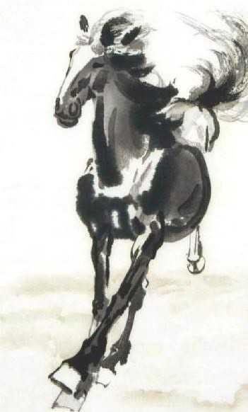
The first one... it a Japanese water colour painting from a century ago.
Love it!