Responsive Design | Why Does My Website Need To Be Responsive?

Responsive design creates a seamless flow for different device screen sizes.
Why Do We Need Responsive Design Now?

In the past, web design was either built for desktop, laptop or phone screen displays. There was no easy way for websites to render screen-specific design instruction. However, in June 2012 media queries became a W3C standard after web browsers added support.
Each website would check for the device type and redirect to a mobile version such as “m.website.com”. Now, it’s easier than ever to write media queries in CSS to handle all different screens sizes. “CSS” — or Cascading Style Sheets are files that tell the web browser how to render a website. CSS media queries could be added at the end of the basic site style to give special directions for phones, tablets and small to large desktop/ laptop screens.
Mobile First Website Design
Mobile first web design allows web designers to future-proof design more efficiently. For example, there could be a page content width constraint of 1200 - 1400 pixels, with sections of content adding up to 100% (as seen in the above image). Using percents instead of pixels allows stretching of content to fit into the 1200 - 1400 pixel constraint.
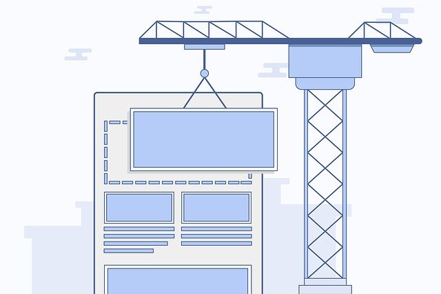
An example of responsive design would be taking the above picture’s middle two sections and making them full width only on smaller screens, such as phones.
Mobile first is an important part of responsive design. It makes it easier to readjust the website components to fit larger screens than it is to shrink content to fit smaller screens.
Keep in mind the page constraint would be set using a “minimum width” media query. As long as the width of the page is set to 100% before the media query, the page should stretch the full device width until it hits 1200 - 1400 pixels.
Viewport And Responsive Design
In addition, the viewport meta tag assists with the display of a responsive design. This is very important because smaller displays require a greater zoom for legible text.
<meta name="viewport" content="width=device-width, initial-scale=1.0">
Without the above line of code, a mobile responsive website may not render the proper font size on smaller displays.
Rest assured, Divto is the leader in responsive web design and conversion. Check out our mobile conversion service and feel free to contact us for any inquiries.
Posted from my blog with SteemPress : https://divto.com/responsive-design/