01.04 - The Anatomy of the Letterform - The Foundations of Typography
Chapter 01 - Introduction
Lesson 04 - Anatomy of the Letterform
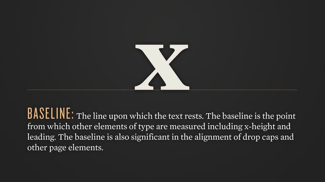
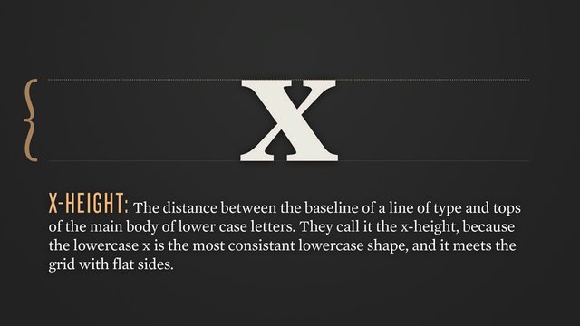
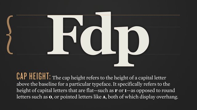
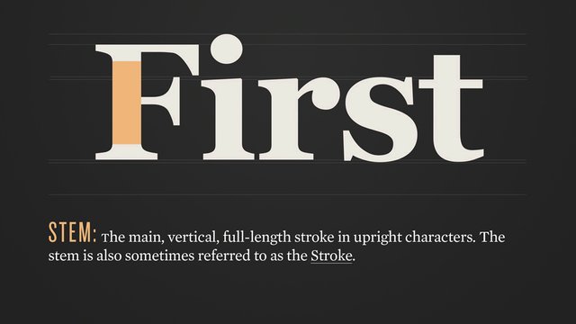
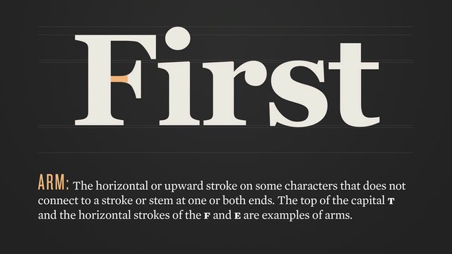
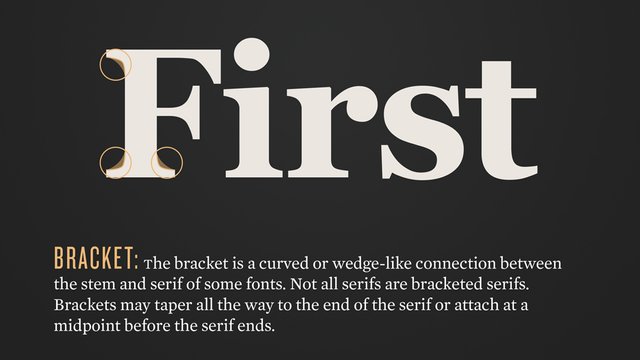
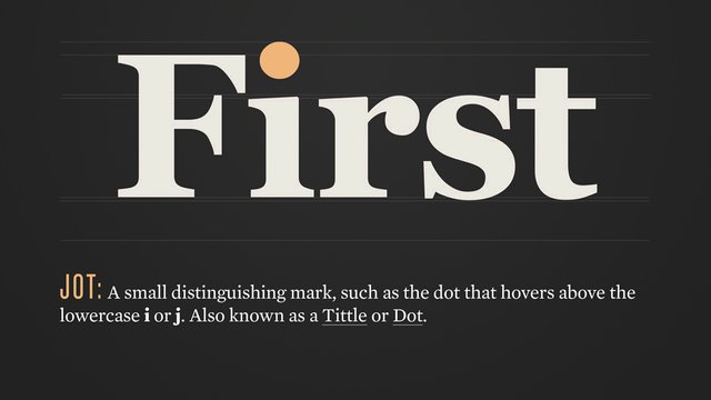
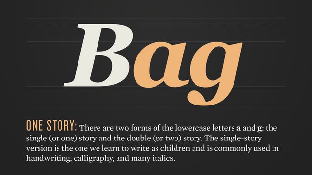
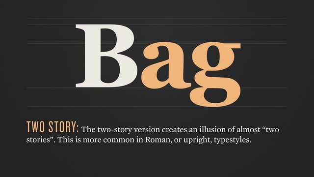
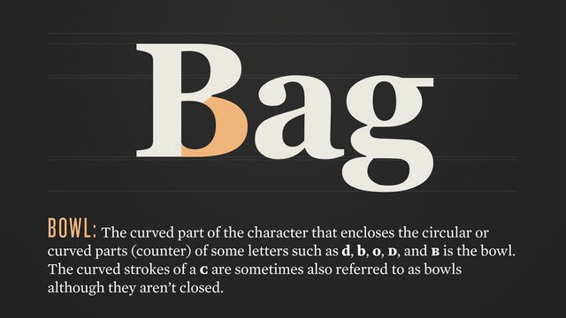
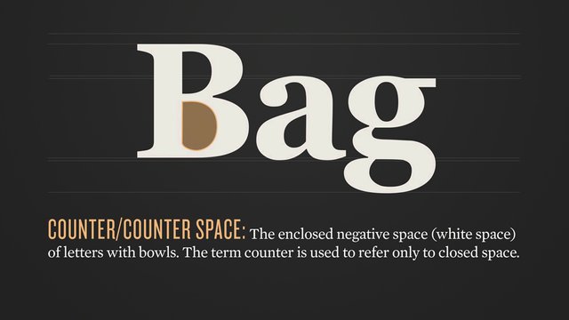
The anatomy can seem a little daunting at first, as there are quite a few terms to remember. But it is useful to familiarize yourself with these terms in order to communicate properly with other design professionals. You don’t want to be referring to the jot of a j as “that dot thingy”, because it sounds ridiculous and you won’t be taken seriously. It's helpful to note that most of the anatomy nomenclature overlaps with the human body, which makes it easier to remember. So, let’s just jump in, starting with the most important line in typography, the baseline!
And finally, the...

Feel free to share these anatomy cards till your heart's content. Now, that you're familiar with the importance, history and anatomy of typography, it's time to start learning about how type can be classified. We'll cover various type classifications in the next chapter.
Let me know what you think of the series so far! I'd love to hear your feedback.
so sick! time to publish a quick reference guide in print
I love this post so much. I had no idea all these names existed for the different segments of text. Also, now I can feel really smart when I inform someone that the dot over the 'j' is called a jot!! lol ;)
Thanks @jenlavallee! I am very happy to hear that! Yes, it's pretty fun to try and throw some of these into casual conversation. I personally hate the word "tittle", so "jot" is my preference as well, haha.
I'm eager to see new posts from you)
Thank you!
The visuals are so fancy! I didn't know any of these names--feeling smarter already. Thanks for this awesome post. Will be watching for the next one for sure.
Thank you @jessicakluthe, I'm glad you're enjoying the series!