Take the type taste test!
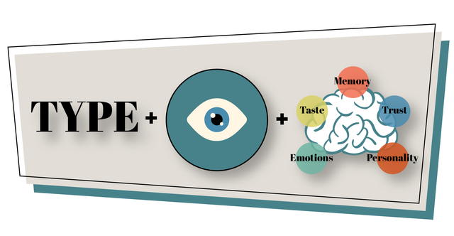
One of my least favorite things about design is working with type. It's probably because I'm bad at it, but it's also because it can be difficult to choose the right typeface to compliment your design or illustration. Honestly, some of my past designs have suffered because of "corny" font choices. I notice that I tend to fall back on picking a decorative font that looks "cool" instead of spending the time to research how to use type effectively. BUT, I read about an awesome exercise called "type tasting" from Sarah Hyndman, author of "Why Fonts Matter", that has helped me out a lot and hopefully you'll dig it too!
Through this exercise, you'll learn how much influence type has over us, how to use it to make a good impression, and how it can be an extension of your voice and personality.
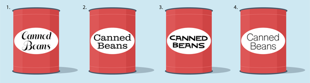
I had people at work take a look at the image above and asked which can they would be MOST and LEAST likely to buy and why. Spend a little time with them and see if you feel the same way they did. Here are a few of their comments:
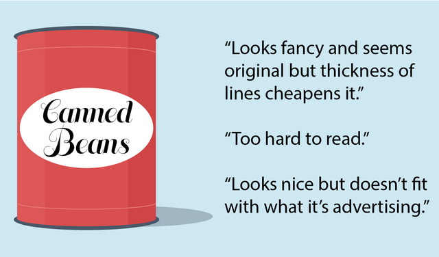
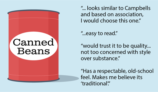
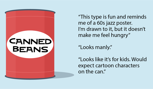
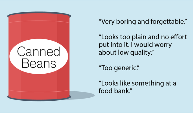
It's important to remember that these are all JUST opinions and there is no absolute RIGHT or WRONG type to use for your project. But after looking at their answers, you can see that choosing type that goes hand in hand with the rest of your design is really important, especially if you are trying to sell a product or service.
In this instance, the "right" type to use would be the one that most made people trust the perceived quality and WANT to buy the product. I'm not saying you should be boring and unoriginal, but if you're trying to move a bunch of beans, give people something they're familiar with. Don't get too cute with it.
OR the "right" type to choose would be the one that looked like it would appeal to kids, if that's who you're trying to get to buy it. Knowing your market, or who you are designing FOR, will go a long way when it comes to choosing which font to use.
Here's another example:
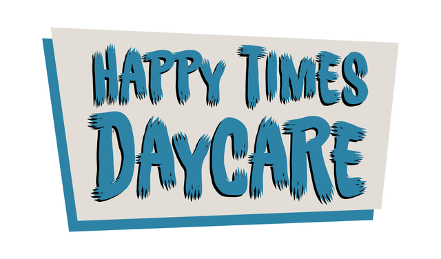
Unless you're a family of werewolves, could you imaging sending your kids to a place with signage like this? No way! But does that mean that the font is bad and should never be used? Well, in the right context...
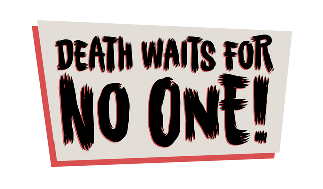
it'd look great! This would be perfect for a sci-fi comic or an old horror movie poster. It's all about context.
I pretty much mainly focused on display and decorative fonts with this exercise but what we are talking about applies to body text too. You wouldn't wanna use something too out of the ordinary for long sections of copy. I know that probably goes without saying, but it's good to cover the bases!
There are lots of interesting little tidbits to pull out of this exercise that I didn't mention here but spend a little time with it and see if you can come up with some of your own. I hope this was helpful and if you have any advice, thoughts, questions or conclusions, I'd love to hear them!
Congratulations @seanbiance! You have completed the following achievement on Steemit and have been rewarded with new badge(s) :
Click on the badge to view your Board of Honor.
If you no longer want to receive notifications, reply to this comment with the word
STOPDo not miss the last post from @steemitboard:
SteemitBoard and the Veterans on Steemit - The First Community Badge.