Looking at the Marital Status for Each Age Across the US
This is a great example of using a Stacked Bar Graph to tell the story of the different marital status distribution across every age. Here you can see what age people tend to get married and divorced.
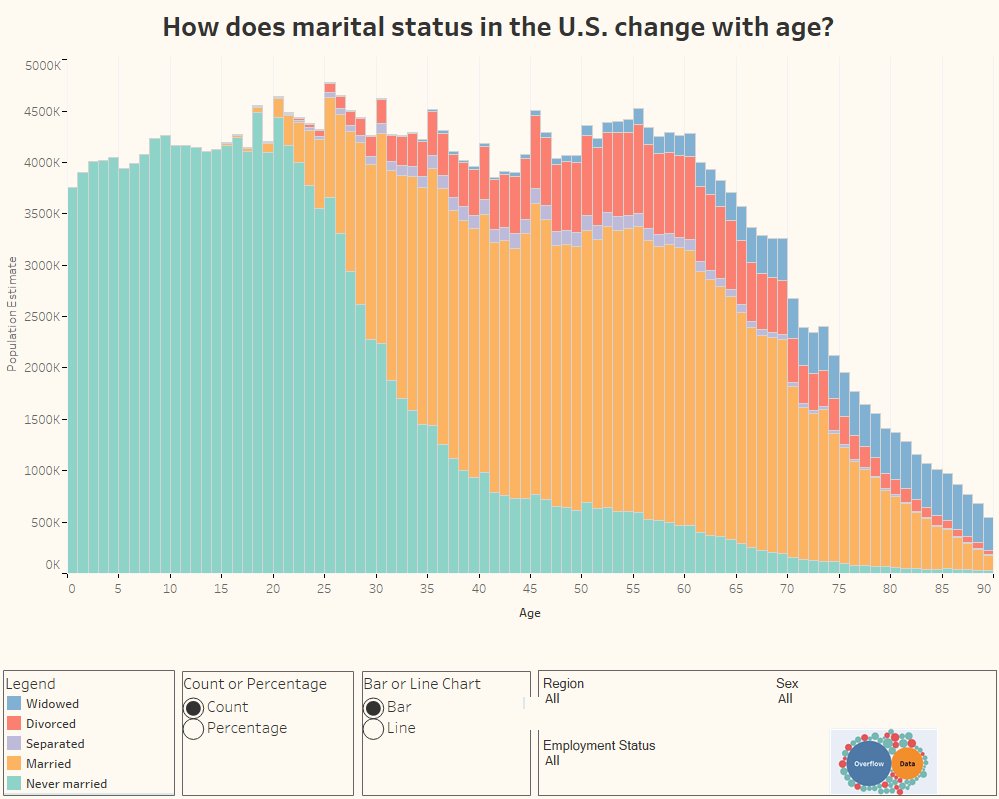
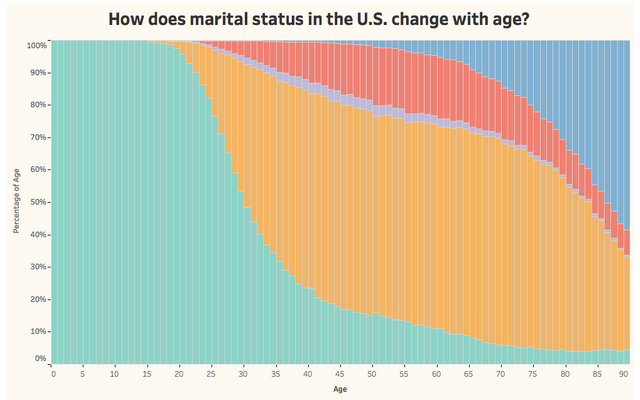
Above is just a static image, but if you go to the original page I found this chart on, you can explore the data more by adjusting the controls. For example, if you set the chart to Percentage, you get a better illustration of what ages have the largest percentage of divorced, married or widowed people. This also you to better compare percentages across every age and of the marital status distribution on each indivdual age.
you're making amazing job with all this data-vizusualization stuff. very interesting for me. hope you'll get more upvotes/followers as it definitely deserves
Thanks that's great to hear and I will try to keep it up but I have a busy period right now. But I hope more interest develops as well. I'm liking the generative art you're doing.