What Happens in an Internet Minute Since 2013. In Search of True Data...
I love numbers and I love statistics, the more I love accurate numbers and accurate statistics. Especially when it is used to things, that surround us every day. Even better when the final result is presented in the form of infographics- one of the most convenient, enjoyable and easy method to perceive the data.

One of my favorite infographics in recent years is ”what happens in an internet minute”. There are many sources of such information, but the most popular (according to the search results in Google) and informative are Domo (Data Never Sleeps) and Excelacom What happens in an internet minute?). It's great that these projects publish such data every year. It allows to visually evaluate how quickly grow the different services and the Internet in General.
From 2013 to 2017 the number of Internet users grew from 2.1 billion people to 3.7 billion. It is not surprising that most of the content generated on social networks. That's why they get into the charts every year, but sometimes change their criteria of assessment.
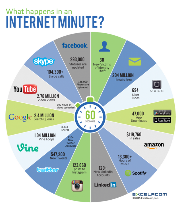
2013
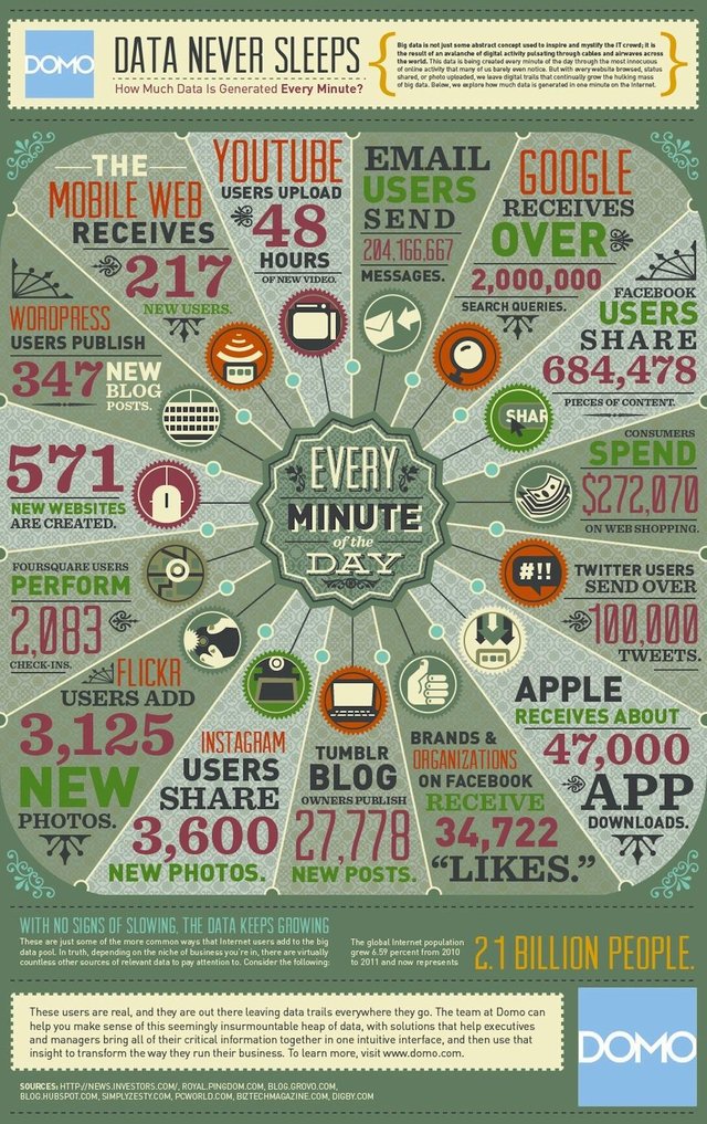
Domo began to publish statistics two years earlier than Excelacom. You can see information about such platforms as Flikr and 4sq (we will not see them again). At the same time, there is no data on Tinder. Tinder was created in 2012, but the growth of its popularity occurred in 2014 +15% new users every week.
Because some services displace other, let's follow up on the major social networks and services:
Instagram: Users share 3600 photos.
YouTube: Upload 48 hours of new video
Twitter: Users send 100.000 new tweets
Google: 2.000.000 Search queries
Facebook: 684.478 pieces of content
2014
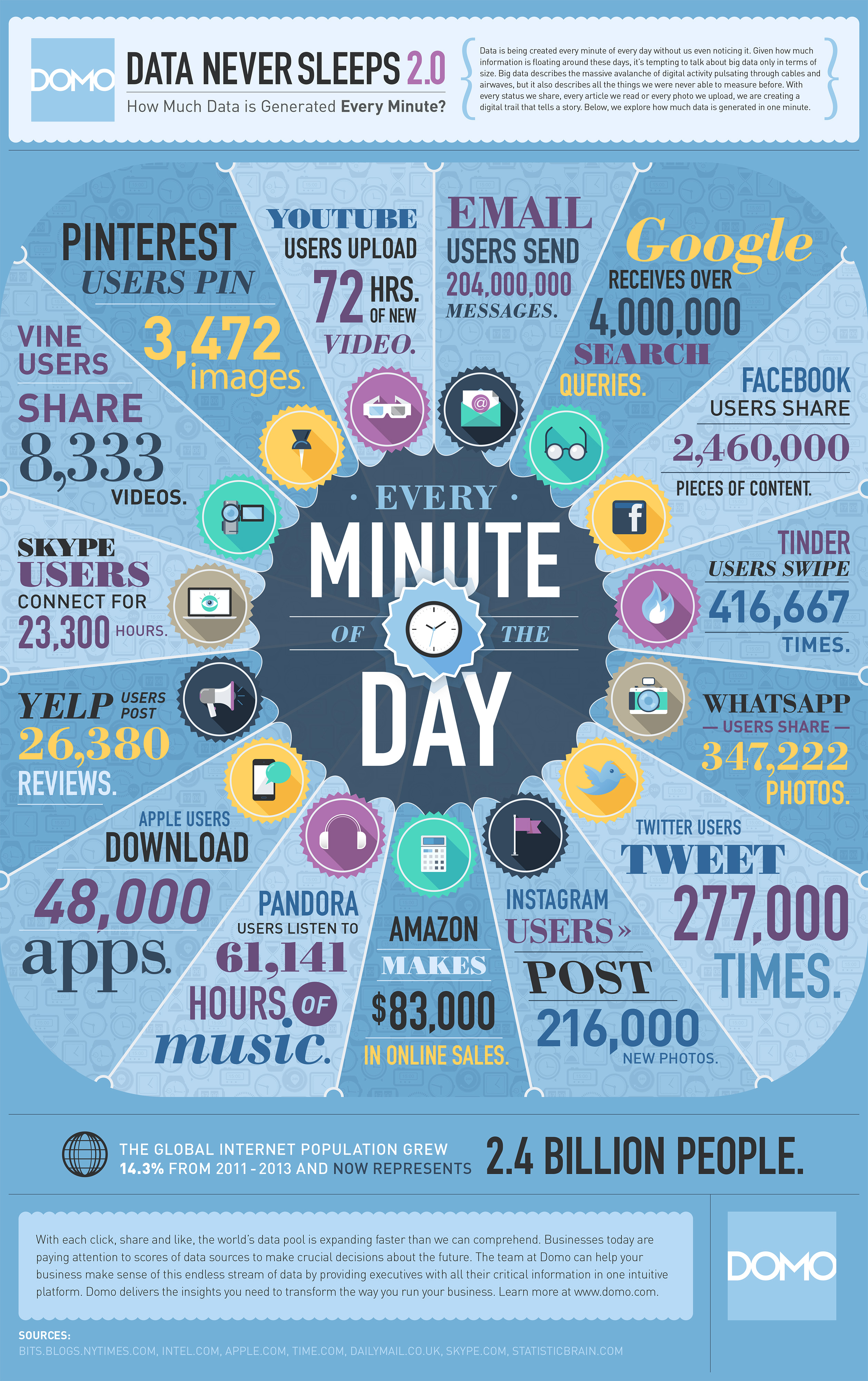
Excelacom still not entered the game, while Domo has quite significantly reshuffled the main participants. This is an example of how new services are changing the market: Vine, Pinterest and finally Tinder. In this graph, there are two serious errors...
2013 vs 2014
Instagram: Users post 216,000 new photos. (vs 3600 in 2013- seems unlikely)
YouTube: Upload 72 hours of new video
Twitter: Users send 277.000 new tweets
Google: 4.000.000 Search queries (two times more than in 2013, although the number of users increased by only 20%)
Facebook: 2.460.000 pieces of content
Tinder: 416.667 swipes
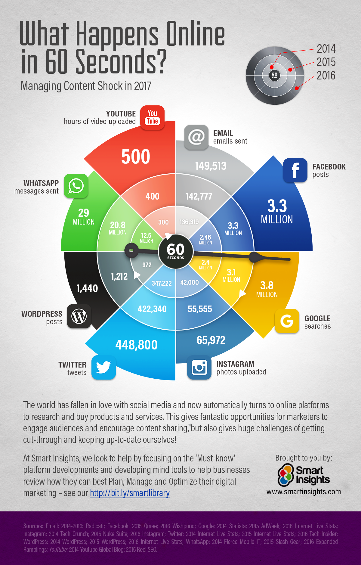
2015
Well, now it's even harder to compare data, because Domo changed the assessment criteria even for regular participants. Now we got numbers of likes for Instagram and Facebook.
Infographics from Excelacom allows to fill in some gaps. But on the other hand it brings even more confusion...
Instagram: 123.000 new posts Really? 3600 in 2013, 216.000 in 2014 and 123.000 in 2015. This is an obvious error information, even with the replacement of the wording in the charts: photos/ posts. The number of users of Instagram increased from 100 million to 300 million (2013-2015 year).
YouTube: Upload 300 hours of new video (vs 72 in 2014).
Twitter: Users send 347.222 (Domo) or 547.200 (Excelacom) new tweets. Who is wrong?
Google: 2.400.000 Search queries (Excelacom) vs 4.000.000 in 2014 (Domo). Domo clearly overestimated this number in 2014
Facebook: 3.300.000 pieces of content (data from another sources)
Tinder: Users swipe 590.278
Honestly, at this stage, my brain began to boil a little. Too much data doesn't add up. But do not worry, we'll soon figure it all out.
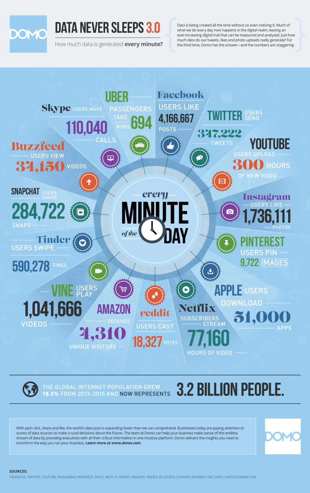
2016
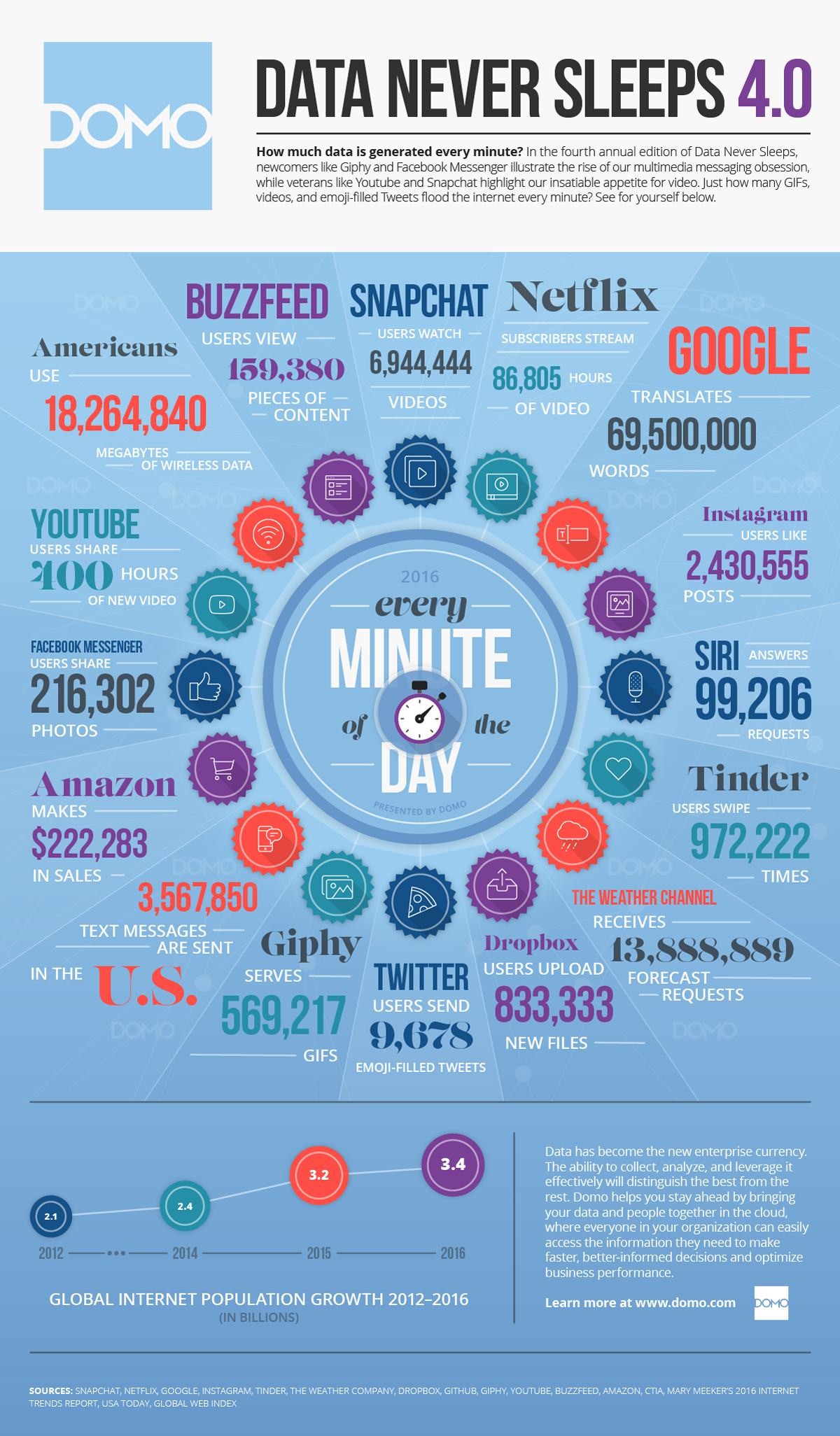
And Domo again changed the composition of participants and evaluation criteria. Maybe they noticed that several times made a serious mistake in past charts, so they decided to change the data type (in which they are not sure) for each new year.
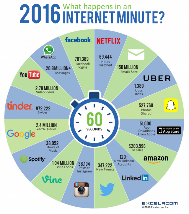
Excelacom decided not to change the data type and practically do not change the composition of the participants. It looks good... until you compare the results of the 2015 and 2016:

2015 vs 2016
The numbers for major services (Instagram, Twitter, Email) have dropped significantly. How can it be, if global internet population increased by 200 million? Some of the data (Google, Vine and YouTube) remained unchanged, which also looks strange.
Perhaps, in this case, Domo chose a more correct strategy and looks more plausible. Anyway, let's try to evaluate the data in the format to which we are accustomed:
Instagram: 38.194 new posts vs 123.000 in 2015 (Excelacom). According to the official instagrams data: users upload 90.000.000 photos every day in 2016, it is about 62.500 photos every minute.
YouTube: Upload 400 hours of new video (vs 300 in 2015). - it is true.
Twitter: Users send 347.222 new tweets vs 547.200 in 2015 (Excelacom). Statistics from tweeter: 500 million Tweets sent each day in 2016, it is 347.200 tweets per minute. So Excelacom was wrong in 2015 and right in 2016.
Google: 2.4 million Search queries in 2015 and 2016 (Excelacom). Official data from Google: they recived 5.5 billions search queries every day in 2016, it is 3.8 million per minute.
Facebook: I could not find data for 2016
Tinder: Users swipe 972.222
As we can see Excelacom presented wrong information in 2015 and made some mistakes in 2016. And we cannot compare Domos infographics.
2017
Domo haven't published their infographic yet, while Excelacom did it back in March.
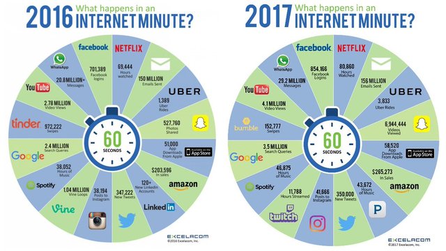
Well, in a sense, they are worthy of respect. Despite the blunders in the past, they do not change the data types and main participants. But now we can independently check whether these data are correct with internetlivestats.
Instagram: Users post 41.666 photos/posts (Excelacom) vs 60.500-65.000 photos (internetlivestats)
YouTube: 4.1 million video views (Excelacom) vs 4.2-4.6 video views (internetlivestats)
Twitter: 350.000 tweets (Excelacom) vs 420.000- 460.000 tweets (internetlivestats)
Google: 3.5 million Search queries (Excelacom) vs 3.6-3.7 million (internetlivestats)
Email: 156 million emails send (Excelacom) vs 156-162 million (internetlivestats)
Well, now we know where Excelacom takes data, at least in 2017. It is obvious that earlier they used a different sources, and continue to do it for such services as Twitter and Instagram.
Perhaps, the most accurate infographic in the period 2014-2016, made these guys:
Unfortunately, as we see such graphics often contain false information, and it is impossible to assert that even internetlivestats provides accurate data. However, we can get a general idea of how the Internet community and social networks are growing rapidly. Let's hope that in 2018 we will see Steemit among the participants ;)

well written post liked your post. upvoted and followed my upvote is not very worthy as i have less steem power sorry for that mate.
Thank you for your support, my friend!
I love infographics. Very nice post, especially for the likes of me who likes facts and figures. Followed and upvoted. :-)
Wow nice infographics! :)
Not mine, but very nice, yes :)
What an interesting post. Keep Writing more friend.
Thanks! :)
good post
thank you