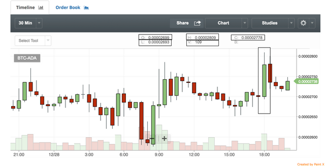
Understanding the candlesticks chart
The candlestick tool was invented in Japan and then were taken gracefully by the western world. This candlestick chart is used to describe the price movement in the selected time unit. This time unit can be 1, 5, 30 mins, one hr, one day, one week, etc. A single candlestick of 30 mins tells a user about the price movement of a stock or a coin for last 30 minutes. By combining multiple charts, one can see the price movement of a specific duration. Example: if we are seeing a 30 mins candlestick chart of last 4 hours, then we will see eight candlesticks. The line chart and the candlesticks charts go parallel. This is majorly used to determine the current price patterns.
Different terms of a candlestick chart:
In crypto exchanges, a candle is composed of the red or green body. It also contains wicks(which are lower and upper shadows).
A single candlestick gives us this information:
Opening price:
It is the price of which that specific candlestick started. Example: for a xyz coin, a candlestick of 30 mins started at 18:30 and the first transaction was done at $1. So, it means the opening price is $1.
Closing price:
It is the price on which the last transaction of that specific candlestick executed. In the above example itself, at 18:59:59, a sale happened with a price of $1.1. It means the closing price is $1.1
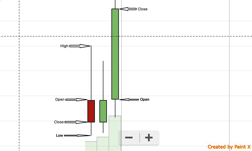
High:
high is mostly the top part of the upper wick which gives information about the all-time high price of that coin within the same candlestick. In the above example, let consider the price of the coin varied from $0.8 to $1.3 within 18:30:00 to 18:59:59. In this case, $1.3 is high.
Low:
Low is mostly the lower part of the lower wick which gives information about the all-time low price of that coin within the same candlestick. In the above example, $0.8 is low.
volume:
It gives us the information about the volume of transactions happened in that candlestick.
How this tool is useful?
- This candlestick of various time duration helps us analyze price pattern, and hence one can identify if this is the right time to buy, sell or hold (In crypto world HODL)
- It quickly helps us in decision making. Example, if the red graph is more significant in size and continuing for few candlesticks, it means the market is bearish, and it might be a good idea to sell it now. And if there are more significant green size blocks with good higher, it means bulls are trying to pull the market up, and the market is bullish. So, this can be the right time to buy few more coins and hold the previous ones.

This is really great and easy to understand. Looking for some MACD's tips and trick. Thanks @qagiri for sharing.
Thanks @andyjim :)
My great pleasure :-)
Here is a Tip.
All technical analysis is BS.
Might as well have a crystal ball.
TA is like looking up at the stars and seeing a crab in the cancer nebula.
You're gambling.
Well said @wanderingsky :-)
Like your post
Thanks @monalishabiswas