Modelling the First Wave
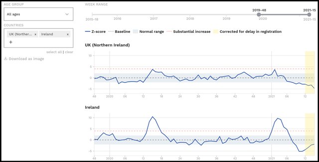
In an earlier article in this series—The First Wave—we examined the alleged effect the covid-19 pandemic had on all-cause mortality in Ireland. We saw that there were spikes of excess mortality in both the Republic of Ireland and Northern Ireland in April 2020, the former being by far the larger of the two:
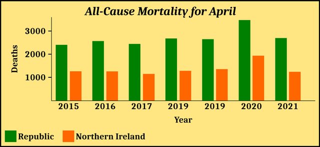
The mortality statistics for the month of April in the Republic are as follows:
| Year | Deaths in April |
|---|---|
| 2021 | 2694 |
| 2020 | 3469 |
| 2019 | 2645 |
| 2018 | 2677 |
| 2017 | 2441 |
| 2016 | 2564 |
| 2015 | 2401 |
Source: Kieran Morrissey and RIP.ie
The corresponding data for Northern Ireland are as follows:
| Year | Deaths |
|---|---|
| 2021 | 1238 |
| 2020 | 1933 |
| 2019 | 1354 |
| 2018 | 1281 |
| 2017 | 1148 |
| 2016 | 1257 |
| 2015 | 1261 |
Source: NISRA
It is clear that something unusual happened in Ireland in April 2020:
The official explanation is that these spikes in excess mortality were caused by the covid-19 pandemic. Even some independent researchers who have been highly critical of the government’s handling of the pandemic—eg Ivor Cummins—are happy to concede that Ireland was hit by a contagious viral epidemic in the spring of 2020 and that this epidemic was responsible for these spikes in mortality.
But are these spikes actually characteristic of a viral epidemic that is being transmitted from person to person?
Modelling Epidemics
An epidemiological curve, or epi curve, is a graphical representation of the course of an epidemic. Such a graph maps the number of new cases of the disease (y-axis) against the date of disease onset (x-axis). The shape of a disease’s epidemiological curve can reveal much about the nature of the disease, the mode or modes of its transmission, the length of its incubation period, etc.
Note that epi curves plot cases of the disease, not deaths from the disease. These are epidemiological curves, not mortality graphs (death curves). But in the case of a lethal disease that kills, say, 0.9% of those who catch it, we would expect both curves to exhibit similar profiles. The death curve will be much lower than the epi curve and will lag behind it, but if the case fatality rate remains largely unchanged throughout the course of the epidemic, the death curve must necessarily echo the rises and falls of the epi curve. And although it is claimed that the case fatality rate of covid-19 has changed over time as new variants have come and gone, it is safe to assume that it did not change significantly over the course of the first wave, which only lasted a few weeks and was attributed to the original strain of SARS-CoV-2.
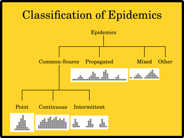
Epidemics are classified according to the manner in which they spread throughout an affected population. Each category—except for Other— is characterized by a specific type of epi curve:
Common Source In these cases the source of the disease is the same for all infected persons. There are three subcategories:
A Point-Source outbreak is one in which all the sufferers are exposed over a brief period of time, or at the same event, so that everyone who becomes ill does so within a single incubation period. Food poisoning is typically a point-source outbreak. The epi curve generally rises to a single peak and falls back to normality within the incubation period.
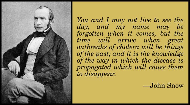
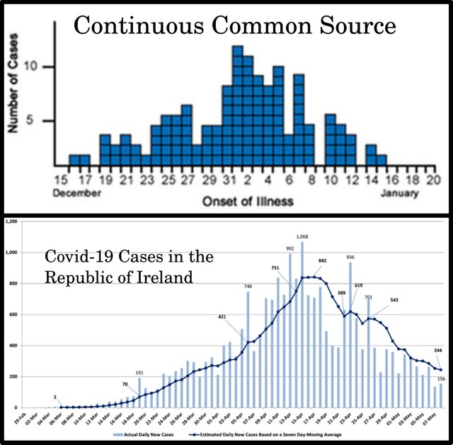
During a Continuous-Source outbreak people are exposed to the source of infection over a prolonged period of time, so that cases of the disease occur over a longer period of time than the incubation period. Outbreaks of cholera due to contaminated water supplies are continuous-source outbreaks. The epi curve generally rises to a peak, fluctuates over a period of time greater than the incubation period, before falling back to normality. The down slope of the curve may be very sharp if the common source is removed—as happened in Broad Street, London, in 1854, when John Snow removed the handle of the pump supplying the contaminated water responsible for an outbreak of cholera—or gradual if the outbreak is allowed to exhaust itself naturally.
In an Intermittent-Source outbreak the disease has a common source but the infected population is exposed to this source intermittently, with intervening intervals during which there are no new cases of infection. If, for example, the source of infection is in a place of business that is only open to the public on the weekend.
Propagated Source A propagated outbreak occurs when the infection is transmitted from person to person. Cases occur over a period of more than one incubation period. The epi curve has a very distinctive profile, consisting of progressively taller peaks, each one separated from the next by a single incubation period, until the epidemic wanes and the peaks become progressively lower. Between these peaks cases fall away, so that the curve resembles a series of common-source outbreaks, each one more serious than the previous until the outbreak begins to wane.
Mixed A mixed outbreak is like a cross between a common-source outbreak and a propagated outbreak. The classic example is the 1988 outbreak of shigellosis, a type of food poisoning, in which 3,000 women contracted shigellosis at a music festival (point-source), but later spread the disease among the wider population through person-to-person contact (propagated source).
Other This catch-all category covers epidemics that do not fall into the other categories. Epidemics of Lyme disease, which is transmitted by a tick, are commonly assigned to this category.
These are theoretic graphs, representing ideal models of outbreaks. Epi curves and death curves based on real-world data tend to be noisier and more difficult to interpret. There are also the added complications of under-reporting, over-reporting, delayed reporting, inconsistent testing, misdiagnosing of cases, and assigning an incorrect cause of death.
Another important factor concerns the way in which the number of cases for a given day is calculated. Epi curves may simply plot the actual number of new cases detected on that day (new-per-day), or they may plot a moving average, such as a 7-day rolling average. In this case, the number of cases plotted for a given day is calculated by adding up the number of new cases that were actually detected on that day and on each of the six previous days, and then dividing the total by 7. This has the effect of smoothing out the epi curve. The reason for choosing 7 days to calculate these averages is to eliminate any artifacts due to the day of the week—eg test centres being closed on Sundays.
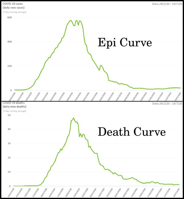
These two methods of recording the first wave of covid-19 in the Republic of Ireland are illustrated in the following curves:
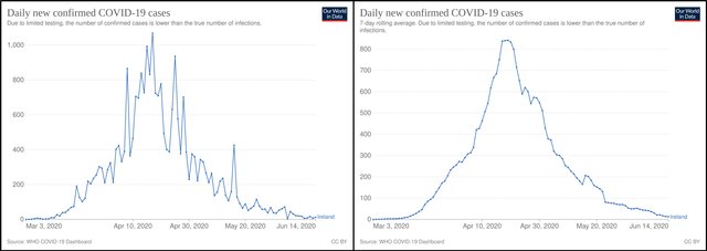
But is this what we want? The rolling average certainly smooths out irregularities due to such things as inconsistent reporting or misdiagnosis. If the jittery nature of the new-per-day curve is an artifact caused by such factors, it would make sense to try and eliminate it. But could the ups and downs reflect the nature of transmission? In the case of a propagated outbreak with an incubation period of only a few days, would we not expect to see successive peaks and dips separated by a few days?
What sort of outbreak was the first wave of covid-19 and what was its incubation period?
Modelling Covid-19
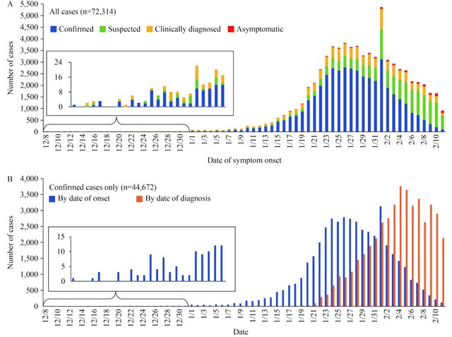
If, for the sake of argument, we accept the official narrative, then the covid-19 pandemic was initially a mixed outbreak in Wuhan, China, before becoming a propagated source throughout the country:
A major contribution of our study is a first description of the COVID-19 epidemic curves. We interpret the overall curve (Figure 3A) as having a mixed outbreak pattern—the data appear to indicate a continuous common source pattern of spread in December and then from early January through February 11, 2020, the data appear to have a propagated source pattern. This mixed outbreak time trend is consistent with the working theory that perhaps several zoonotic events occurred at Huanan Seafood Wholesale Market in Wuhan allowed 2019-nCoV to be transmitted from a still-unknown animal into humans and, due to its high mutation and recombination rates, it adapted to become capable of and then increasingly efficient at human-to-human transmission. (Zhang 8)
The disease was attributed to a virus, later identified as SARS-CoV-2, which was transmitted from person to person. The incubation period of covid-19 during the first wave was estimated to be between a couple of days and a couple of weeks:
The time from exposure to symptom onset (known as the incubation period) is thought to be 2 to 14 days. Symptoms typically appeared within 5 days for early variants, and within 4 days for the Delta variant. The incubation period appears to be even shorter—about 3 days—for the Omicron variant.
We know that people tend to be most infectious early in the course of their infection. With Omicron, most transmission occurs during the one to two days before onset of symptoms, and in the two to three days afterwards. (Harvard Health Publishing)
The epi curve for the first wave of covid-19, then, should have multiple peaks separated from one another by a period of 2‒14 days. Initially each peak should be taller than the previous one, before the epidemic begins to wane and the peaks start to dwindle. Between the peaks, the number of cases should decline dramatically.
Is this what we see in the Republic of Ireland’s covid-19 epi curve?
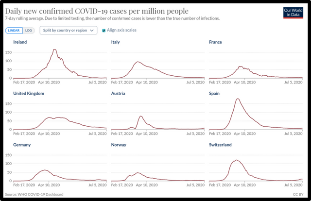
No, it is not. The 7-day-rolling-average curve most certainly does not resemble the classic epi curve of a propagated source. Even taking into account the wide variation that real-world epi curves must display, this graph is not remotely similar to the classic propagated-source curve. If I had to choose, I would identify this as the epi curve of a point-source outbreak with an incubation period of three or four weeks. And this profile is not unique to Ireland. It is shared by many of the epi curves that record the first wave of covid-19, which hit numerous countries across the globe around April-May 2020. Take, for example, the following nine countries in Europe:
If we switch to the new-per-day model, the epi curves begin to resemble that of a classic propagated source with a variable incubation period of a few days, but they are still sufficiently different to distinguish between the two cases. Although they now exhibit a series of peaks and dips, the dips are progressively less and less shallow until the outbreak reaches its peak and begins to wane:
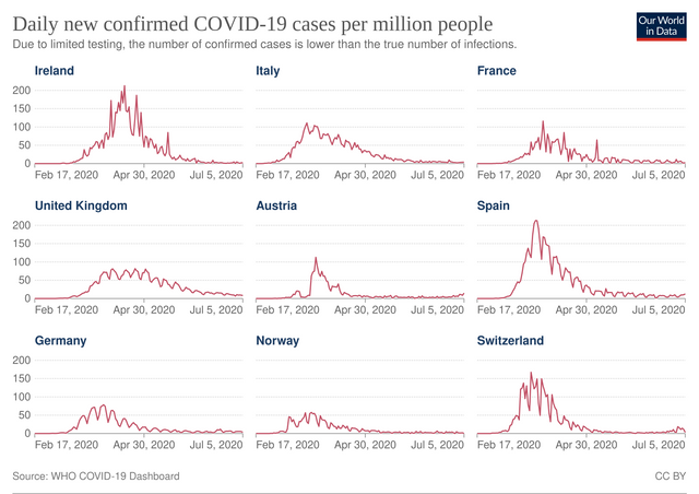
The unimodal (single-peaked) nature of these curves is undeniable. This is not what one would expect to find in the epi curve of a propagated source, which is multimodal. If I had to match them with one of the standard templates, I would choose the continuous-source curve. Compare the Republic’s new-per-day epi curve for the first wave with the CDC’s example of an epi curve of a continuous-common-source outbreak:
The failure of these epi curves to clearly resemble the profile of a propagated source must give us pause. But perhaps it is simply a reflection of the fact that real-world data are messy and imperfect. How many cases of covid-19 were misdiagnosed? We have been told that influenza disappeared almost completely from the World in 2020. This is beyond belief. Clearly, patients presenting at A&E or at their GPs’ surgeries with the flu were all being diagnosed as covid cases. There is also the question of how reliable the PCR tests were. Even if one accepts the science underpinning these tests, one cannot deny that different protocols were used in different jurisdictions and at different times to calibrate the tests.
Models and Reality
It is curious that even though covid-19 was recognized to be a propagated source once it spread beyond Wuhan, many early attempts to predict the course of the pandemic which were published in peer-reviewed journals treated the pandemic as though it were a point-source outbreak, with a bell-shaped epi curve:
The initial epidemic curves of the COVID-19 outbreak from Hubei, China showed a mixed pattern, indicating that early cases were likely from a continuous common source e.g., from several zoonotic events in Wuhan, followed by secondary and tertiary transmission providing a propagated source for the later cases.

The propagated (or progressive source) epidemic curve visualizes the spread of an infectious agent that may be transmitted from human to human starting from with a single index case, that continues to further infect other individuals. This shows up as a series of peaks on the epidemic curve, that starts with the index case, followed by successive waves of the infection set apart with respect to the incubation period of the pathogen. The waves continue to follow each other, until appropriate mitigation measures, prevention, or treatment are implemented, or the pool of the susceptible population becomes infected. This is a theoretic curve, that is generally influenced by lots of other factors.
Several studies investigated the impact of different interventions with respect to minimizing contact rates in the population in order to slow the infection spread, minimize COVID-19 mortality rates and health care utilization, or to suppress the epidemic per se. Flattening the curve by reducing peak incidence may limit overall case fatality rates. Nevertheless, most of the forecasts and simulations thus far started out from Bell-shaped curves, that fail to account for the progressive nature of the current outbreak given the known secondary, tertiary even quaternary transmissibility of the virus. (Kolosvári et al)
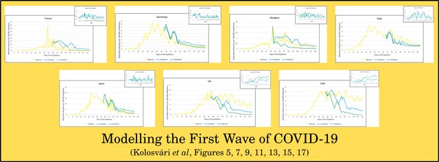
Kolosvári and his colleagues tried to model the course of the pandemic in various countries using Artificial Intelligence. Their predictions, however, are often at odds with the reality on the ground, despite the fact that they correctly modelled the epidemic as a propagated source. In fact, the inferior bell-shaped models they criticize are usually better at saving the appearances.
Kolosvári et al modelled the first wave and the second wave (September-October 2020) in the case of seven countries: France, Germany, Italy, Spain, Hungary, UK, and USA. In each case they attempted to predict the future course of the pandemic, using two different models (Prediction 1 and Prediction 2). At first glance, the results for the first wave are far from convincing:
On the whole there appears to be a disconnect between two strands of the official COVID-19 narrative. On the one hand, the nature of the disease and the nature of its transmission imply that the epidemic was a propagated-source outbreak. On the other hand, the actual data seem to imply that it was some form of common-source outbreak, either a point-source or a continuous source.
Ultimately, though, I think there are simply too many uncertainties built into the data and the epi curves to draw any definite conclusions.
All-Cause Mortality
As we have seen, death curves must shadow the actual rises and falls in the true epi curve. Deaths are reported as they happen. They are not subject to weekly irregularities. If someone dies on Sunday, their corpse is not left lying around until Monday morning. And there can be no question of overcounting or undercounting deaths: a death is a death is a death.
There are still serious uncertainties. In the case of covid-19 there is undeniable evidence of massive over-reporting of deaths due to covid. There have been numerous well-publicized cases where the cause of death was reported as covid-19 simply because the deceased was diagnosed with covid shortly before the time of death, even though covid was not the actual cause of death. Identifying deaths due to a specific disease and distinguishing them from all other deaths is not a trivial task. Nevertheless, by considering all-cause mortality one can at least measure the extent of excess mortality experienced by a jurisdiction over the course of the pandemic.

It was largely for these and similar reasons that the Canadian researcher Denis Rancourt chose all-cause mortality as the best index for accurately assessing the true nature of the covid-19 pandemic. We looked briefly at Rancourt’s conclusions as they applied to Ireland in an earlier article in this series, but in the next article we will be taking another look at Rancourt’s paper and examining his allegations in a wider context.
And that’s a good place to stop.
References
- Brendan Kennelly et al, The COVID-19 Pandemic in Ireland: An Overview of the Health Service and Economic Policy Response, Health Policy and Technology, Volume 9, Issue 4, Pages 419-429, Elsevier, Amsterdam (2020)
- László Róbert Kolozsvári et al, Predicting the Epidemic Curve of the Coronavirus (SARS-CoV-2) Disease (COVID-19) Using Artificial Intelligence: An Application on the First and Second Waves, Informatics in Medicine Unlocked, Volume 25, Article 100691, Elsevier, Amsterdam (2021)
- Kieran Morrissey, Ireland: Study of COVID-19 Deaths, Global Research (2021)
- Denis G Rancourt, All-Cause Mortality during COVID-19: No Plague and a Likely Signature of Mass Homicide by Government Response, Research Gate (2020)
- Yanping Zhang et al, The Epidemiological Characteristics of an Outbreak of 2019 Novel Coronavirus Diseases (COVID-19)—China, 2020, China CDC Weekly, Issue 2, Number 8, Chinese Center for Disease Control and Prevention, Beijing (2020)
Image Credits
- COVID-19 Poster: © 2021 Dublin Region Homeless Executive, Fair Use
- Excess Mortality in Ireland: © 2021 EuroMOMO, Fair Use
- Epi Curve and Death Curve for Covid-19 in the Republic (First Wave): Kennelly et al, Figures 2 & 3, © 2020 Fellowship of Postgraduate Medicine, Creative Commons License
- John Snow: Anonymous Autotype of an Anonymous Presentation Portrait (1856), Public Domain
- Two Epi Curves for the Republic’s First Wave of Covid-19: Our World in Data, WHO COVID-19 Dashboard (source), Creative Commons License
- Initial Epi Curves for COVID-19, © Zhang et al, Fair Use
- Epidemiological Curve for Covid-19 in the Republic: Kennelly et al, © 2020 Fellowship of Postgraduate Medicine, Creative Commons License
- Epi Curves for 9 European Countries (7-Day Rolling Average): Our World in Data, WHO COVID-19 Dashboard (source), Creative Commons License
- Epi Curves for 9 European Countries (New-Per-Day: Our World in Data, WHO COVID-19 Dashboard (source), Creative Commons License
- Epi Curve of a Continuous-Common-Source Outbreak: Centers for Disease Control and Prevention, Public Domain
- Epi Curves for Republic of Ireland: Department of Health, HSE, Ireland, © Government of Ireland, Fair Use
- Wuhan, Hubei Province, China: © Andrew Horne, Creative Commons License
- Denis Rancourt: © Mike Carroccetto (photographer), Ottawa Citizen, Fair Use
Online Resources
- RIP.ie
- Central Statistics Office (CSO)
- Northern Ireland Statistics and Research Agency (NISRA)
- EUROMOMO
- Our World in Data