Seeking advice from GIMP users or people into editing images
The task
The Contest Kings are growing and changing things up a little, the only problem is the guy who used to make our signage @trisquelwhare has gone MIA. We all hope that he is ok and just taking a break from steem for a bit but in the interim, I have offered to try and make some of the headers... To be honest I had been playing around with some images and have been enjoying it. But this project has made me realise just how much I still have to learn.
I honestly didn't realize how much time and work would have to go into each phrase. Originally I was using phonto on my Samsung Galaxy Note 8.
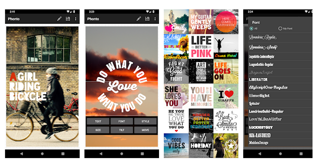
Phonto is great, it's simple to use and has loads of features. It includes 200+ fonts and you can even download custom fonts and edit them within the app.
However, it has its limitations... Originally I thought I could use the app to recreate the headers that @trisquelwhare had made. Plus the new headers needed for the new guild posts.

Photo allows you to add a border, change the colours and even select colours to make a gradient to the image. We felt the ends were slightly too dark, so I tried to tone it down a little...

But with Photno, I couldn't seem to get the nice crisp gold colouring like the original, and as you can see the edges were quite blurry. So I went in search of another editing app. My wife suggested picmonkey before canva, we used picmonkey as it was free and quite user-friendly. However, now picmonkey requires a monthly payment. So I went looking for something new.
GIMP
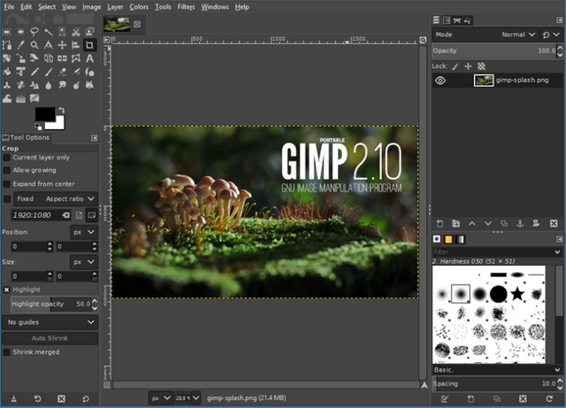
Gimp is a Free program with lots more features, much like Photoshop which is great, but also a lot more complex to try and use. I jumped in hoping that maybe there was a way to make a template with the desired effect and that I could then just edit the text layer for each of the headers... this may still be possible, but I am not sure how to set that up.
I quite enjoy playing around with the images and creating different things. I have been watching videos on youtube and picking up tips and tricks along the way. But I still cannot get the image as nice as it should be.
After a few days of playing around, learning about layers, filters and different effects I managed to come up with this...
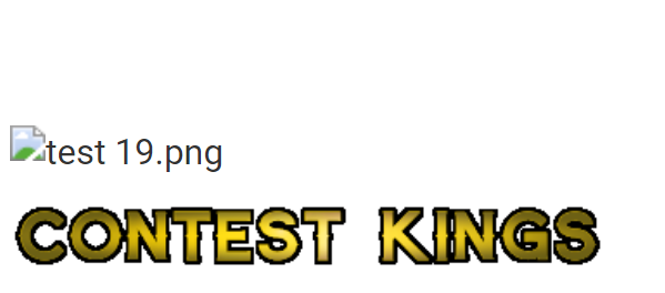
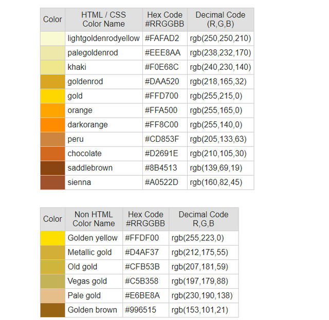
But when placed onto a white background the edges show up really bad. Plus it still lacks the real gold kind of look to it. I had found a Gold Colour code chart and tried sampling different colours in the vignette overlay in an effort to achieve a darker edge plus just using one solid colour just makes it look yellow. After the vingette filter, I added a lense flare to the inner layer to add a shine to the text, but it is still not what I am really wanting to achieve.
The solution...
I'm am still working on this, but it has already taken longer than I had hoped and would like to try and get them finished a.s.a.p. So if anyone has any advice or suggestions I would really appreciate your input.
Mainly the way the edges are looking so blurry?
Is it from growing the selection to add the black border? I tried alpha selecting the black grow selection, inverting the selecting and sharpening the image, and cutting out the inverted selection. but it still looked blurry.
I also tried remaking the image larger, then shrinking it down once I was done... but that didn't seem to work either.
Is gimp even the best program available for what I'm trying to do?
Either way I am enjoying gimp, and will definitely be watching more videos to learn how to use it properly. Quite a few of the videos currently on Youtube are for older versions though, and for this specific task, I have not really found any helpful tutorials.
Are you writing letters from scratch or are you starting from an image?
For golden color, Gimp allows you to use a golden gradient that gives a good effect, but you have to change it from the linear shape to the spherical contour, you can also play with the gradient to see the different configurations.
@darthgexe I'm writing the text in as a text layer at the start... not importing an image.
Should I do it differently?
I really want the edges no so pixelated, I know this is 400%, but at 100% it just seems so blurry
Font size?
The bigger you choose it the less pixelated, try with another font also to see if it is that.