When too much is TOO MUCH!
Whether referring to fashion or decor - there is such a thing as "too much" when it comes to the use of colour.
Kids are the masters of the "too much" syndrome, lol - as they will usually develop a passion for a certain colour, and then absolutely everything worn must be that colour.
Sadly however, this "monotone obsession"... seems to have stuck around through into adulthood for some people.
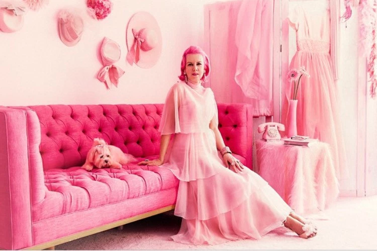
Image Credit: https://www.thesun.co.uk
I am sharing this post to help those have not as yet "crossed over to the dark side" haha!
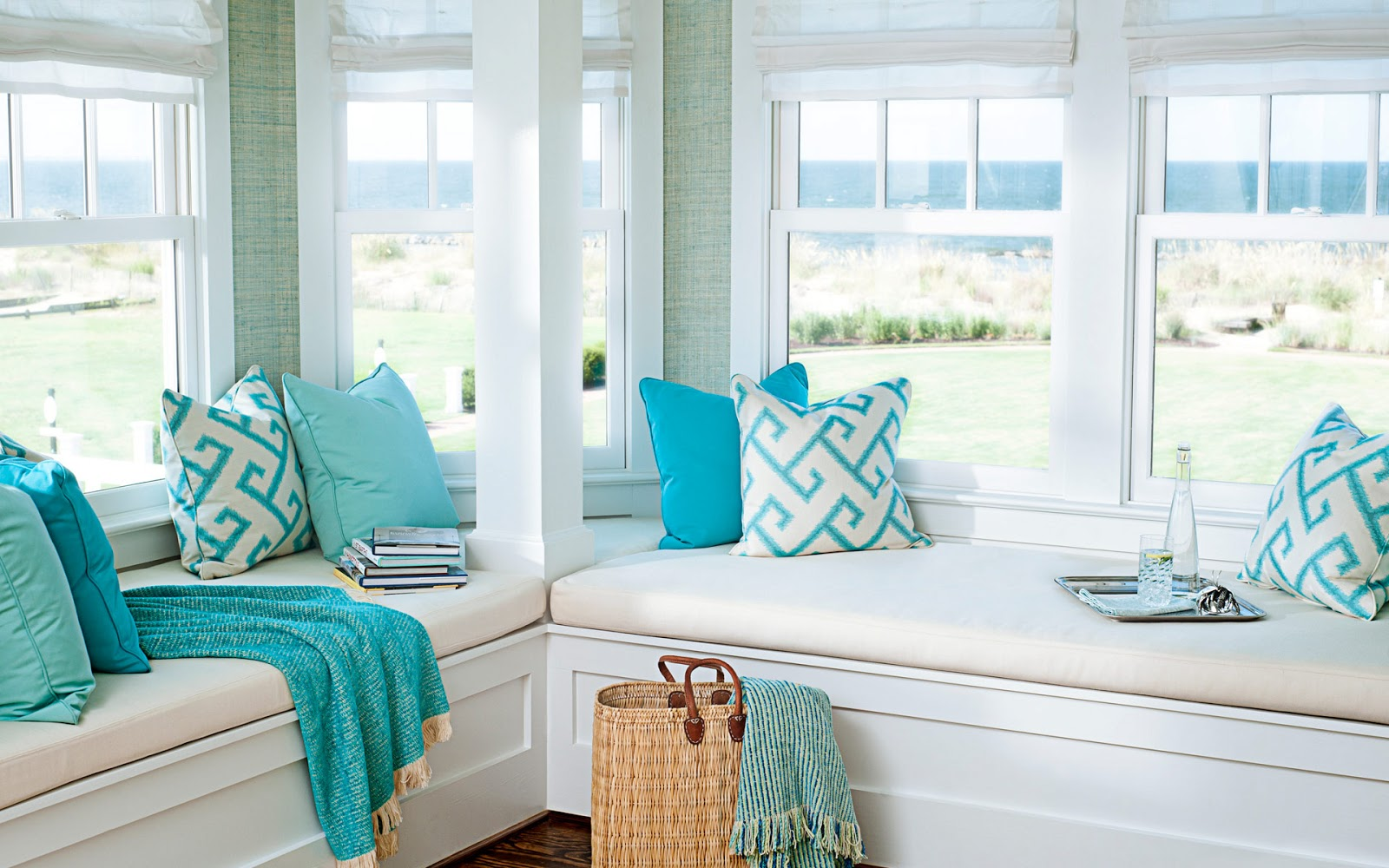
Ok, now... you have seen the above example of what "too much" is... now - below is just the right amount of one colour with the correct balance of another...
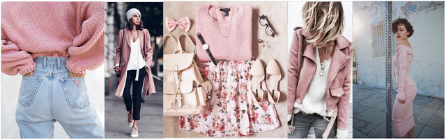
Image credit: http://www.ladyqs.com
Let's do this one more time...
This is too much...
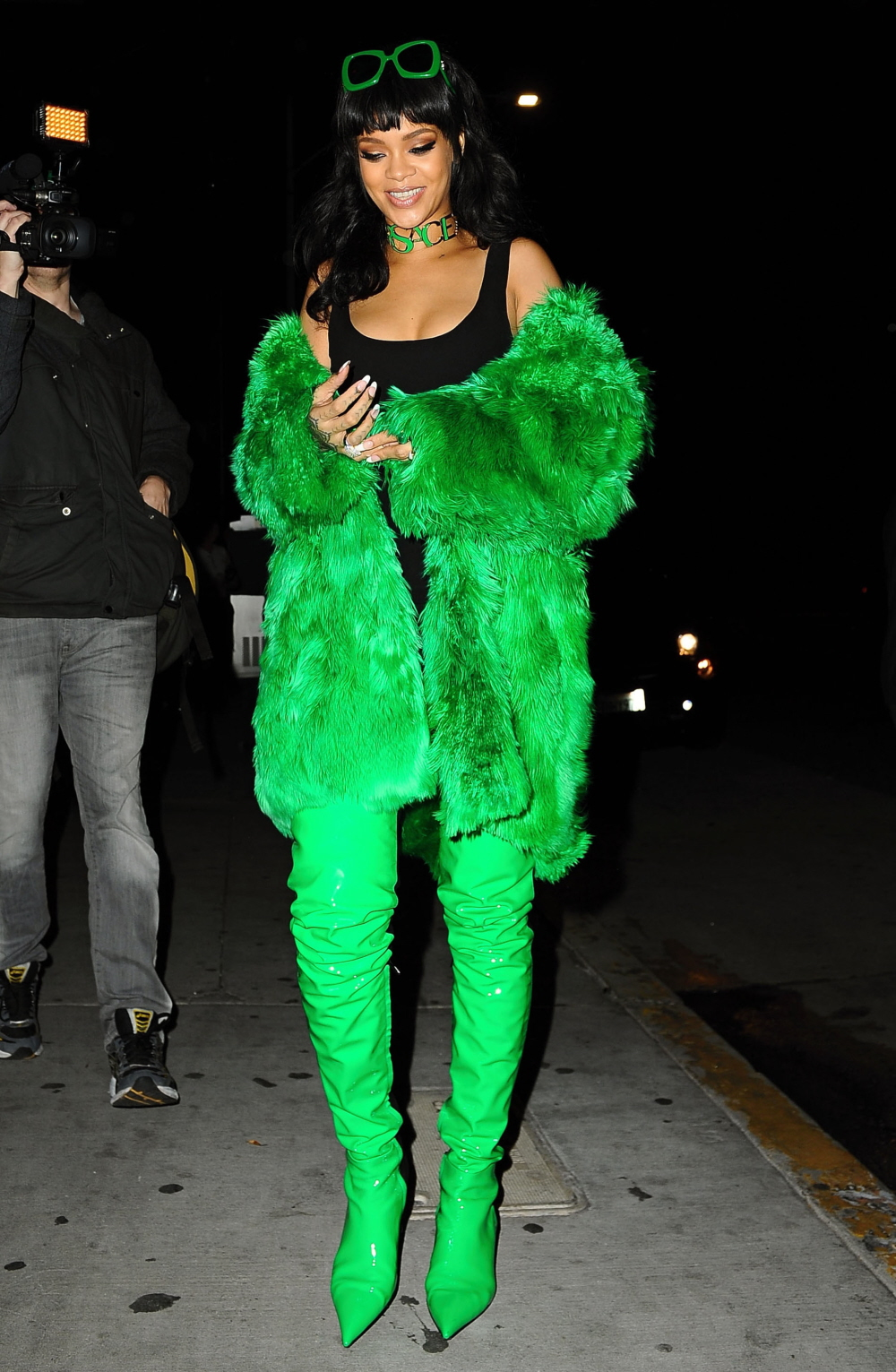
Image Credit: http://www.celebitchy.com
and this is just the right amount...
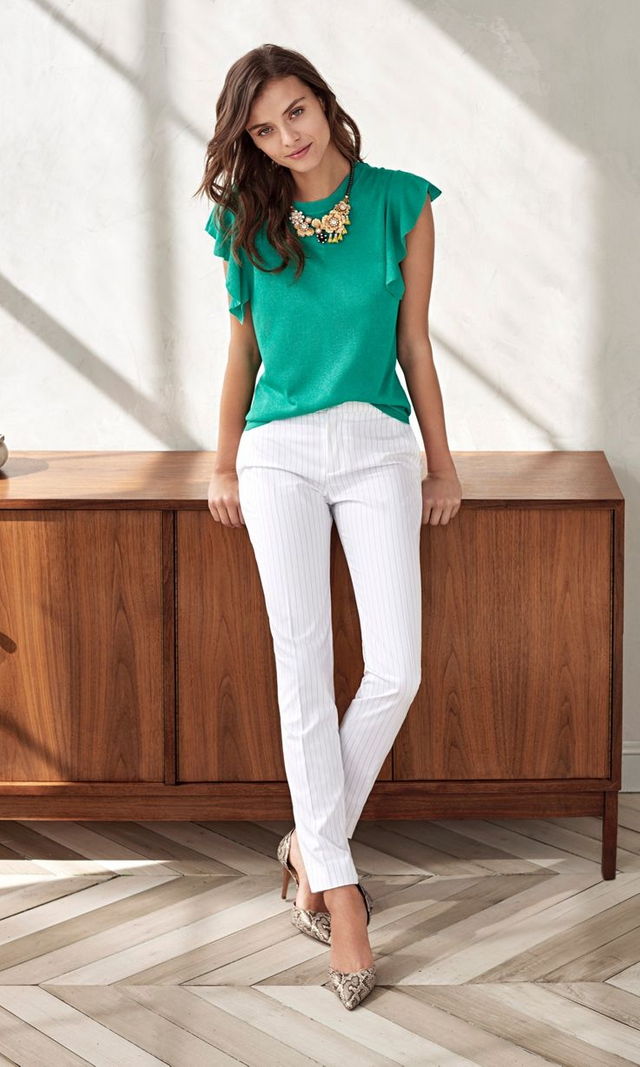
Image Credit: https://s-media-cache-ak0.pinimg.com
THIS PRINCIPLE TRANSLATES INTO DECOR TOO....
This is just complete overkill....
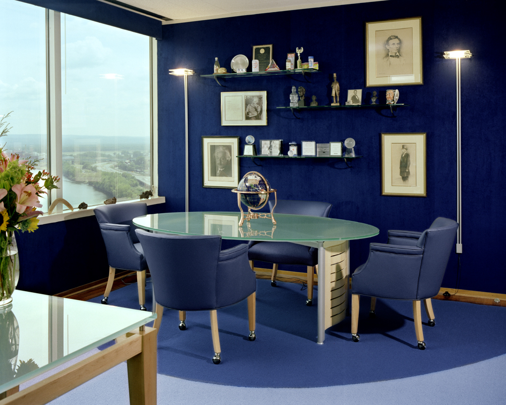
Image Credit: https://s-media-cache-ak0.pinimg.com
and this is well balanced and very easy on the eye...
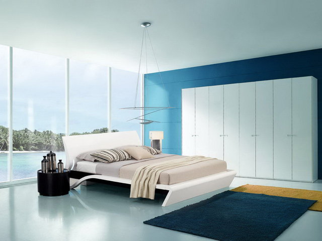
Image Credit: http://fendhome.com
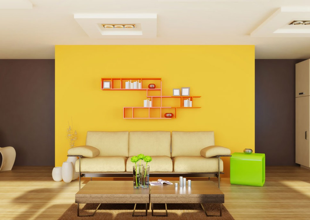
single colour feature walls are an amazingly effective way to bring a strong pop of colour into an area, without having to decorate everything else in the same colour...
because when you do that - you end up with this...
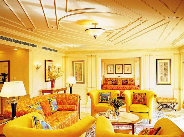
Image Credit: http://houseofflowers.us
I think I officially have a headache now...lol
To my mind - if you want a focal colour in a specific room, it is better to do the foundation of the room in a neutral and then add accents of colour with ornaments, pillows, feature walls etc.
That way - if you are anything like me and bore easily... you can quite quickly and inexpensively give the room a colour revamp when your mood changes... haha
So... now that we are on the same page...
Happy Decorating peeps :)
oh and PS. These are my opinions... you don't HAVE to agree ;)
The right ones are beautiful, the over the top ones...... uhm nooooooo
indeed! lol
Great report @jaynie regards
thank you :)
Nice examples ;hahha :)
thanks ;)
cool beans, thanks :)
I think my closet is turning into a festival of grays. Thanks for the reminder to regularly reassess!
haha pleasure :)
Apparently every colour has the ability to help a mood of some kind.Blue stimulates calming chemicals while red quite the opposite and is often associated to anger for a good reason. So, a room with lots of different colours ...can be emotional hell 😳😀...(upvoted)
hehehe so true - yet, there are many facets to each colour too - like blue can also be depressing and rd can also be very sexually stimulating... I suppose in many ways, each individual has to gauge their emotive response to each. :) thanks for the input xxx :)
Very nice comparisons! I feel like this is something the people in these photos should actually see! 🤣
hahahaha.... especially Rihanna! lol ;) Thanks for the feedback xxx