Bitcoin Weekly Chart Analysis: the world upside down
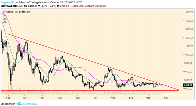
The price of Bitcoin is absolutely motionless. Meanwhile, we have been in the zone of $6,000 - $7,000 for more than 2 months. It has been years since the market was so boring. The stock and bond markets are even a lot more interesting with the volatility of the past few months due to the uncertainties at the international political level, the import duties and the Q3 sales reports. While there is a lot going on all over the world, the price movements of the biggest cryptocurrencies have almost come to a stop. At Bitfinex we have had a 24-hour volume of under $100,000,000 a number of times. This is low. Very low. If Bitcoin were a city then the streets would be empty while a bleak wind blows a newspaper through the air with an article that Bitcoin once reached $20,000: that good old time!
On Coinbase the price is at the apex of the descending triangle, on Bitfinex the price is stagnant. No volume, no movement, just slowly moving forward with ever-decreasing volatility. The 20- and 50-day moving average even came together to emphasize once again that the streets in Cryptoland are really empty!
We've already talked enough about this scenario in recent weeks, but just briefly:
It is normal for volume to dry up at the end of a large pattern because traders become more cautious.
The fact that the descending triangle has not yet broken down is a bullish signal, but since the trend is bearish, the chance of a bull trap remains high.
In my opinion, confidence in the market is too low for the start of a healthy and long-term rally at the moment.
This. is. boring.
While the price of Bitcoin is at a stand still, it is a good time to turn Bitcoin's chart. Just adjust some settings on tradingview and tadaaaa, see the result below!
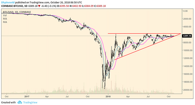
Looking at image 2 the picture looks pretty bullish. The price is in an ascending triangle and currently supports the rising trend line of the ascending triangle as well as the 20-day and 50-day moving average. Based on this graph, I would go long with a stop loss just below the 50-day moving average and the rising trend line of the ascending triangle! Looking at the bigger picture, the December dip seems temporary and the price has recovered well. The Stoch-RSI on the daily chart is a bit on the high side but on the weekly chart the oscillator is more at the bottom and there is plenty of room for an upward swing.
Although the graph looks bullish, it is noticeable that the price has made lower 'highs' lately, the volume dries up and has trouble going through the resistance of $6,000 but a break through the $6,000 would clear the way up .
Ok, back to reality. The fact that the graph from Figure 2 looks pretty bullish says a lot about the current situation. I have been saying it for weeks and i’ll repeat it again: one has to be very careful in a market like this. In the short term, due to the lateral movement, no clear trend is visible, but in the slightly longer term the trend is still bearish. It is of course nice to read as some analyst (or rich investor) with many followers says that we have reached the bottom and it obviously brings in a lot of readers but please do not just fall for it. These kinds of statements have little substance and the chance of a bull trap is, as I said before, very large and is often increased by this kind of 'heroic' statements. I very much hope, for the people who have lost a lot of money lately, that we will soon be in a good bull run again but wishful thinking does not belong in the financial markets. The trend is bearish and this trend is not broken yet. On to another new week!