Original Art Photography Series by @velimir #165 'Thin White Line'
The name of this art photograph is: 'Thin White Line'
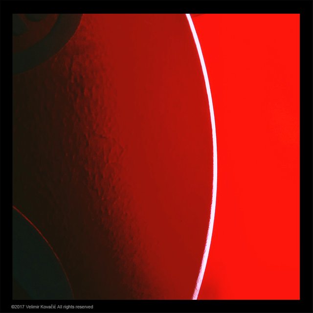
This photograph could be categorized as an abstract constructivism art, but only at first sight. What's specific to this piece is that there are no square elements at all. Squares are the basic element of constructivism, therefore, the adjective 'abstract'. Everything we see, except for the frame - are curved lines.
What does it do for me? I love its aggressive feel, the decisiveness of the right side, while the softness and humbleness of the left one make me understand the idea of completeness. To achieve something, to get somewhere is possible but often not without both of these dimensions.
The straight cut between the two red colours is achieved by the white line. A sharp cut, a very dominant and aggressive one. To the left, we have a gentle transition from light to shade very appropriately juxtaposing the abrupt cut. These two borders define the three dominant parts of this composition - shade, red and very saturated red. The shaded elements in the top and bottom left corners are extremely important. Their size and positioning perfectly balance the white line and make this composition work.
The balance is almost everything in this photo. A little move to any side and this delicate example of how to achieve balance is gone. It is also interesting to notice that the abrupt change of colour, done by the white line is moderately softened by the line's curvature. The white line and the border of shade create an illusion of the middle part being protruded.
Did you notice a very thin red line following the bottom left element? It reminds me of the title "Thin Red Line", an excellent war movie about God. Yes, you read it right. It is an astonishing masterpiece directed by Terrence Malick in 1998. He is one of the most respected film directors in my book. Also, probably the lifetime performance of Jim Caviezel in the main role.
Enjoy!
©2017 Velimir Kovačić All rights reserved.
All images and text published in this post are my original work. I encourage everyone to use own texts, thoughts and images as much as possible. Be yourself and stay yourself. This is a proper way to build steemit.com. I do not have respect for dishonest authors. Also, bloggers actually DO matter!
• For good, inspirational read on various subjects follow: @gavvet
• For crypto news, follow always up-to-date @kingscrown 's blog on the subject.
• I really like to read @vcelier 's life story!
• If you want to laugh away enjoy @meesterboom 's posts full of brisk humour and positive attitude!
• I suggest a visit to @adsactly society's blog if you feel like reading hi-quality posts about many themes daily provided by ADSactly society members!
• Vote @thecryptodrive @reggaemuffin and @adsactly-witness for your witnesses in the Witness Parliament. They are kind people who will represent you well.
I'd like to extend my gratitude to everyone who continuously supports both of my ongoing projects (Motorcycle Travel Series and Art Photography Series). Big thank you for enjoying the content and appreciating my effort. This is what steemit.com is meant to be about.
I am a member of the @buildteam crew, innovative creators of @minnowbooster @steemvoter and @steemsports blockchain projects.

The @adsactly society is a meeting point for free thinking individuals who want to cooperate. It is a welcome addition to Steemit.com community. Feel free to ask about it.
The @adsactly society Discord channel is here: ADSactly You are welcome to join!
Hope you don't mind that I modified your work, but the first thing I thought when I saw this photograph and read about the line work was:
I rounded the corners to fit the lines and it somehow feels right to me like this, I'd love your input. As it is a jpg to conserve space, the corners are simply white to fit the steemit white background.
Edit: Now it's a png with transparency.
hahaha looks funny :) you totally removed the seriousness. quite cool! I like the right side better. sometimes less is more. if only the right side is bent and following the line, I'd like that a lot! :)
Thanks very much for the input! I thought the bends on the left made the frame look sort of like a coca-cola can, but I agree that maybe they don't fit too well overall so here's a version with just the right side, hope you like:
Your art seems magnificent!
You just got yourself a new follower.
I am interested in your posts. The way you display photos and review them impresses me. Frankly, I learn a lot from the photos you show in Steemit.
Almost all of your photographs are always trending for certain tags like "art" and "photography" tags, which means that your posts are really good quality and lots of fans, including me.
Thank you for sharing photography. If you have time, occasionally visit my blog @ jharyadi and give input to my post.
Thanks and best wishes from Bandung, Indonesia.
A great photo velimir! what was the object?
this raises in me the thought that even though things might look dichotomous - good and evil, beauty and ugliness etc. - things are actually on a scale and things can be good and bad in two different aspects of the same thing or in the eyes of two different people, the fact that there is red in both sides, one that looks very clear and decisive and the other that makes you understand it's more of a scale and things can be blended expresses it in a clear way. the red thin line might be a metaphor of the slow processes the world moves though to better understanding of the fact there is a grey area, not only black and white - the postmodern philosophy and postmodern way of living even without the philosophy behind it are the most apparent parts of this change, even though we can see black and white point of view in many parts of the world like in the doctrine of ISIS and such - there is a process that generally moves forward but there are still drawbacks now and thin.
I believe that in the long run, the eclectic, diverse point of view will win!
thanks for the interesting and thought provoking photo and article.
Please come to adsactly discord server. :)
Velimir, hands down, one of the most creative people I know. An artwork with no square elements, who would have thought. It surely does have an aggressive feel :)
Drama through simplicity. Excellent! Reminds me of a fast car or sexy woman in a red dress. A juicy cherry or red lipstick. Like you said the balance and curvature of the white line play a important role in this piece.
Ah loooool just answered a comment a second ago about Coca-Cola and a woman lmao!!!!
I like it, Red and White, Red and black are always great combos. BUT, this makes me want to drink Coca-cola for some reason?
Here is something along the same lines, from a noob.
I totally agree with you. these guys completely soiled this colour combination. A few days back I saw a woman dressed in black and red, with red lips and black hair. My first thought was... Coca-Cola. This is how unconscious conditioning works... one should be aware.
Hi @velimir My friend I'm Back ;)
Let me put this photograph in my own way. The major portion of the picture is Red which seems quite similar to SUN. Lets assume person who is looking at this photograph is blind from one eye thats why he is considering it Sun's zoomed pic :P According to his views Sun is bleeding as Moon strikes with it so moon summed into Sun in a very brutal way. So that white light is basically Moon of the Earth :P
By the way i really did know about abstract constructivism art before. Thanks for this amazing art and for teaching me this new terminology.
Stay Blessed, Have a nice weekend :)))
The original art style is called constructivism, I added "abstract" because there are no squares which are a "must have" for constructivism. My little joke :)
Your sense of humor sometime surpasses mine :P @velimir
Such abstract photos contribute to the flight of fantasy and thoughts while you look at it. The bright red color from the parade side looks decidedly aggressive, but gradually fades to the left. You correctly pointed to the balance, I did not notice it immediately.
Of course, I will repeat, but each person is individual, that's why beautiful pictures are perfect - everyone can tell something about himself, especially what he sees only.
"A thin red line" - I need to look at this film, thank you for the advice.
@velimir ! I mean what a mind and deep thoughts. At first glance on the art , to be very honest my inner self said, "what is special in it that he have got so much good comments and appreciation" But when I started to read the gems words, I realized that Oh why artist are so elegant, they are different from us . I mean by "us" Engineers and other fields.
Now 😆 being illiterate at art , I saw much things in the " THIN WHITE LINE". something negative and most of the positive aspects in the art.
#thanks @velimir ..
hahaha thank you, buddy. All of us are needed for this beautiful world to function properly, engineers, artists, teachers, fishermen, you name it, even politicians... :D The key is human virtue, not what we do for living :)
You are very good at choosing words @velimir .. but you have thought that I really agree with. Yeah I am trying to be as optimistic as you are , as one of my teacher is. #thank you again Brother.. Don't mind if I call you brother.
And yeah I forgot. You have got another follower Filmmaker :) . I would rather say " Author".