Riverside - Original oil study on paper

I've been painting small quick oil painting to get better at replicating color and light. I went down to the river bank in my local park to paint this scene on toned paper primed with acrylic emulsion. Getting the right color relationships was difficult in this one. The light conditions were changing and the high contrast scene set up made it even more challenging.
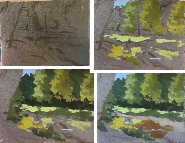
I was trying really hard to keep the contrast between the sunlit areas and the shadowy ones. And in some ways I think some of the intermediate stages hold more interest.
What do you think?
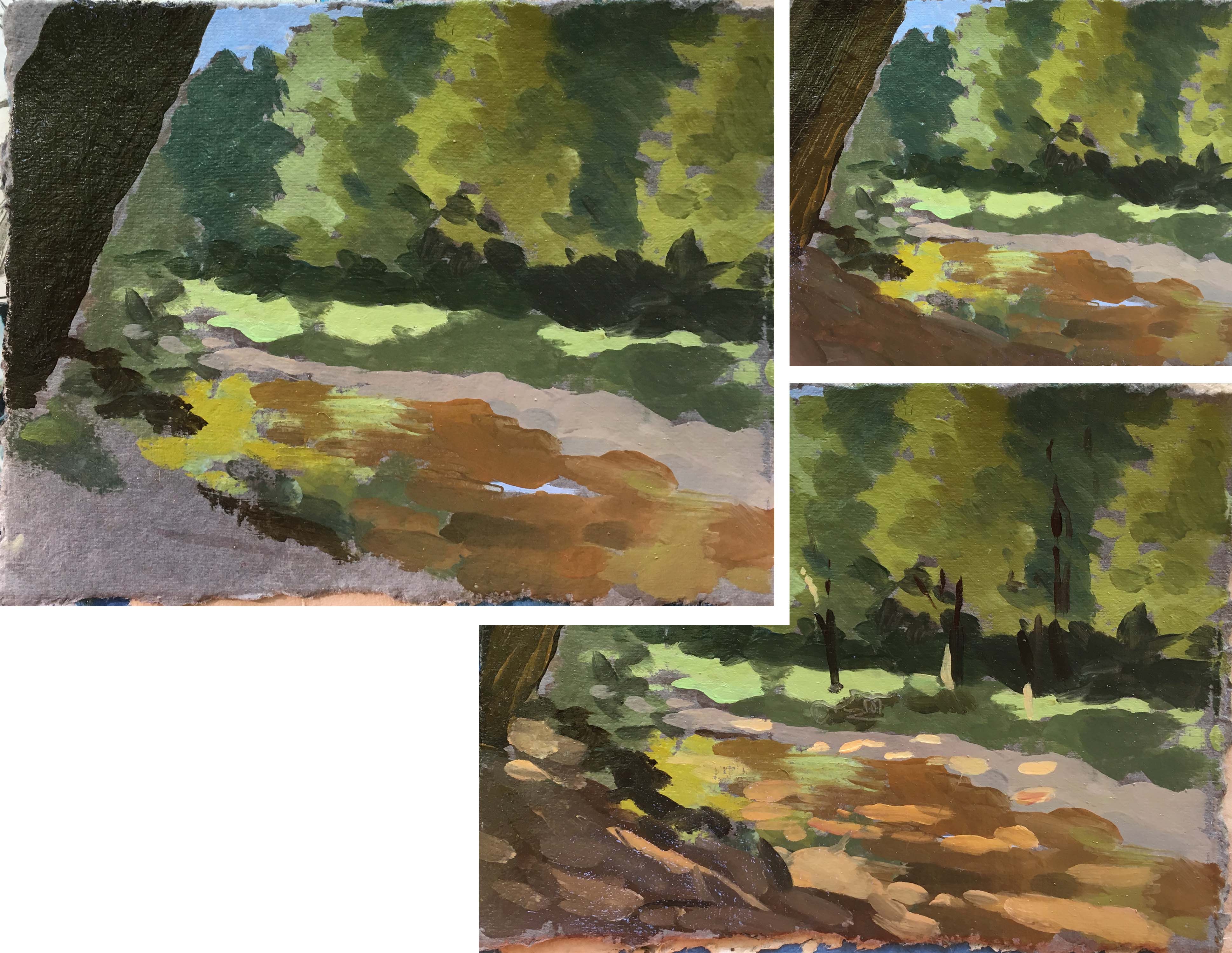
Sorry, I'm extremely distracted by this... is this your signature? It's right smack dab in the middle and I can't seem to pull away from it.
Otherwise, I think the colors are nice. And I always enjoy seeing progress photos. But there is something to be said to create interest. I don't love to see an image of the location you were painting as it would be easier to critique. Since you said you were trying to capture the correct colors.
Thanks. It is actually some sgraffito with the end of the brush. was going to imply some texture with it but ended up forgetting about it. (just noticed as you pointed out) there is more of it in water. I'll get a picture in the next ones.
Funny, cause the first portion looks like the copyright symbol and the rest looks like it could resemble your UN Siloe! Haha That's why I thought it might be your signature! I was like, dude, there's a reason why we sign in a corner. Haha. In any case, definitely wouldn't be distracting if it were all over. I did notice the texture in the other places, but that one just looked "wood like". Bahaha.
Can't wait to see some more of your work. Oil is not something I ever messed with.
It does have a "script" feels to it. And I never really sign things... :-) Anyhow, try oils. They are a beast to be controlled, but they bring lots of rewards (that sounded like a ill translated chinese fortune)
Haha, that made me laugh.
I dunno, the only beast I really like to attempt to control is watercolor. Otherwise, I like colored pencil best for color. I also really enjoy just drawing straight in pen.
I am not a huge fan of "messy" mediums. I constantly was cursing at charcoal and pastel when I had to use them for college...
I suppose we all can agree pen is king. I share your disdain of charcoal and pastel messiness, but only because they smudge forever. I love messiness as long it gets set once set. I respect watercolor but I just love being able to add light values back into a drawing :-)
That's when multimedia comes into play! I love to use colored pencil (especially the soft delicious prismacolor pencils!) on top of watercolor. Then you can add white or whatever lighter value on top. Also, the best is to add some white gel pen, that works real well too.
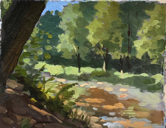
Looks pretty good. That shady area by the tree works great.
Thanks!