My Logo Design Entry No. 5 - ICON DIGITAL NETWORK
Time is dwindling!!!
Only one day left to enter the @truthproductions ICON DIGITAL NETWORK logo contest!
There have some very valuable entries already,
exhibiting some amazing talent here on Steemit!
I have been excited about making a few creations myself.
See my 1st, 2nd, 3rd, and 4th logos,
and my call for collaboration on this creative opportunity.
Here's my 5th logo entry:
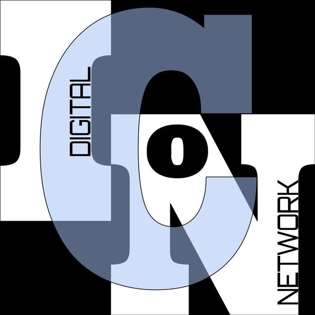
Really like this a lot. Feels its by far the most artistic of them all. However I think we need something more clean, direct and powerful not so artistically fantastic.
Great job though! Will be cool for the archives of history one day!
I like this one the best of all mine too. Was super fun to get my creative juices flowing again and potentially contribute to something really fantastic. Thanks for the comment @quinneaker. I appreciate your keen eye.
they will not use this i think... because its a little bit "hard" to read or to see what it is!
But i like this a lot... great work.
i didnt know about this contest and now its finish :/ ... next time!
GOOD LUCK WITH YOUR WORKS!
cheers,
-edga NOWARGraffitis
I hadn't really intended to have the twirly letters be legible. It just so happens that they make a cool pattern co thought it worthwhile playing with as a design element.
I appreciate your comments and the wishes. Thanks for stopping by my blog.
Beautiful outlook...
Thanks @asaha.
You're welcomed
This comment was made from https://ulogs.org