Steemit Exclusive : A Graphic Design Class! Lesson 3 - Packaging
Greetings steemians!
Thank you for the support in previous lessons!
In case, you didn't check previous lessons, I recommend checking them out!
Now let's get on to it, today we will be talking about a graphic design medium very familiar to all of you!
Lesson #3
PACKAGING
Yes that's right! Whenever you go shopping, hundreds or thousands of products are smiling at you from the shelves. You may have already found yourself deciding between two products, having some trouble with chosing the better one, and then just taking the prettier looking one. And there you go, that's what today's lesson is about.
The goal of packaging design is to sell a product. So how should the ideal packaging look?
a) Shouldn't make you think.
b) Should be good looking.
c) Minimal and eyecatching.
You don't want to make packaging look mysterious. You can make a book cover look mysterious, but not packaging. If you make people think too much with your packaging, you will lose their attention.
Let's take a look on how a good packaging should look!
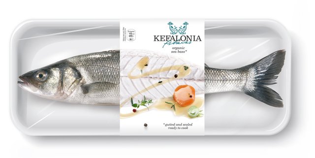
This is a perfect example of how a packaging should look.
It is showing the people what the product may become, if they take it home with them.
Minimal, eyecatching, very good looking, and doesn't make people think too much.
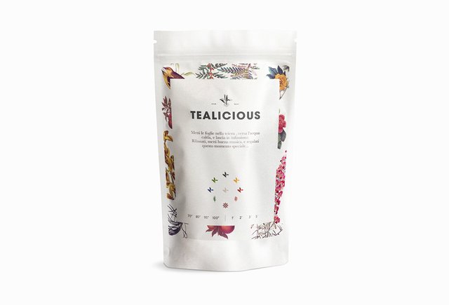
This one is a little different. Instead of showing you the real product, it aims to evoke the senses, whether it is by a nice combination of colours, nice minimalistic design, or the birds and fruits used on the packaging. It also makes people think that this must be a really good tea.
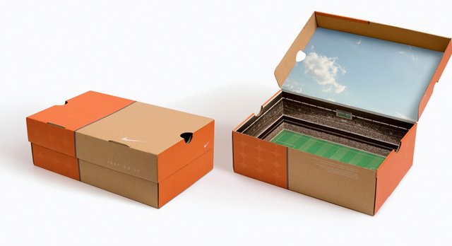
I was showing you the Nike logo in previous class, but now let's take a look on one of their genius packaging design.
A limited number of Nike shoeboxes were transformed to look like a stadium inside, with a printed sheet of paper looking like a stadium interior. They also had embedded sound chips,
so you could hear the crowd go wild when the box was opened!
The result was that football-crazy kids spreaded the word, and sales increased massively.
In our next example, I'd like to show you how easy it to actually come up with an idea for packaging design.
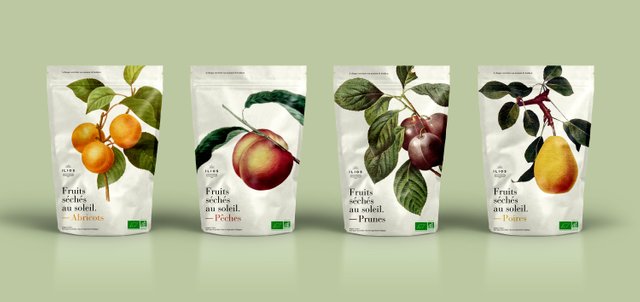
Looks pretty, doesn't it?
Minimalistic, aesthetically pleasing, and doesn't make you think much.
The images used here are actually in the public domain, because they're old.
That means they're usually very cheap or even free.
Go to google and search images for "vintage fruit". This is what will come up.
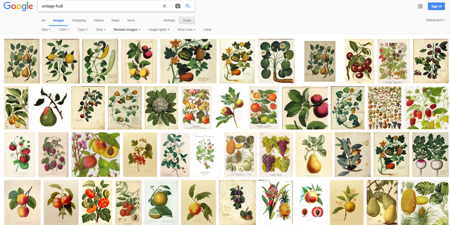
Easy right? Half of your work done.
It's not always as complicated as it looks.
So remember.
Shouldn't make you think. Should be good looking. Minimal and eyecatching.
And that's it for today's lesson!
Next time we will look at book covers!
Thank you all for support,
upvote, comment and resteem if you want, and see you next time!
Cool post and really helpful for the youngsters @deus !!
Thanks alot @eugenciachir !
Great to hear that!:)
Congratulations @deus! You have completed some achievement on Steemit and have been rewarded with new badge(s) :
Click on any badge to view your own Board of Honnor on SteemitBoard.
For more information about SteemitBoard, click here
If you no longer want to receive notifications, reply to this comment with the word
STOPIf you want to support the SteemitBoard project, your upvote for this notification is welcome!
@patelincho new lesson out, if you're interested :)
Nice iniatitive.... Keep it up... Is there any way we could see the breakdown of the works.???
Hi! Have you heard about @krwhale? It is similiar with @randowhale. For your information please click on.