Arsenic Lullaby- Commissions past and future?
I've got a full boat for you for the weekends post! a blog AND after that, a buncha pics of cool commissions I've done. This should keep you busy for awhile.
ahem...
Lettering and inking/commission request advice!
I myself don't take commissions very often. I am usually busy working on a book, or getting ready for a comic-con. Once or twice a year I am available for commissions..usually this time of year. AND as luck would have it I am open for commissions for the next month or so! You can contact me here or send an email to douglaspasz--@ --gmail.com and we can figure out the details.
Getting a commission from one of your favorite illustrators (although it pains me to type that in such a way as to imply you might have another favorite besides me) is a pretty great thing. But, it does cost a few bucks and could go sideways if you request the wrong type of thing from the wrong type illustrator for that type of thing....That might have been confusing...
What I mean to say is- Here's a tip to make sure you you get a commission you are happy to show off and is worth your hard earned currency.
Consider what about this particular illustrator makes him a favorite, what is he good at? What does he excel at? Requesting that a guy who draws big tits all day to draw you a picture of your car is probably not going to turn out as good as you envision.
Take me for example- there are probably a thousand guys out there with a more interesting style when you break it right down. I make by bones with detailed backgrounds, unusual camera angles and of course punch lines, and expressions. I've (for reasons that only the zeitgeist knows) five times had to steer people away from having me redoing the cover of The Hulk no.1. This is a great cover but has nothing that I can really bite into. It's a simple camera angle, not much in the way of back grounds and mostly the composition revolves around a large central figure. If I where Leinel Yu or Todd Mcfarlane this would be a perfect cover to do...there would be bulging sinewy muscles and nigh bursting veins, all nicely done. But for a guy with a very simple cartoonish style this cover would turn out dull and sub par. I could do it, take the money and deliver my take onHulk no.1 but it wouldn't be worth what I would charge and that's bad business and worse...bad for the ego.
I got a commission recently that really hit the nail on the head.
The gentleman wanted the cover of spider man no.129 (first appearance of the Punisher)
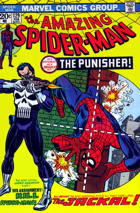
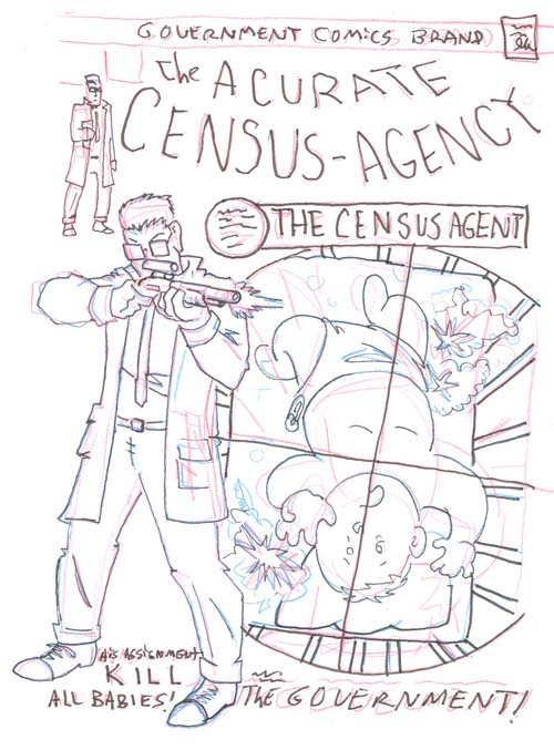
He wanted it redone with Edgar Breyers from Arsenic Lullaby in place of the Punisher. This was a brilliant request. It's a landmark cover so people will recognize it as a parody right off, AND it compliments my style. A lot of words to change around for the sake of a laugh, interesting camera shot, and even though it has a large central figure, there is a lot of detail to exploit, most notably the rifle. Via e-mail we both scoffed that the rifle in the original was made up and resembled no actual rifle we know of. So right there I have a way to add an inside joke at the expense of the original cover. I gave the rifle some thought. Something modern? ...a shotgun would be funny since his target would obviously be a baby...nah...Seeing as how Edgar is deep deep in the covert field of the government- Lee Harvey Oswald's rifle would be perfect. done and done. a quick thumbnail sketch letting the patron know what I had in mind and off i go..
Onto the problems...or "challenges" as more optimistic people call it.
The lettering was a BITCH. Regular modern lettering is fairly easy to mimic with new words but this was done back in the day...old school. Here's the thing about lettering back in the day...it was every bit as boring as it is nowbut they HAD todo it by hand. SO often to make it interesting to draw they pulled out a few tricks. this logo is curved, and has a vanishing point (like the words atthe beginning of star wars) either element is tough...both are what I refer to as "something I should have noticed when Igave the price". I did a quick mock up of my own curved version that i was all set to slip onto the light table when i realized...this logo does not only curve down, and has a vanishing point it is ALSO slightly larger at the front than and the end...it curves down and expands left to right, and expands top to bottom. AND the top curve is different than the top curve. this was done old school and will have to be redone old school...WITH OLD SCHOOL TOOLS.
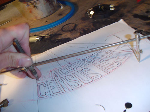
This allowed my do break out some of my more archane drafting supplies. FIRST my bendable straight edge.
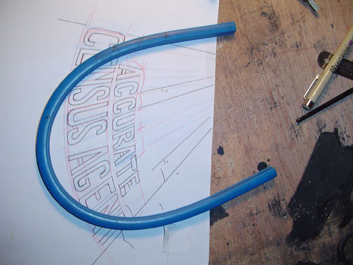
This thing is pretty cool, it's plastic with some kind of pipe cleaner metal insert, you bend it to the curve you want and it holds that shape. The only problem- after you've used it for ten years there are so many kinks and curves in it that you really have to flatten the bastard out before it will make a true curve again. that and you can't ink with it, if you try to run your pen or brush along it the ink just bleeds under it and/or smears.
The second problem is this bastard has a lot of circles.
You all know what this is, it draws circles.
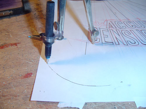
But what about inking circles? USUALLY this isn't an issue. i just partially disassemble my technical pen, and attach it to the compass with an adaptor and off I go.
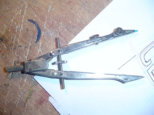
HOWEVER some of these circles are too big and too small. this brings us to this horrible object.
It was devised by a think tank of nazi scientists, witch hunting puritans, and the guy who invented the iron maiden. It is a tool of such exquisite torture that the most hardened prisoner would gladly confess before being forced to use it to ink a circle.
The tip is basically an adjustable dip pen. You have to fill the tip with an eyedropper and then adjust the thickness with a tiny wing nut. Then...you have ONE and only ONE chance. The split second the tip hits the paper you have to draw that circle in a quick smooth motion. If you stop or slow down the tip digs into the paper and ink bleeds leaving a bulge that can never be undone. Even opening the tip width to draw the whole circle the size of the budge can't save you because as soon as you spin it and the tip hits that grove it will skip and spray. ONE chance is all you get.
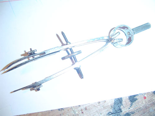
The big circles are even more horrid. You use a similar tip after assembling this hellish contraption. It was designed in Salem during the witch trials, they gave it to you and if you could actually draw a circle with it they knew you must have used blackmagic and they stoned you to death...which is more fun than using this to draw a circle.
Re-lettering old school logos leaves you choosing between the lesser of too evils. Do it with a technical pen and have it look like you used a pen(which I think takes away from the piece..you want people seeing the image not noticing how you did it) OR use a brush...giving the lines more consistency and a very "arsenic Lullaby" style and look...and getting arthritis. I chose the later, as I usually do because I like the old school look.
On the upside, after all that, drawing Lee Harvey Oswald's rifle with historic accuracy seems like a walk in the park.
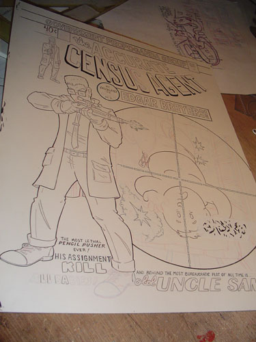
I'd post the finished thing, but I can't find the scan anywhere, but you get the idea. Precise details, old school look, that's my strong suit. Other guys have other strong suits...finding something that compliments the style of the Illustrator and their knowledge and skill set will usually give you more bang for your buck than you expected.
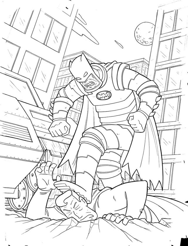
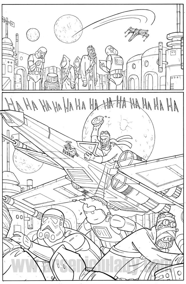
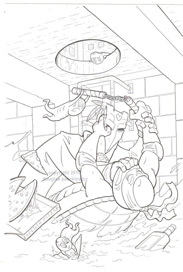
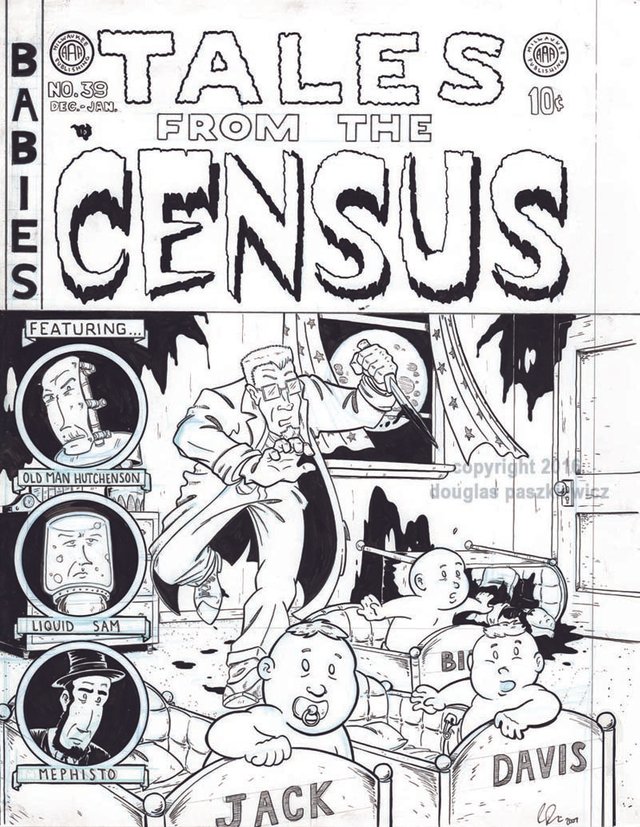
Since I don't have the finished scan of this bad boy, here's some other past commissions.
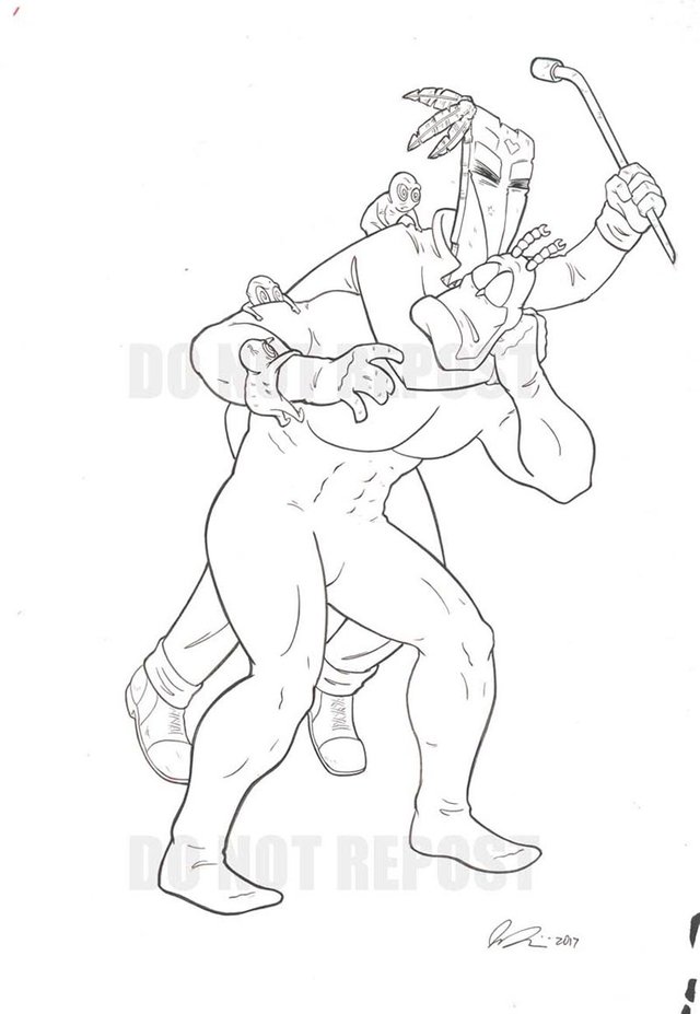
First a Batman vs Superman (batman winning of course)
Then this mash up of Star Wars and The Joker from Batman the Animated series (that X-wing was less fun to draw than it looks)
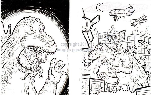
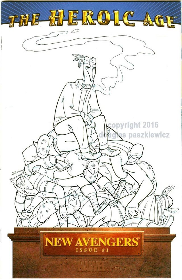
Have gotten a few requests over time for Arsenic Lullaby's main villain ( or hero) VooDoo Joe beating up on some other publishers character (which I am always happy to do)
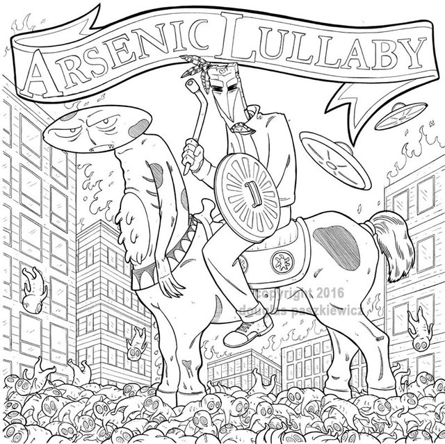
Even got this request for a parody! of a Album Cover with A.L. characters in place of the original figures!
...as long as I started this post with a commission on Edgar, I'll end it with a cover parody featuring him that i DO have the scan for.
That's all for now...contact me if you'd like a commission ( I accept SBD of course) and if not, I hope you got a kick out of these and maybe got a good tip on requesting a commission from ( choking back tears) someone else.
everything that you make and post here make my day every time they pop in to my feed, just letting you know <3
gorgeous post, doug ! i loves it (as usual) <3
That is good to hear! I like to think I'm doing some good ;)
On the bright side, if you ever want to have a miniature curling tournament, you have your measuring stick already.
it may come to that when I finally lose my mind
Honestly sir, just the number of drafting tools present in this post essentially make it a modern mini master class on illustrating. Brilliant work sir!
Thanks! I really got to get around to doing more how-to vids on youtube and places like that
Hi arseniclullaby,
Visit curiesteem.com or join the Curie Discord community to learn more.
Awesome, thanks a lot!
This is so amazing
well, thank you! stop by again for more.
Wow amazing! I like it a lot, what a good job, in fact, since I want to see more, I'll be watching your publication! regards.
Awesome! Thanks, I'll try to keep it up!
Just saw your FB post, glad to see it is you on here. Welcome aboard!
Thanks! wait .....you couldn't have told me about this place a year ago?
It's a tougher sell than you would think
anyways...we're both on here now!
damn dude love your style!
Hey, Thanks! I'll be entering that contest of yours this week!
Awesome! Looking forward to it!