Teardrop Media Token Logo Entry
I decided to make a teardrops logo just to see if I have a skill for it.
Contents of the Post:
Short Background
The Logo Making Process
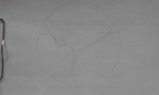
Preview of the next logo (yeah I made two but I have yet to finish the other one)
Footer
Short Background:
Teardrops is an initiative promoted by @surpassinggoogle
There is a lot of humanitarian activities with this initiative. You can find more about it here.
It's a lot of read over but there's no fluff. This is an initiative for the common good.
Please support @surpassinggoogle and @steemgigs as witnesses.
Visit this link and type in their names on the first search box.
Step 3: The Logo

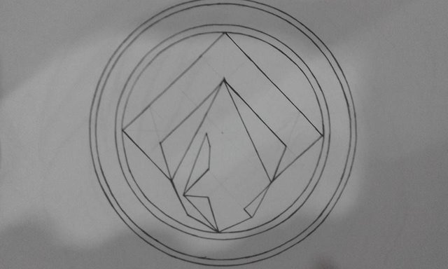
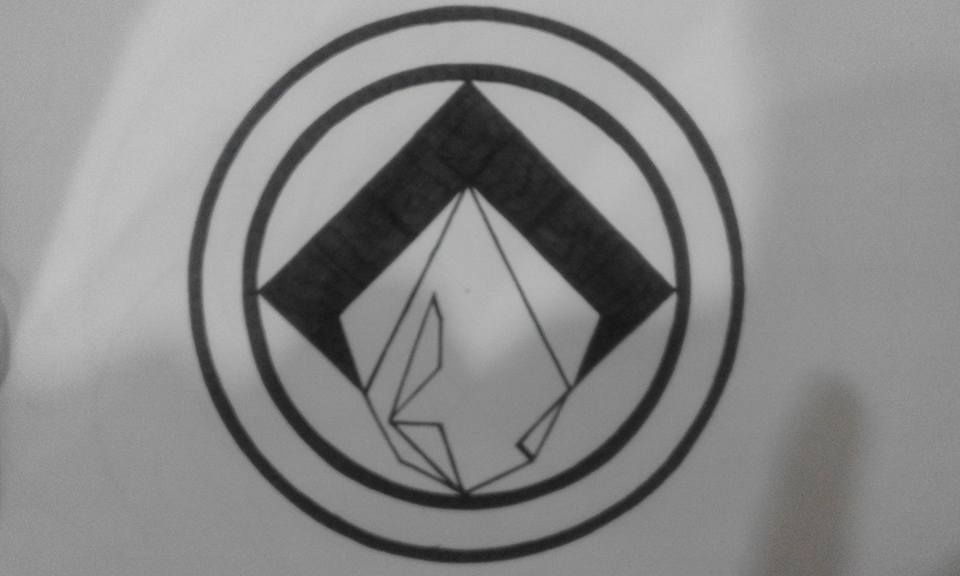
The Process:
Step 1: Pencil and Ink the layout
Step 2: Color
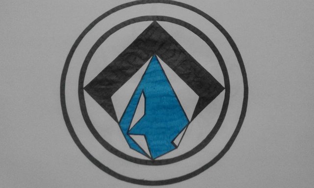
Step 3: Final Work
I used black gel pen and a bond paper. I colored it through photoshop to darken some lines and access to other colors.
Instead of yellow, I chose a darker shade of the color so it won't hurt the eyes
I'm no expert at creating logos. You can see it from my outputs. However, I often see people making logos with too much detail. A logo should be simple to remember and makes an impression that lasts to an observer. Too many details just confuses the eyes and can distort the message. I don't think I did a good output with this one.
I used too much black and instead of repairing it, I decided to create another teardrops logo. Here's a preview of it:
.jpg)
For Steem Writers wanting to connect with other writers, check out Isle of Write
For Steem Artists wanting to connect with other artists, check out Steemartists
Get your content more noticeable and connect with like minded steemians :)
Wow nice art post.....i like your post..... thanks for sharing......
The logo is nice
My dear you did well with that awesome pics.... You will go higher. Keep it up
You have the skill. I always prefer simple and clean designs, like yours.
@adamada you are a real art designer.nice art work.but theres a little mistake the eye is really cool but there was no drop of tears.your target or topic speaking for is on teardrops,so it has to take that sign to prof tgat real something is drop. God bless you for the art work. Just want to thank our boss @surpassinggoogle for his good work on this community
Thank you for your input @tpassion .I believe you're right about the tear preferably dropping instead of being confined in the eye. I was focused on creating an image of a coin that shows a tear. Your compliments are encouraging as well. @surpassinggoogle is indeed generous to this community.