Partial Network Analysis: the interaction of the Top 10 users from the last few hours
We are on a social network, which means we interact with others. Based on that fact I decide to represent the relation between the users.
To realise this work, I created a Python code to scrap steemwhales.com and steemd.com.
I gathered the name of the 10 firsts on the Top list of SteemWhales, then I collected all the upvoted by and upvoted for on Steemd.
Therefore I managed to collect 660 usernames and 982 relations.
Then, thanks to this data, I used Gephi in order to create the network.
Here is the results of my work:
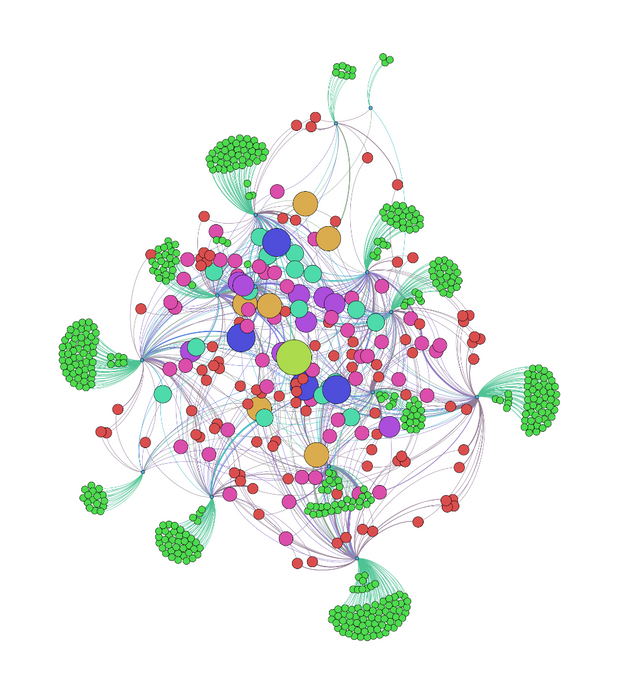
Few people trust the charts
The first observation we can make is that when a dot is big, he has more incoming upvote. One is trusting the charts in the middle in green/yellow, but at least 4 are "right" behind in dark purple.
We have to keep in mind that the size of the bubble is only related to the number of incoming votes, and not the power of those votes. It means that some people may have more upvote, but will maybe have a lower income.
A lot of people don't interact with each others
We can see a lot of clustering. Every little dot in green represent the fact that the user was upvoted only once, and they didn't vote for anyone. Indeed, 68.48% of my sampling just got 1 upvote and didn't give anything.
However, the average number of upvote received is 1.48, which means the gap between the green dots and the others is huge.
But those who interact benefit from a dense network
As you can see, the number of relation in the center of the graph a very dense. Almost all of the dot that are not green are connected to each others. This means those members are quite active and received and gave upvotes a lot.
Only a few upvote a lot
A lot of those single green dot are related to a single upvoter. Which means that most of the votes on this graph come from just a few. Upvotes bot or fanatic upvoter? You tell me.
They act like gatekeepers, they are the only connection between the greens tiny dots and the rest of the ecosystem.
Most of the people only upvote on do not receive upvote (AKA they do not post)
As you can see, the upvoters I was just talking about are little. This means that they only upvote people, and don't receive upvotes. Or maybe they didn't post anything, so nobody can upvote them.
The same graph with the names
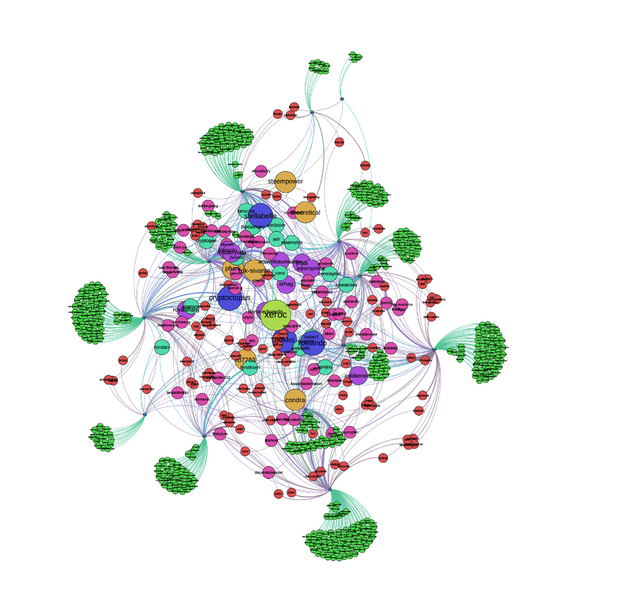
And the winner is ... @xeroc ! Congrats.
@cryptoctopus, @stellabelle & @roellandp are just behind you, be careful!
I would like a recut version of this after today to see if I can move up the rankings somehow. 1000 comments should move the needle!
Great visualization that is validated from my experience so far in just up voting vs contributing. Key takeaway for me is to add value to the discussion by commenting vs merely up voting!
Nice work here @clement !
Thank you!
I should take in consideration what you said, and add the number of comments by a user!
I've noticed that some of the highest paying posts have hundreds of comments of mostly multiple back and forth discussions vs just a one liner--'thanks for the post reply'. I don't have the data to back it up, just casual observations. I believe the community is more valuable with increased collaboration.
Keep up the good work. We need good analysis like this to track how this experiment unfolds.
I will try, it took a lot of time to get that so I hope a lot of people will want more!
Fascinating. Do you think you could render this as an SVG? Or even better using a dynamic graph rendered using D3.js for example?
I can render this as an SVG! And I was thinking about making it dynamic on a website, but I need to learn how first.
A very nice exercise in applied graphs, congratulations.
Was the result expected?
Could this be done as something semi-dynamic? Or on a daily basis? Not that I am pressuring into makins something :) Just asking...
I am looking into it to make something dynamic but my coding capabilities are limited.
I didn't expected to see so much single green dots, especially because they was upvoted by whales and they should have more visibility.
That's a really cool graph!
Thanks :)
That graph reminds me of some complex alien life form from SporeTM
These are super useful visualizations of the social interactions on the network. Thanks @clement! I wonder where a small fish like me is residing. Probably in a sea of green.
I was supposed to add all the interaction and all the people of Steemit, but the website crashed when I scrapped it, too much calls I guess.
I will try to focus on the green sea next time, to show the interaction without the whales :)
Holy shit! Never expected, but it seems like my name is in this graphic. Just thought I might take a look, and it really was there. I feel a lot better now. :D Can you please confirm it?
Yes you are in there!
Nice! Thanks for checking. :D
Hey @clement . This is interesting but somewhat over my head. I see my name in a medium sized yellow bubble. Does this mean I Upvote too much and engage too little? Please if you have time could you expand on your findings.
Thanks for this fascinating insight!
It means that you have been wildly upvoted by the sample in comparison of the others in the sample.
Your own votes only influence the others size, not yours. So congrats :)
Oh that's really great to hear. Thanks for all your hard work. Upvoted and followed.