Why F1's new logo works
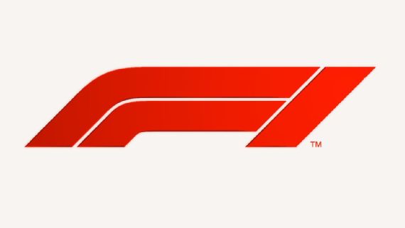
ABU DHABI -- Seeing the iconic 'Flying 1' logo fizzle out and be replaced by a striking new badge was the perfect way to wrap up the first year of Formula One under Liberty Media.
Sitting in the press conference to unveil F1's new logo ahead of the Abu Dhabi Grand Prix (it was officially unveiled to the public after the race), it was hard to imagine anything similar could have happened 12 months earlier. The 2016 edition of the event had been the last of the Bernie Ecclestone era, with the 87-year-old unceremoniously shuffled into the powerless position of chariman emeritus shortly after Liberty Media's takeover was confirmed several months later.
Though the new logo caught the most attention, the media presentation which accompanied it was an eye-opening look at the short-, medium- and long-term future of Liberty Media's Formula One.
In the 25-minute conference, spearheaded by F1's managing director Sean Bratches -- part of the new triumvirate which replaced Ecclestone -- and new marketing director Ellie Norman, the word "digital" was said ten times, while the word "brand" hit 24 mentions. It's hard to imagine the former, especially, being a popular go-to phrase in an Ecclestone media scrum (his preferred way of talking to the media) about the future of Formula One.
Digital considerations were a big motivator in Liberty creating a new logo and one of the main areas the American media company has already differentiated itself from the way Ecclestone ran F1 during his long time in charge. The second is what the likes of Bratches and Norman live and breathe in everything they do, the idea that the whole image and "tone of voice" -- another phrase used during the media session -- of F1 is as important as the final product.
Though reverential towards the outgoing 'Flying 1' logo, Bratches explained that the old design -- which has a number one cleverly hidden in the gap between the two letters -- is problematic not just in a digital space but also more simply in effectively displaying other brands alongside it.
"We hold in high regard the incumbent mark," Bratches said. "It's served Formula One extremely well for the past 23 years but in terms of where we're taking the business and our vision for the business, it's the negative space in the '1' doesn't come through candidly in digital.
.jpg)
"In fact if I had marked or polled the number of people who I have met and discussed the mark since I've gotten here, many of them went years and years not understanding that the invisible space between the left and the right was actually a '1'. So we wanted to keep it simple and clear, and I think that's important for our digital space."
Much of the conversation in the media centre leading up to the announcement was whether F1 really need to change the mark. The 'Flying 1' has become one of the most iconic and recognisable trademarks in sport. While many car manufacturers and internationally-renowned brands often choose an evolution of their brand logo, rather than a completely new one, Bratches explained why F1 felt the need to detatch itself from an emblem perhaps a little too closely linked to the previous regime.
"These are difficult changes and anytime you change a corporate mark, particularly one around a passion brand, and Formula One is clearly a passion brand, the incumbent mark has been around for decades and it has served the sport well. We've not gone into this light-heartedly, we've given it a lot of thought and it seems from my perspective from the moment Chase [Carey, F1 CEO] called me it was one of the things I really wanted to look at because from my eye it seemed to be dated and seemed not to reflect where the sport could go.
"If you look at Starbucks as an example, or Coca-Cola, which has taken the condensation off its logo to enter digital. We felt we had to go a little bit further to re-tool it to position us on a going-forward basis."
In a 25 minutes littered with marketing buzzwords, Bratches also offered perhaps the most important quote in terms of understanding where F1 management sees its future direction.
"We are trying to re-position Formula One from a purely motorsport company to a media and entertainment brand with the heart and soul of a race car driver in the middle of it."
##Again, imagine Ecclestone saying that -- F1 has come a long way in a year.
##Long-term thinking
.jpg)
But beyond the talk about the logo, the press conference revealed something deeper about Liberty's vision for Formula One. For a sport that so often suffers from a knee-jerk, short-term approach, it was refreshing to hear the press conference delve into the reasons behind keeping the 'Formula 1' underneath the new red emblem.
"We will be using Formula One [name] with the icon lock-up," Norman said. "Long term, 20-30 years' time, we may be in a position to just use the icon itself but in our applications and to put campaigns into the marketplace for next year we will continue to use the Formula One mark alongside the icon."
To which Bratches followed up with: "To that point, if you look at a company like Nike when they introduced their Swoosh logo they used the work Nike under it for 24 years before the Swoosh could operate independently and act as the identifier for that brand."
It's rare to hear anyone in an F1 press conference talk about anything so far down the line -- usually long-term thinking is reserved for the next cycle of contracts of regulation change (see current discussions about the new engine rules in 2021). Though Norman's comment was specifically talking about the longevity of the new logo, it gives an important reminder that Liberty Media did not spend millions to buy control of F1 just to make it a success in 2017, 2018 and 2019, but to utilise the potential F1 has globally and turn it into a long-term business success.
Bratches also made a point of stressing the fact that Norman is F1's first-ever marketing director. He was responding to recent reports and quotes of some team bosses apparently uneasy with Liberty's aggressive investment this year -- something which has included the lavish and popular London Live event (a format to be replicated in other cities next year) and the new logo and rebrand itself.
For Bratches, the steps Liberty have been taking in 2017 -- including creating a logo for the modern age of media -- is all about building a foundation for what's to come.
"When I arrived there was no marketing, there was no digitial group, there's no sponsorship group, no communications group, there's no research group, no media rights, on and on. We had to make an investment today for the future. As for select comments in the press, I think the teams understand that Formula One needs investment and we're having many conversations. I think from a general standpoint they're optimistic in terms of what the opportunities are and it's early in the game."
There are bigger problems facing F1's new management in its second year than how well fans receive a new logo, of course. Concerns linger over the quality of racing, inequality in finances and performances levels, while its first proper regulatory proposal has led to an impasse with the sport's main manufacturers and even prompted Ferrari to threaten to quit the sport -- a baptism by fire even the most pessimistic members of Liberty Media's board would have felt uneasy predicting in January.
But in Abu Dhabi F1 management gave its clearest indication yet of how it sees the next years of its own developing and also that it is embarking on a long-term mission. We are only just seeing the roots of it at the moment.
source; google.
Thank you for Using #promo-steem tag, Promote steemit by inviting your friends and your family!
thanks