Typography – Part 5: Fraktur - The German Font
Hey Steemers!
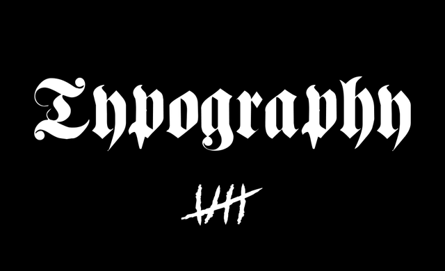
Today I want to talk abut ‘the German Font' - The Fraktur. I think it's a topic that deserves its own post, not only because I'm german of course, no. It's a very beautiful font and is still very popular and often used nowadays. Besides that it just looks amazing. It's art. It's one of a very few fonts to tell a story and to be very emotional.
-/ A historical flashback
The term 'fraktur' (latin: fracture) says, that the rounded lines of the letters which date back to the classical antiquity, were ‘broken'. This process already started at about 1200 after Christ, in times where the romanesque round archs were broken in architecture. The first font-group being developed in the scriptoriums in the north of france was the gothic form. This narrow and high font was replicated by Johannes Gutenberg when he made the first print ever to happen in the occident. At about 1470 the second ‘broken‘ font was developed in Germany, the 'Schwabacher‘, named after the german city Schwabach, near Nuremberg. The translation of the bible by Martin Luther started the creation of a uniform written language. And the Schwabacher made it look beautiful.
________________________________________________________________________
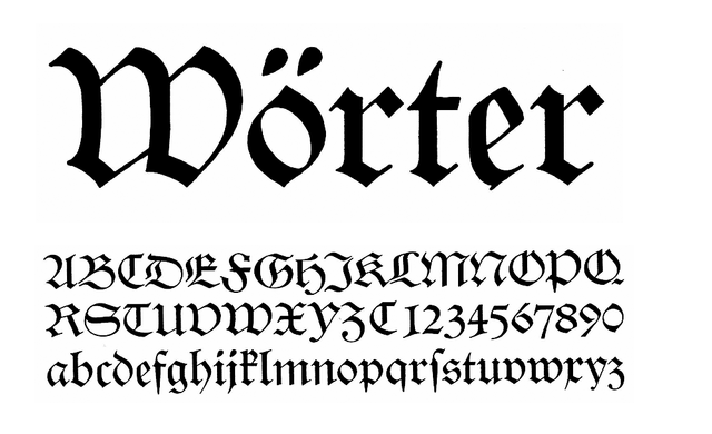
The Schwabacher
handwriting and print font of the 15th century; made in the south of germany
Already back in 1517 the Fraktur steps into the light of history. One of its earliest users was Albrecht Dürer. The font becomes famous in the german-speaking areas soon after. The font is soon used in eastern countries as well as in Scandinavia. Until the 20th century the Fraktur was used for nearly all german texts, that's the reason why it is called "german font".
The term ‘german font‘ probably came from Italy, anyhow the term ‘lettera tedesca‘ appeared back in the end of the 19th century in upper Italy. And the fonts called ‘lettera tedesca‘ were the Schwabacher and the Fraktur because they have become the standard font for german texts.
In the subsequent period font artists permanently created better and more readable Fraktur-fonts. And they did not miss out on beauty! The Fraktur becomes a piece of art combined with usefulness. Under the direction of some great german font artists, calligraphy experiences a tremendous upturn and reaches its climax between 1920 and 1940. During this time numerous fonts of timeless elegance and beauty were created in Germany.
________________________________________________________________________
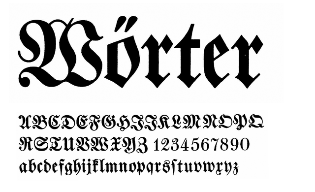
Fraktur
created in the 16th century;
-/ The shape
A good readability of a Fraktur-font is based on four crucial features:
1) more letters have ascenders and descenders to make them pop out
2) letters distinguish themselves very prominent which makes it easier for the eye to read the text
3) most Fraktur-fonts are kind of narrow which make it easier to catch more letters at once; beneficial for german texts as syllables usually have more letters in german language compared to other languages;
4) the final 's' in a word indicates the end of a word; in the middle of a word the so called ‘fugue‘ catches the attention of the eye;
Examples: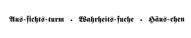
Very welcome to ‘non-germans‘ because it's easier to read:
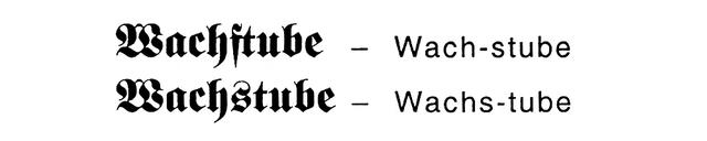
First word says ‘guardhouse', second one ‘tube of wax‘, although the look pretty much identical; it's just a matter of pronounciation.
-/ Forbiddance and aftermaths
Let's take a quick look at the history again, back to the times of the NSDAP, the Nazi-era. Nowadays the Fraktur is no longer as popular as it was back in the beginning of the 19th century. The main trigger for this cultural decay was a directive from the leader of the NSDAP, Martin Bormann, on 3rd of January 1941. On behalf of Adolf Hitler. The "gothic font" was labeled as the ‘schwabacher jewish letters‘. From that day only linear antiqua fonts – ‘normal‘ fonts – were allowed to use. It was a lie on purpose which made the Fraktur disappear completely. Unfortunately these fonts were not included in the reparations. In fact there is no longer a forbiddance today but no minister of education wants to see it part of the education in school although it is such a valuable cultural asset.
The works of art have been forgotten. Sadly.
-/ BUT – what do we have here!
The Fraktur is still alive and made its way despite its heritage. It's a beloved font among artists, musicians and even gangs. Here are some proofs that'll show you that this font rocks, literally. The beauty of this art accompanies us every day. We just need to watch closely. And the message this font transports is not replaceable by any other font. It's a statement. Period.
Tattoo art // Members of the Mara 18
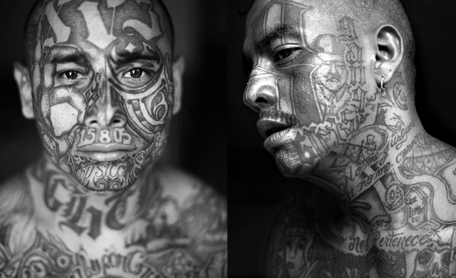
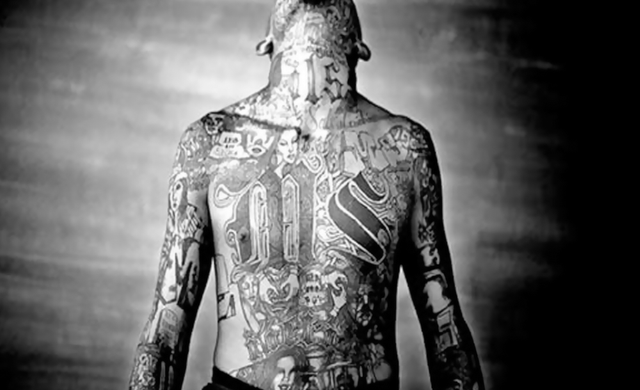
Tattoo art // Member of the Mara Salvachutra (MS), Mara 13
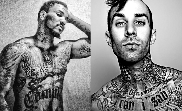
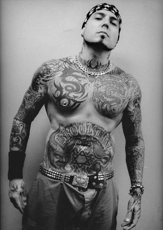
Tattoo art // The Game and Travis Barker
Tattoo art // Eminem

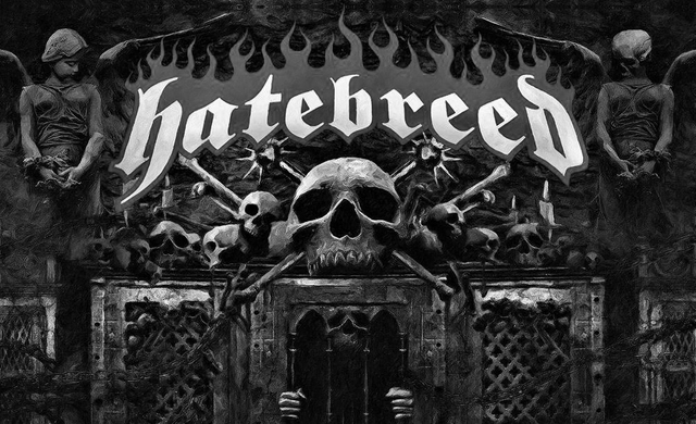
Logo // Hatebreed
Tattoo art // Evan Seinfeld, Biohazard
________________________________________________________________________
Image credits:
________________________________________________________________________
There are so many different variations of Fraktur-fonts available today, it's crazy. You can get many of them for free and start being creative.
Thank you very much for your attention!
Maybe to be continued ... :)
Hi sascha,
nice work.
Can you give us a hint for a better logo for the german speeking steemit community?
https://steemit.com/deutsch/@twinner/logo-idee-fuer-die-deutsche-steem-gemeinde
Best regards,
twinner
Hi @twinner! Thank you! I can take a look, no problem! :) cheers!
I first encountered Fraktur when studying mathematics. It's neat-looking.
Great font and great story!
Thanx @richman! My pleasure!
Typography – Part 5: Fraktur - The German Font
Well, when I saw that even gangs use the font I think we can say it's not just for the Germans anymore. Ever notice that there are a variety of fonts to choose from when you compose on Google Docs or similar programs. Even though the German font is literally hundreds of years old ( At about 1470 the second ‘broken‘ font was developed in Germany). Having an established acceptance is it any wonder that the German fonts gave way to the acceptance of the 1920s and the 1940s calligraphy? With the Fraktur not being completely stamped out despite an "official" death, is it any wonder that it would be a lettering of choice among those marginalized by society.
Gangs, musicians and artists to include graffiti taggers use this style as indicative of their cultural norms. As you get more information can you please add more information similar to this article? I think your photos were extremely congruent with the styles of font shown in this article. You may have inspired a latent artist as sometimes a person will commit themselves to a project simply because they now have a greater understanding of something no one ever informed them about. Just my thoughts, Ron
Hi @getonthebus! Thank you for sharing your thoughts! Maybe I'll consider to talk more about it, I just felt to bring it up as it is really something unqiue and special, its art - everywhere you see it. Cheers!
@Sascha, you make letters look cool! Outstanding presentation!
Thank you very much @justinlaak!
I quite often use different fonts. Thus it's quite interesting to learn the history.
Thank you, @sascha!
You're welcome @omfedor! Happy to see my posts are interesting :)
The gods be praised, I grew up among old books (and German beer bottles). So I went to school in Germany in the 80ies/90ies, and in our history book, there was a page of an old Bible, the old Gutenberg bible even I think, the first page of the Psalms and our history teacher challenged the class to read it out loud. There was not much enthusiasm... I was confident enough to raise my hand because I knew the part more or less by heart anyway and the class' (and teacher's) reaction was kind of "wat".
I can read it quite fluently, be it in an old bible, a german pre-1900 book or, ironically, Mein Kampf, and it makes my heart break to see others squint, turn the book, keep it away or look over their glasses because they ſtumble over some of the finer details.
I still don't quite understand the Nazi rationale. From a propaganda standpoint, it was perfect, because it gave German(s|y) an even more distinct and unique identity - and, as its use now shows, one of "elegance" AND "badassery" - just what the ideology called for.
Anyone else find it a terrible idea to use Fraktur in all-caps (like Seinfeld)?
//edit: I'm stupid, it can't have been the Gutenberg bible, it was set in Latin, so it must have been a page from Luther's translation a few decades later.
Hi @akareyon! Thank you very much for your detailed comment! Awesome! All-caps is bascially a no-go, depends on the single fontface though. Evan's tattoo looks quite cool. If you use the 'Fraktur" as shown above you can't read it anymore :)
Isn't it called "Old English" in Word?
Hi @deleted! There are numerous variations of Fraktur-fonts, different names, different styles. 'Old English' is very famous as well. There are others like Wilhelm Klingspor, Goudy Text and Fette Fraktur. 'Fraktur' is a collective term for these type of fonts / group of fonts and a font as well (Fette Fraktur).
Fraktur is amazing. Thanks for this informative post.