The One Good Reason to Choose Greyscale
You have probably heard various reasons for converting a photograph to greyscale. I think that there is just one good reason.
converted to sRGB profile and NO edits were done on the image – this caption is just for Richard’s information
Small Point

It is a personal bugbear. We all do it. I do it. But we really should not say “black and white”. Maybe it is easy to say, and B&W does have a much wider catchment of understanding, however, it is a long way from the truth, and “greyscale” is much more accurate.
Singular Reason for Choosing Greyscale
The reason for choosing greyscale seems very clear to me. I could write one sentence, take a bow, then exit stage left. However, I think you, readers of dPS, deserve a little more explanation than that. Also, I admit, I have experienced that it is not necessarily an idea which others always greet with immediate enthusiasm. So I am very interested to see what you think.

You have probably heard some of the standard reasons given for choosing greyscale. For many people, at the top of the list is that it reveals form, shape, and line. Closely related to this is the capacity to emphasize texture. Also, the use of greyscale can help to set a mood, enhance an atmosphere. The luminance, the relative brightness of objects within the frame, often takes on more importance. All these are good reasons for choosing greyscale.
First Example

Months after I had taken it, I came back to the image above and converted it to greyscale. I liked this guy when I met him. Rather, I liked his face, but I did not think the portrait offered much. Then:

In the context of writing for dPS, I find it difficult to comment on my own photographs, but surely the greyscale version is a great deal better, do you not agree?
The reasons include many of the standard ones given above. For me, and we all see things differently, the prime thing is that the mood is much more dramatic. Surely the greyscale version emphasizes the shape of his face much more. The processing choices are quite extreme and show the texture and details of his face. Luminance is now also a much bigger factor. For me (please refer to my dPS articles on Photographer’s Metadata) it shows the man’s vibrant character more strongly. That is curious, isn’t it? When the color is removed the character is more evident.
Zen
For me, the preliminary point to grasp is that if something is not contributing to a picture in a positive way, it probably has a negative impact on the final result. If an element in the image is not contributing in a good way, it is very likely a distraction. All a bit Zen, aiming for clarity of vision, with all the unnecessary removed.

Removing the Distractions
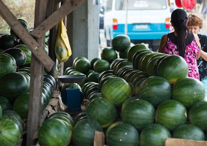
Looking at the photograph of the watermelon store below, what do you think is the point, what is the subject, what is the story? I think it adds to the photograph that there is retail transaction taking place, and this tells part of the story. However, at least for me, I do not think that is the main subject of the photograph.
The biggest feature is obviously the melons, and I do not think it is their color, I think it is their shape, and the repetition of that shape which is emphasized by the rim light. I am certain that the van at the back is not helpful, adds nothing to the story at all, and it is quite a big distraction.
The One Good Reason to Choose Greyscale
The Zen of removing non-contributing factors, unnecessary distractions should be the reason why you choose to convert a picture to greyscale. The item at the top of that list of distractions is the most obvious thing. The biggest distraction is color itself. A tip that I heard a few years ago, which I have found very helpful, is that the reason for converting an image to greyscale is that it REMOVES THE DISTRACTION OF COLOR.

The One Good Reason to Choose Greyscale
Shapes and light.
More Examples
Another street shot.
The One Good Reason to Choose Greyscale
Filipino street boys.
In the greyscale version below, the luminance of the objects is improved. Just look at the plastic begging cup in the boy’s hand, it is much more of a feature. The texture is shown a great deal more clearly in the grime on the boys’ faces, shirts, and very much in the matted nature of their hair. The mood grimmer. All of these, probably more, are part of the standard list of reasons for choosing greyscale. However, all of them are subservient to the main overall reason. All the improvements are achieved because a conversion to greyscale has removed the distraction of color.
Another street shot.

In the greyscale version below, the luminance of the objects is improved. Just look at the plastic begging cup in the boy’s hand, it is much more of a feature. The texture is shown a great deal more clearly in the grime on the boys’ faces, shirts, and very much in the matted nature of their hair. The mood grimmer. All of these, probably more, are part of the standard list of reasons for choosing greyscale. However, all of them are subservient to the main overall reason. All the improvements are achieved because a conversion to greyscale has removed the distraction of color.
