Suggestion: Making Steemit Website Simpler
Components
Steemit Website is a platform is a blogging and social media website on top of the Steem blockchain database, this platform produces STEEM DOLLARS and STEEM tokens that can be convert into some paper money.
Proposal
Hi, my proposal is to use some unused spaces in the steemit website, also this will help users (especially those who are new to the platform) to execute some functions easily. Steemit website have some collapsible links that being hidden to those users who are not used in using the platform
Mockups / Examples
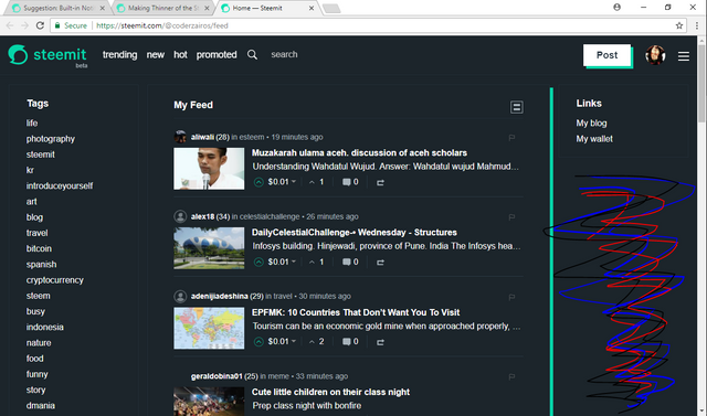
Steemit Website Interface

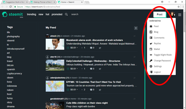
Collapsible Links

My suggestion is to use the unused part of the website for the collapsible links that was hidden from the users
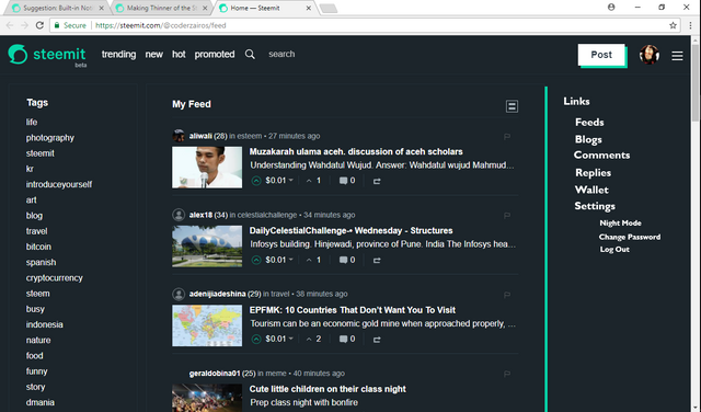
This will how it looks

This will how the new platform will look when the collapsible links will be put in the unused space of the website
Benefits
The benefit of the suggestion will be to have an easy access in the platform. As new users was introduced in the platform many find it hard to find some links that was in the collapsible button. With this users can now see the links easily as it was only in the right side of the platform
Posted on Utopian.io - Rewarding Open Source Contributors
This post has received a 0.22 % upvote from @drotto thanks to: @banjo.
Hello @coderzairos, your contribution has been declined reason because it is trivial (has little or no value to the project).
Please Note:You must understand that very little suggestions like this will not be welcomed or approved in the future.
Examples of good contributions : 1, 2 and 3
Please be sure to improve the quality of your contribution.Doing this will increase the quality of your contribution in this category and the community at large. I do hope to see some improvement in your future contribution.
Are you not certified with this feedback ? Please feel free to contact us on discord.
Thank you.
[utopian-moderator]
This post was being upvoted by @steemian-sniper. Thanks for supporting