U.S. Stock And Sector Performance Heatmaps
The following percentage graph shows a 1-year comparison of the S&P 500 Index with the S&P Sectors. You can see which Sectors are outperforming or underperforming the Index.
Stock Market & Sector Performance 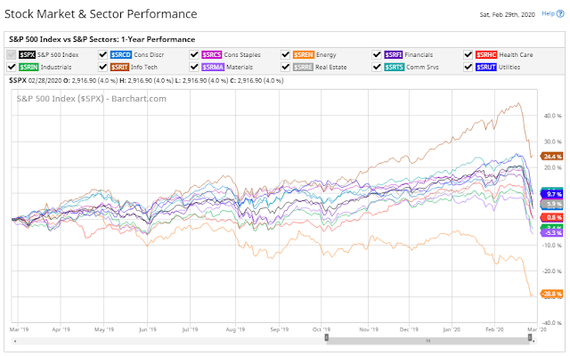 Stock Market & Sector Performance
The following heatmap shows the percentages of stocks within the Sectors and Major U.S. Indices that are currently trading above a variety of moving averages, as of Friday's close.
You can quickly see which are the weakest and strongest of the weak (especially after last week's record market purge) by which ones have the most/least stocks above their 200-day moving average.
With regard to the Major Indices, the Nasdaq 100 is the strongest, while the Dow Transports are the weakest.
Major Indices 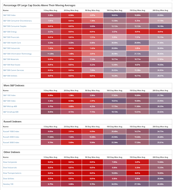 Major Indices
The following percentages gained/lost graphs of the S&P 500 Index and the 9 Major Sectors are provided by Stockcharts.com.
The timeframe on each of them is one year, year-to-date, and last week, respectively.
You can see that Technology is outperforming Energy on all three timeframes, while Financials aren't looking too healthy. That is confirmed on the heatmap above...check out the percentages of their stocks above their 200-day moving average.
Sectors Chart 

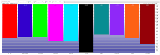 Sectors Chart
BOTTOM LINE:
There are no Sectors or Major Indices with stocks that are in the green above their shortest moving average, namely their 5-day moving average, on the heatmap.
Generally speaking, if Friday's bounce continues into this coming week, we may see that flip at some point. If that happens and fails to hold, look for a further equity selloff. Otherwise, we may see them rally to their 20-day moving average before they, either continue convincingly, or reverse around that area of resistance for another leg down to, potentially, new lows.