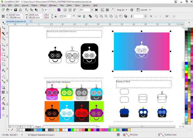
Logo Design for mlconjug
Design process links:
Communication with Project Owner
Tools I used
CorelDRAW_Graphics_Suite_2017_19.0.0.328 (logo design)


 (https://creativecommons.org/licenses/by/4.0/)
This work is licensed under a Creative Commons Attribution 4.0 International License
Hey @zuur ,
Thank you for the contribution, in my opinion it could be better if you use more contrast colors. You used 3 tone of blue two of them so similar, also black and blue has low contrast between each other. Using colors with low contrast reduces visibility. It may be good for you to look here
Your contribution has been evaluated according to Utopian policies and guidelines, as well as a predefined set of questions pertaining to the category.
To view those questions and the relevant answers related to your post, click here.
Need help? Write a ticket on https://support.utopian.io/.
Chat with us on Discord.
[utopian-moderator]
Hey @zuur
Thanks for contributing on Utopian.
We’re already looking forward to your next contribution!
Want to chat? Join us on Discord https://discord.gg/h52nFrV.
Vote for Utopian Witness!