Cómo pinté una acuarela estival / How I painted a summer watercolor

En el verano hay que descansar y hacer otras cosas que nos gustan pero no hacemos durante el resto del año.
Quise practicar con el programa Sketches de pintura en la tableta. Poco a poco voy aprendiendo y cada día descubro algo nuevo.
Siempre me ha atraído pintar a acuarela y nunca lo he conseguido hacer bien. Me parece que son pinturas que tienen mucha luz y trasparencias y por eso me gusta.
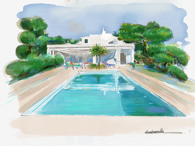
Os expongo los pasos que di en la realización de esta acuarela digital. Lo expongo con honestidad ya que cometí varios errores que solventé como pude.
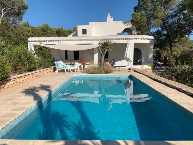
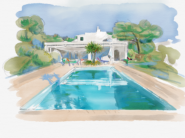
Me basé en una fotografía personal, sencilla, sin grandes problemas pero con unos bonitos colores. Sobre ella realicé un dibujo, mas o menos rápido, para localizar los elementos de la composición.
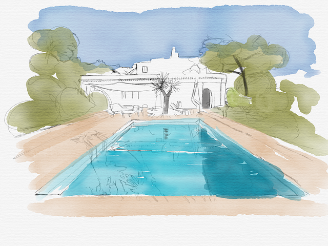
Fui aplicando una tenue capa de color a todo el dibujo. Cuidé de que no fuera excesivamente opaca para poder introducir más tarde algunos matices.
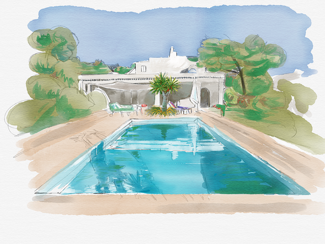
Pinté con detenimiento el drago central, al que añadí algunas copas mas para que se viera algo mas sano y vigoroso que el original. Lo pinté con detalle puesto que será el elemento que debe atraer la atención inicial.
Pinté algunas sombras del suelo y repartí ese color por el resto del dibujo. Si queremos que un dibujo tenga todos los elementos integrados es importante que, de alguna manera, los mismos colores estén repartidos por todo el lienzo. Como si los colores rebotaran dentro del cuadro,
cuando introduzco algún color nuevo en algún elemento, lo reparto también sutilmente por el resto del cuadro.
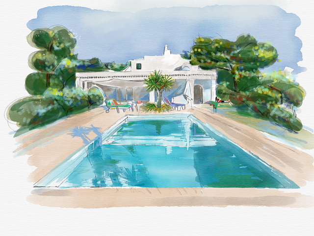
Trabajé los árboles. Me pareció muy difícil porque si pintaba con mucho detalle atraería demasiado la atención en ese lugar. También, oscurecí las sombras del borde de la pisicina. Creo que aquí me equivoqué pues me llevé por la fotografía original y creo que , tal vez, se creó un excesivo contraste.
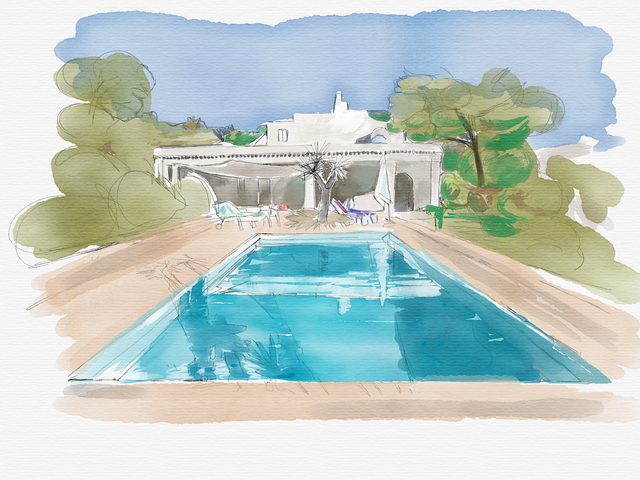
En las copas de los pinos quería resaltar su irregularidad y le apliqué un punteado multicolor. No me gustó el resultado. No estaba a gusto con tanto colorido en las copas y por eso le apliqué por encima una capa de verde para homogeneizarlas.
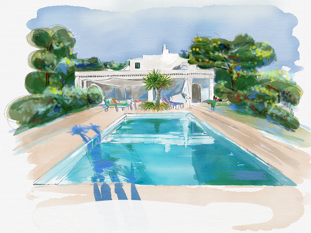
Creí haberlo terminado y lo firmé. Sin embargo no estaba muy satisfecho con el resultado.
Lo dejé y lo estudié con detenimiento al día siguiente.
Después de mirarlo de nuevo, creo que las sombras del suelo eran muy llamativas. Además sólo se veía la sombra y no estaba en el dibujo el elemento que la producía. Me pareció que también había un efecto de distorsión de la perspectiva.
Decidí borrar las sombras y volver a pintarlo. No estaba seguro de no estropearlo definitivamente. Es complicado volver a encontrar los mismos tonos del agua. Estaba preocupado por si no era capaz de encontrarlos.
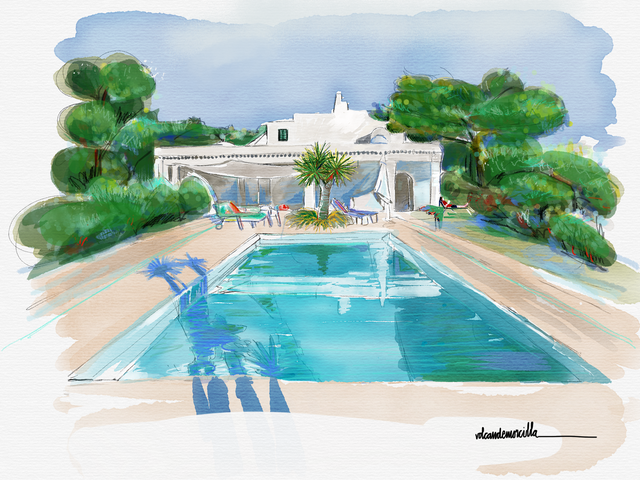
El resultado creo que está mejor sin las sombras del suelo.
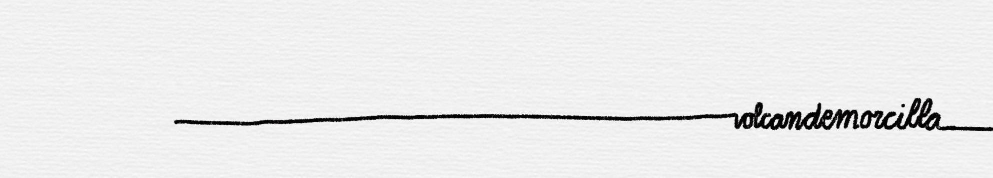
Sin embargo, la firma y la sombra del agua producían un gran desequilibrio hacia la derecha. Así que rehice la firma y la cambié de lado.
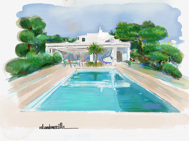
Este es el resultado. No está perfecto pero es un dibujo que a mi me trasmite la tranquilidad y el descanso que los tiempos estivales deberían tener para recargar fuerzas y energía.
Summer watercolor
In the summer you have to rest and do other things that we like but we do not do during the rest of the year.
I wanted to practice with the Paint Sketches program on the tablet. Little by little I learn and every day I discover something new.
I have always been attracted to watercolor painting and I have never managed to do it well. I think they are paintings that have a lot of light and transparency and that's why I like it.
I expose the steps I took in the realization of this digital watercolor. I expose it with honesty since I made several mistakes that I solved as I could.
I relied on a simple personal photograph, without major problems but with beautiful colors. On it I made a drawing, more or less fast, to locate the elements of the composition.
I was applying a faint layer of color to the whole drawing. I took care that it was not too opaque to be able to introduce some nuances later.
I carefully painted the central dragon tree, to which I added a few more glasses to make it look healthier and more vigorous than the original. I painted it in detail since it will be the element that should attract the initial attention.
I painted some shadows from the floor and distributed that color for the rest of the drawing. If we want a drawing to have all the elements integrated, it is important that, in some way, the same colors are spread throughout the canvas. As if the colors bounced inside the box,
When I introduce some new color into some element, I also distribute it subtly for the rest of the painting.
I worked the trees. I found it very difficult because if I painted in great detail it would attract too much attention in that place. Also, I obscured the shadows on the edge of the pool. I think I was wrong here because I took the original photograph and I think, perhaps, an excessive contrast was created.
In the tops of the pines I wanted to highlight its irregularity and applied a multicolored dot. I did not like the result. I was not comfortable with so much color in the glasses and that's why I applied a layer of green on top to homogenize them.
I thought I finished it and signed it. However I was not very satisfied with the result.
I left it and studied it carefully the next day.
After looking at it again, I think the shadows on the floor were very striking. In addition, only the shadow was visible and the element that produced it was not in the drawing. It seemed to me that there was also a perspective distortion effect.
I decided to erase the shadows and repaint it. I wasn't sure not to spoil it definitely. It is difficult to find the same shades of water again. I was worried if I wasn't able to find them.
The result I think is better without the shadows of the ground.
However, the signature and the shadow of the water produced a great imbalance to the right. So I remade the signature and changed it.
This is the result. It is not perfect but it is a drawing that gives me the tranquility and rest that summer times should have to recharge forces and energy.
Cómo lo hice / How I do it
Utilicé el programa Sketches para la creación utilizando la herramienta lápiz y acuarela.
Use the Sketches program for creation using the pencil and watercolor tool.
Los dibujos son míos y originales.
¡Espero tus comentarios!
The draws are originals and mine.
I await your comments.
Buen Camino!
It's like the shadows never existed. The results are incredible. Amazing!
Hello: The program allows you to make corrections although it is very possible that they are noticed. Thank you for your comment and rating. Regards 😊
Posted using Partiko iOS
I did not know there was a program for watercolor painting. What software is this?
Sketches 😊
Posted using Partiko iOS
Buenas, Su post ha sido propuesto para ser votado a lo largo del día por el witness @cervantes. Un saludo.
Muchas Gracias por la distinción. Un saludo
Posted using Partiko iOS
Ya quisiera yo llegar a cometer esos pequeños errores. El trabajo para mí quedó muy bueno, la idea, los colores, las sombras fueron colocadas en correspondencia con la fotografía, al menos eso aprecio aunque entiendo tu postura como experto en el área. No me llames la atención por lo que digo. Simplemente genial 20 puntos. Saludos.
Bueno, también es interesante ver como se puede borrar y rehacer, no?
Gracias por el 20. Jejejej
Posted using Partiko iOS
Woow, quedo increíble ¡felicidades!
Muchas 😊Gracias
Posted using Partiko iOS
Hi volcandemorcilla,
Visit curiesteem.com or join the Curie Discord community to learn more.
Thank you so much
Posted using Partiko iOS
Inspirador tu trabajo, quedo bien chevere tu acuarela!
Muchas Gracias. Me alegra que te guste. Con la práctica, quizás consiga dibujos mejores. Un saludo afectuoso. 😊
Has dado una clase de pintura a través de la explicación del proceso que seguiste, a mí me encanta la acuarela, me considero una aprendiz de la misma, ahora no se consigue el papel adecuado por lo que esta idea es excelente, en papel es imposible rehacer esos detalles. Saludos cordiales.
En el papel lo he intentado pero me siento frustrado porque no se hacerlo. Quizás debería ir a dar unas clases que me expliquen bien. Sin embargo la acuarela digital es mucho mas versátil y se pueden hacer algunas correcciones.
Un saludo 😊
Eso es lo bueno que se pueden hacer correcciones, pero veo que tienes clara la teoría. Yo seguiré intentando y deseando que se consiga el papel adecuado por aquí. Saludos.
Digital watercolor suits you very well :) it's a lovely painting and it makes me feel like I was somewhere on vacation. It's this kind of lace which I would choose if I would go on vacation this year :)
It's colorful, bright and clean - very pretty.
Thank you for sharing and have a lovely day!
Thank you very much for your comment. I have visited your blog and I really like your posts. Congratulations!! 😊
Posted using Partiko iOS
Muchas Gracias por vuestra valoración.
Posted using Partiko iOS
Te quedo bien amigo.
Un abrazo.
Muchas Gracias amiga. Si pudiera practicar más....
Posted using Partiko iOS