Monochrome as opposed to Color in photography
I captured an image this morning which I thought was really beautiful.... not spectacular photography BUT spectacular nature. When I showed it to my other half she asked me to make it black and white ... pronouncing that it would make the trees more 'striking'.
I would really welcome your thoughts on these two types of photography as I have never yet worked in monochrome before.

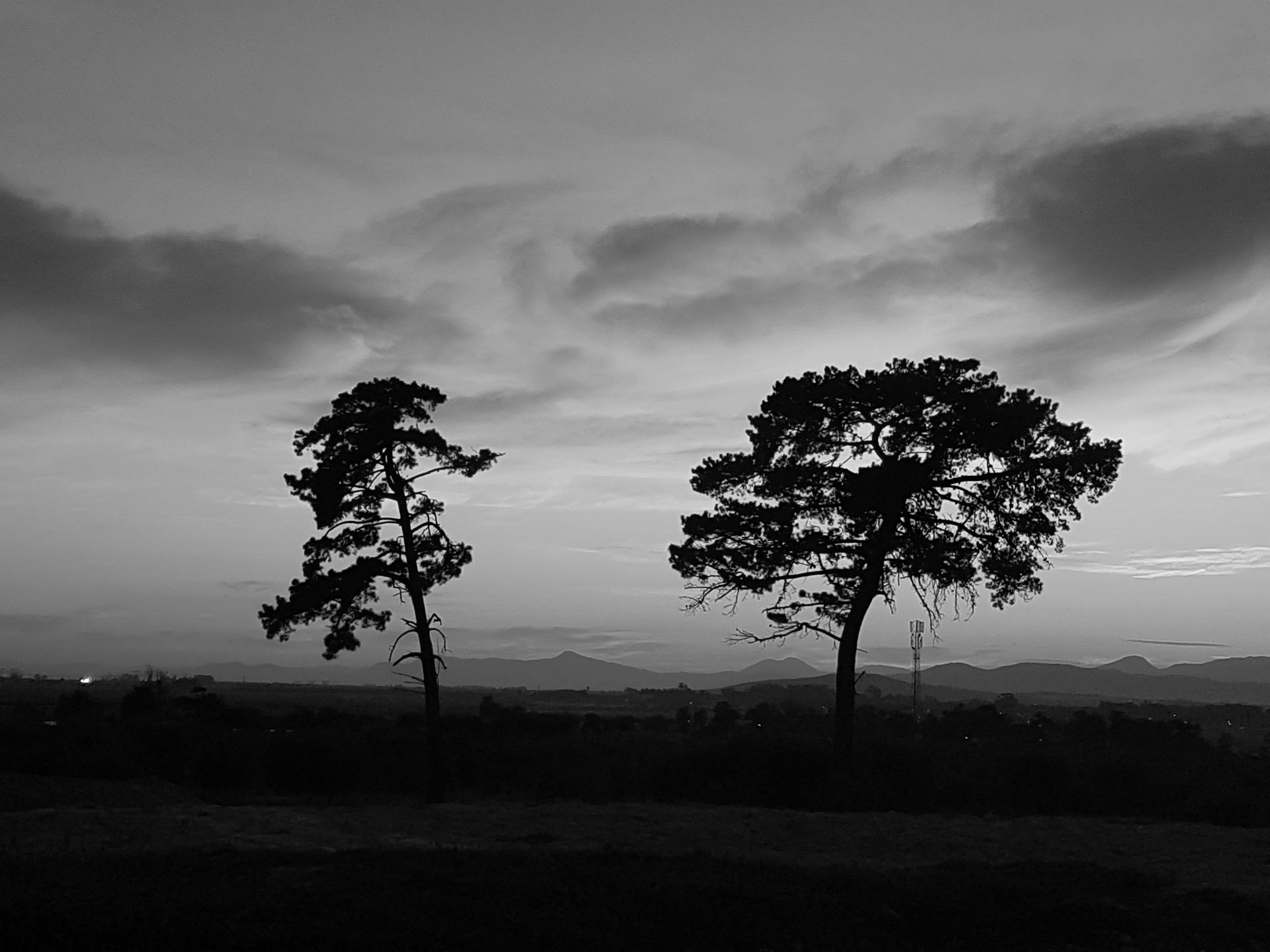
If anything I reckon the black and white is more forgiving on focus ...'clarity' ??
 >
>
The colour one for me please :-)
You got it...and a 9c tip ...{friendly wave...heads off to prepare for corporate cubicle}....{spirits drop}
Clutching at straws a little here, but one good thing about the corporate cubicle - at least you get to go home at the end of the day. When you work from home, it's easy to always be at work. Today was a public holiday here, but we've been catching up on some things (in between reading Steemit and resting), and I've just stopped work now at 7.30pm.
It depends on the effect you wish to create. Beautiful and peaceful, or disturbing and creepy.
Good point. I had not thought of that !!
I love monotone photography in the right context. I do prefer the bursts of colour in this particular image. I don't think you can beat creating monotone images in the dark room.... the grainy images and burning in processes just adds the the overall effect.... i used to spend hours in the dark room.... i think that's why my brain in pickled now!!!!
Thanks for the feedback .... methinks it is just your 'dark' side..lol
Ha ha ha you're probably right xx
The black & white is way way better & more artsy.
thank you for your response...I know you love minimalism...and was hoping you would give feedback.
💗
Really like photos, and I like them both equally to be honest. But the bw version gives me a sense of abandonment , when the first one -of calmness.
Thanks for your feedback... I really like this ... because after each reply I go try and see what the respondent is 'seeing'... and I definitely get the abandonment bit !!
Thanks... is that a dead heat for the two of them {smile}
both look same quality to me.
Thanks, but do you have a preference for what they portray to you? If you have no preference this is also good {smile}
no preference as i see sadness on both.
Good answer, thank you.
Sure, Not at all.
Personally I think the colour one has much more depth on this one, and since the focus is the colours of the sky. It's important to preserve it, nevertheless great capture 👍
Gonna follow for more.
Ahhhh, sounds like an experienced photographer... thank you for taking the time to respond. I pretty much like color, and also do not really like 'editing' photographs... but I assume as I learn more I will start doing that.
Not at all :), but I agree, The less editing the better, if I want to look at edited photos I look at chicks on magazines :)
And ofcourse it all depends on the purpose of the photograph.
Take care.
I get the idea of the black and white with those trees. But the colors are so beautiful that the color version is by far my favorite. The trees make a nice silhouet.
Thanks @ellenvddoel ...strike two for color :)
Beautiful job, my choice is fist one, it's gorgeous photo!
Thank you , especially for your positive feed back!!
nice post and good job @themagus