Turn the chart upside down to see where we are going
This is a thing...
Sometimes when a chart is hard to read, just flip it upside down.
It often becomes more clear that way.
Here's an example:
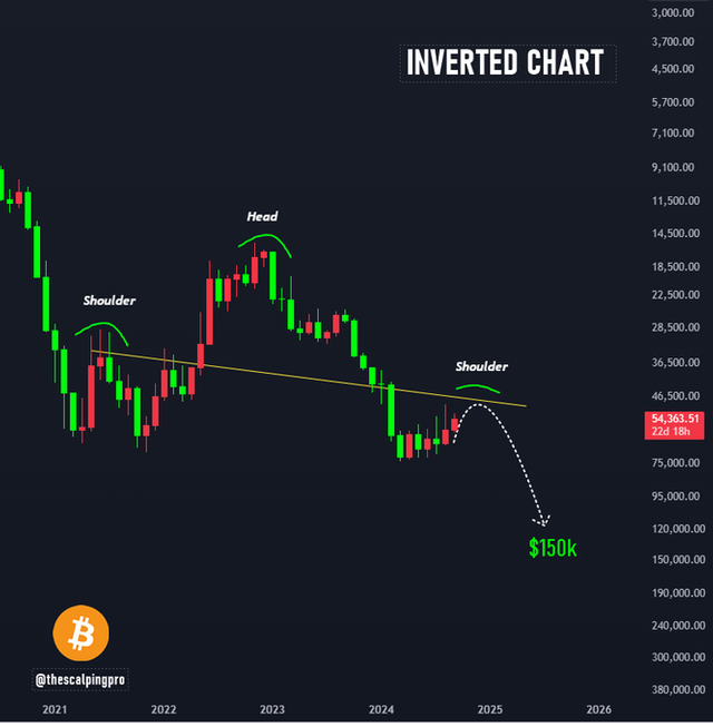
(Source: https://x.com/thescalpingpro/status/1832682785796206708/photo/1)
Looks like a head and shoulder pattern pointing to $150k.
Yep, sounds about right.