plan of attack, March 18th
Society Original Products Media Plan
The focus centers on:
- The bike sports aesthetic
- The fashion aesthetic
Specifics
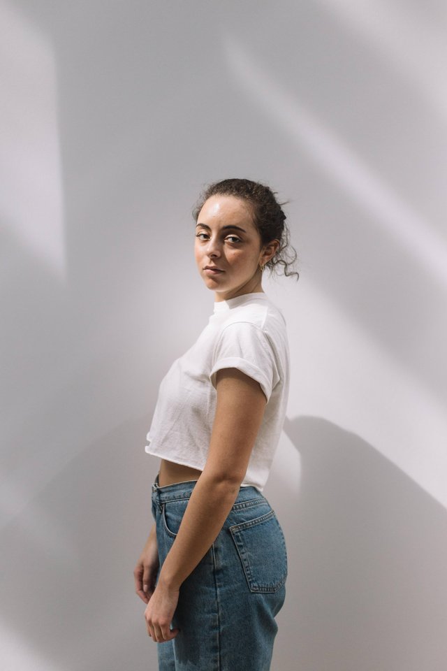
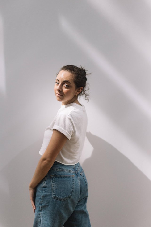
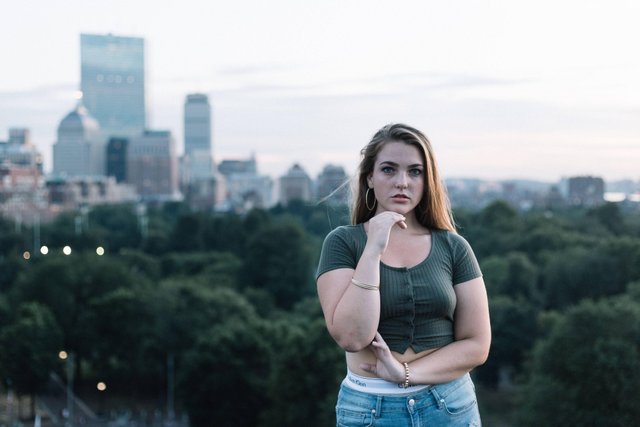
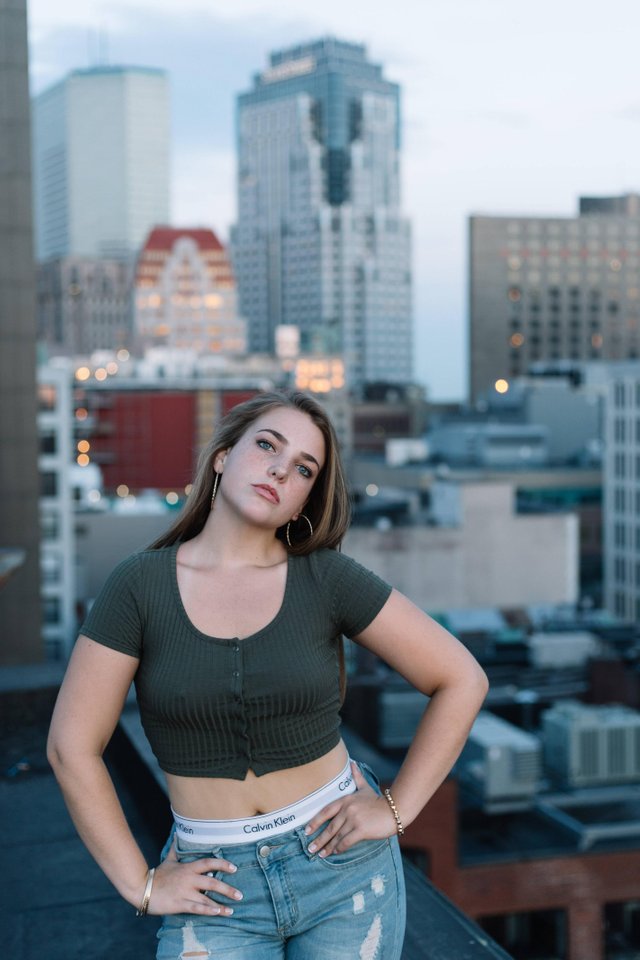
- Clean - "really good" - photos
- Of lifestyle
- Of products
- Of candid moments
- Of great color combinations
- Hot Pink
- Neon Orange
- Safety Green
- Sports / active wear for bike sports, etc.
- High-street fashion
- Quality
- Color adjusted
- Slightly sharpened
- Variations of solid background colors
- Contrasting pop colors
- Minimal clean surroundings
- Great photo selection and grouping
- Genuine nature of the models and poses
- Color schemes
- Background's role in composition
- Brand in question
- Chosen subjects
- Picture editing and quality
- Bellingham Hill Park
- City Square Park
- Galley Diner
- Jamie's Variety
- L Street Pizza
- Malone Park
- Bike on the waterfront
- Off a dock
- 'Green room' in Seaport
- The midst of a construction site / traffic stop
Color Scheme
Segments
Important elements
Additional notes
Points of Interest:
The concept behind the photos will tie the rich history of Boston, with the urban feel of winsome styles produced by Society Original Products. As a locally built brand, the times and events that defined Beantown shape our future as well. One can find it in our lifestyle, tastes and preferences – we believe in the homegrown, winner-take-all attitude, a soul you can only find in a city of champions. After all, there’s no place like home.
The ideas here are not set in stone, neither the concepts, as the objective of the plan is to give direction to the mantle I will take up under the wing of SOP's founder, Mr. Angol. I'll most likely reference this as a springboard by which I can bounce ideas.
Love the fashion.
Very urban, yet nonchalant. It cries angsty youth and it is a favorite of mine. Thanks.