Basics to Trade Cryptocurrency II - Steemit Crypto Academy |S6W3| - Homework Post for Professor @nane15
Good day, crypto enthusiasts. I believe we are all in good health. We are in the third week of Season 6 of Steemit Crypto Academy. Professor @nane15 prepared a comprehensive lecture on some of the important fundamentals of trading crypto currency, which includes candlestick charts, support and resistance levels , Fibonacci retracement, trading volume, and accumulation and distribution zones. This is my presentation for the homework task assigned by the professor after the lecture. Let's get started!

Cover

1. Explain your understanding of charts, candlesticks, and time frames. (Use your own words and put screenshots)
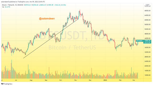
When it comes to crypto trading, charts, candlesticks, and timeframes are some of the most basic things one needs to know about to get started. Having knowledge of these will help you understand how the price is being represented graphically and how to adjust them based on your trading plan. I will be explaining my understanding of these three concepts in the next paragraphs below.
Charts
Data is usually very difficult to understand when it is not analyzed. Charts represent data in a graphical form to make it comprehensible. There are so many forms of charts. Some of the common types of charts include bar charts, line charts, pie charts, and others.
When it comes to crypto trading, there are three main types of charts, and they include: line charts, bar charts, and candlestick charts. The most commonly used chart pattern among the three is the candlestick chart. They are used to represent the price of an asset graphically so that traders will be able to anticipate the trend of the price for trading opportunities.
An example of a chart|Screenshot from trdingview.com
The prices are represented in the chart with respect to time. On the candlestick chart, the price line is drawn against time, with the price on the vertical axis and the time on the horizontal axis. The chart will display the change in price over time, and traders will then use it for technical analysis. Technical analysis involves referring to the historical data of the price to be able to make trading decisions. Live charts are available on sites such as tradingview.com and MT4 for traders to assess the live change in price of assets, and they include technical indicators to assist traders in their technical analysis.
Candlesticks
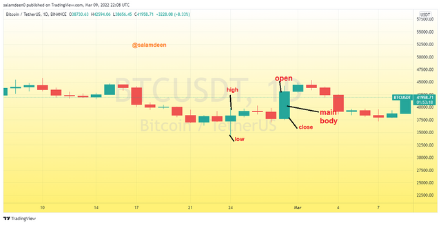
Candlesticks are the most commonly used chart pattern in crypto trading. It originated in Japan and is generally called "Japanese candlestick chart patterns." New candlesticks are created after very small changes in time, and they are dependent on the timeframe selected by the user. Candle sticks have different names, and it depends on their structure and how they are formed.
However, in terms of the body and trend of the candlestick formed, they are broadly divided into two, which are easily identified by their color. By default, the bearish candle, which represents selling, is red or black, and the bullish candle, which represents buying, is green or white.
Candlestick chart|Screenshot from trdingview.com
If a green or white candlestick is dominating on the chart at a particular period, it means there is currently more buying of the assets, and vice versa if the color is red or black. Every single candlestick has an opening, closing, high, and low, which represent the action of the price within the specified time range. The state of the candlestick contains a lot of information which traders use to analyze the price.
Timeframes
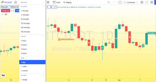
A timeframe represents the time it takes to plot and display a data point on the chart. A trader can customize the timeframe based on his trading strategy or the type of trading he does. For instance, a swing trader could use longer timeframes like the 4 hour or 1 day time frame for his analysis.
An example of the various timeframes on a chart|Screenshot from trdingview.com
A scalp trader, on the other hand, will be cool with lower timeframes like 30 minutes, 15 minutes, or below. In the Japanese candlestick chart pattern, new candlesticks are displayed after each timeframe. For instance, if you are using the 1 hour timeframe, it means that a candlestick is generated every hour. This means that, in a day, there will be 24 candlesticks. It is always good to use the right timeframe at the right time. Using a lower timeframe for long term analysis will not give the expected results in most cases.
Screenshot from trdingview.com
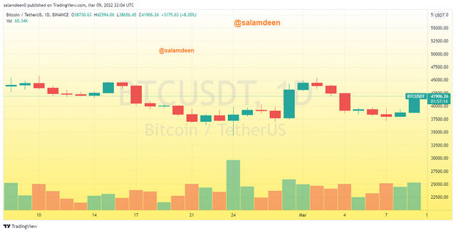
The candlestick chart below is in the 1 day timeframe and it contains the daily candlesticks formed by the BTC/USDT pair in the last 30 days and some of the commonly used timeframes in tradingview.com.
Explains how to identify support and resistance levels. (Give examples with at least 2 different graphs)
Support and resistance levels are very important zones on the chart. They represent levels with higher demand and supply, and traders can use this to predict the market. The support level represents points with higher demand. This means more buying if the price falls to the support level, it has a higher probability of retracing.
The resistance level, on the other hand, represents points on the chart with higher supply, and the price is likely to retrace when it touches the resistance level. If a support or resistance level is broken, the price can easily follow the breakout if the trading volume is high. Support and resistance levels switch roles. This means that, when there is a successful breakout of a support level, it will turn into a resistance level and vice versa when there is a breakout of a resistance level.
We can identify support and resistance levels in different ways, but the most common way of identifying support and resistance levels is through horizontal lines. I will be using the horizontal line to demonstrate how to identify support and resistance levels.
Identifying Support Level
To identify a support level, we first look for lows formed by the price line and then draw a horizontal line. If the horizontal line lies on multiple lows, it means, the level is a support level. When there is a breakout of the support level, it can then be used as a resistance level.
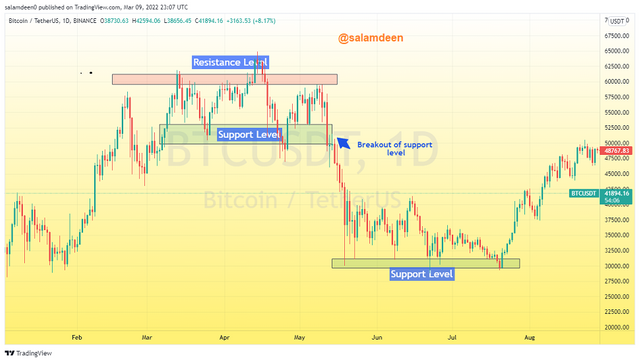
|Screenshot from trdingview.com
In the BTC/USDT 1 day timeframe chart above, I have identified support and resistance levels. The price declined further after the breakout and reached another support level.
Identifying Resistance Levels
In order to identify a resistance level, we have to look for highs formed by the price line. These are the points where the price retraces and falls back. We then draw a horizontal line and if it passes through multiple highs, it will be a resistance level.
|Screenshot from trdingview.com
On the BTC/USDT chart above, I have identified some resistance levels, and it can be seen that, whenever there is a breakout, the resistance level will turn into a support level.
Identifies and flags Fibonacci retracements, round numbers, high volume, and accumulation and distribution zones. (Each one in a different graph.)
Fibonacci retracements
Fibonacci Retracements are another way of indicating support and resistance levels on a chart. It is best used on charts with a clear trend. The price is likely to reverse after hitting any of the retracements. The Fibonacci retracements represent support and resistance levels. You can buy or go long at the Fibonacci support level when the market is in an uptrend and sell or go short at the Fibonacci resistance level when the market is in a downtrend. The Fibonacci retracements work with the psychology that the price will usually retrace at some point before continuing with the trend.
In a downtrend, the Fibonacci retracements start from the swing high to the swing low, as seen in the screenshot below. It can also be seen in the chart below that, the price exhibits some retracements at some of the Fibonacci levels.
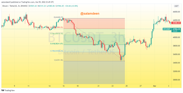
Fibonacci retracements on a downtrend chart|Screenshot from trdingview.com
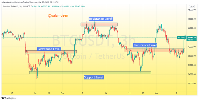
Round Numbers
Round numbers also represent support and resistance levels on a chart. It is believed that most buy and sell orders are set at round numbers, so if the price hits those levels, it is likely to retrace, especially if the volume is not significant. The round numbers as support and resistance levels work perfectly in most of the cryptocurrencies. For instance, in BTC, there are some support and resistance levels at $30k, 35k, $37K, $40K, and many others. These levels host a lot of buy and sell orders, and this applies equally to almost all the crypto assets. This strategy works based on the psychology of the market participants.
As seen in the chart below, I have ruled some horizontal lines at some of the round numbers like $40k, $37k, and $45k, and they can be seen to be serving as support and resistance levels
|Screenshot from trdingview.com
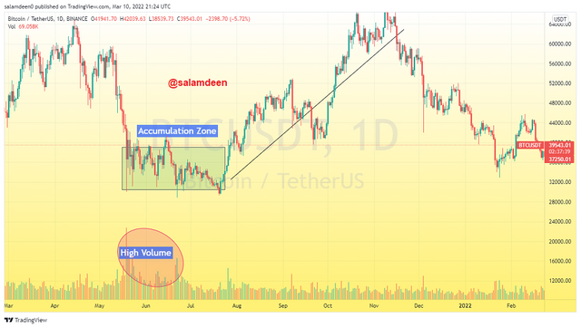
High Volume, Accumulation and distribution
Trading volume gives a lot of information about what is happening in the market. Higher trading volumes always show that there are a larger number of transactions in the market. If you pay attention to days with higher trading volumes, you will realize that the market always reacts in the following days. If there is high selling volume, the price of the asset will move lower and move higher if there is higher buying volume. High trading volumes usually occur at the accumulation and distribution zones.
In the accumulation and distribution zones, buying and selling soar higher. This is usually caused by the strong hands that hold larger amounts of the asset. The accumulation zone is the area where they place huge buy orders. This will increase the demand on the side of the weak hands, and this will be accompanied by higher trading volumes as an indication that there is cash flow in the market.
The increase in demand will drive the price higher, and they will be able to exit the market to realize their profit by selling what they have accumulated at higher prices. This represents the distribution zone, and it is also accompanied by higher trading volume on the bid side. The price is expected to move lower after the distribution zone as most of the weak hands will be motivated to exit their positions.
We can use the volume indicator on the chart to display the reaction of the trading volume at the distribution and accumulation zones. You will realize that, there are high volumes in these zones. As seen in the BTC/USDT 1 day timeframe chart below, there was some accumulation around June 2021 and it was followed by a bull run to the all time high.
Screenshot from trdingview.com
The screenshot below also shows some accumulation and distribution zones identified in the ETH/USDT 1 day timeframe chart.
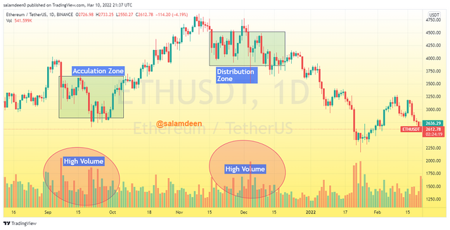
|Screenshot from trdingview.com
explains how to correctly identify a bounce and a breakout. (Screenshots required.)
When a price rises or falls to a resistance or support level, we expect a bounce or a breakout. It is critical to pay close attention to these two situations because they can provide us with information about the market's direction. The price is most likely to bounce when it hits the support or resistance level with lower trading volume because the supply and demand are high at these levels. Hence, it will need higher volume to break. If there is higher trading volume by the buyers at the resistance level, it is likely to be a breakout, but the breakout could be a false one. Hence, it is always necessary to wait for confirmation with multiple candles before entering your position.
To identify a bounce and a breakout, you first identify the support and resistance levels and then monitor the action of the price when it gets to any of these levels. The price retraces its steps and is expected to retrace after hitting the level. If it breaks it, you should confirm the breakout to know if it is a false one or a successful one.
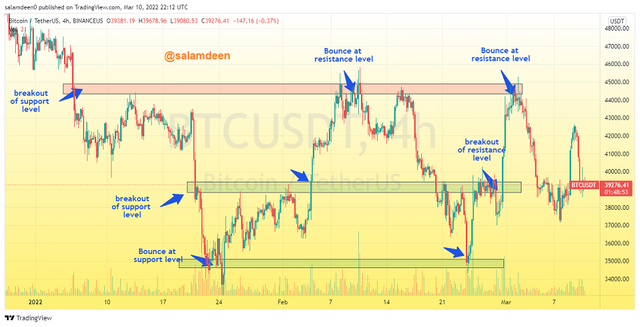
|Screenshot from trdingview.com
From the BTC/USDT 4-hours timeframe chart above, I was able to identify some bounces and breakouts of support and resistance levels.
Explain that it is a false breakout. (Screenshots required)
In most cases, a breakout of a support or resistance level could be a false one. In that case, traders who rush to enter trades will be at a disadvantage. There are some factors that may cause a false breakout. It could be low trading volume or other market sentiments. In most cases, strong hands usually fake a breakout to lure most traders into panic buying or selling. It is necessary to confirm a breakout with different strategies to filter out the market for strong signals so that you will not be lured by a false breakout.
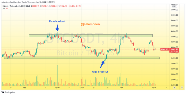
|Screenshot from trdingview.com
The chart above is the BTC/USDT 4-hours chart, and we have identified an example of a false breakout.
Explain your understanding of trend trading by following the laws of supply and demand. It also explains how to place entry and exit orders following the laws of supply and demand. (Use at least one of the methods explained.)(Screenshots required.)
Trend trading is basically trading based on the direction of the market. We can use the laws of demand and supply in trend trading for profitable trades. When the price is going lower, it means the supply is currently high, hence the volume indicator will show bearish higher volume. If the price is in an uptrend, it means demand is currently higher than supply, and the volume indicator will show bullish high trading volume. We can use this idea to get trading opportunities in either bullish or bearish markets.
In his lecture, the professor @nane15 demonstrated how to enter a trend trading trade using Elliott waves. With the Elliot waves, we monitor the market in a trend, and when the trend begins to weaken, we can apply the three waves a, b, and c by following the rules of the Elliot waves theory. If we draw wave "c" and it is observed to have broken the high or low formed by waves "a" and "b", we then observe the volume to confirm the trend. The volume formed at wave "c" is expected to be lower than the volume at wave "a". If all these requirements are met, you can set your entry after the breakout, and the stop loss should be set below the previous low. If it is a long trade, the take profit can be set at the nearest support or resistance level.
In the example below, it can be seen that the downtrend weakened and there was a retracement in the upward direction. I drew the three waves, a, b, and c. As the line of wave "c" broke the previous low, I confirmed with the volume that my entry was set near the breakout with a stop loss at the previous low and a take profit at the next major resistance level. That is a risk-reward ratio of 1:1.
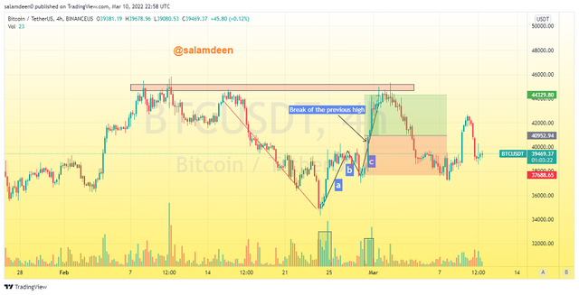
|Screenshot from trdingview.com
Open a live trade where you use at least one of the methods explained in the class. (Screenshots of the verified account are required.)
I opened a spot trade in my gate.io spot account.
Trade entry, I used the Elliot waves theory in addition to the high volume strategy. My entry was set as the price broke the previous high at wave c as seen in the screenshot below. The volume at wave "a" is higher than the volume at "a" and this complies with the strategy.
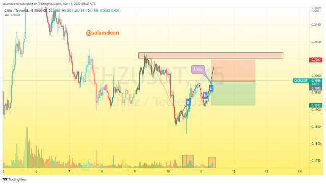
|Screenshot from trdingview.com
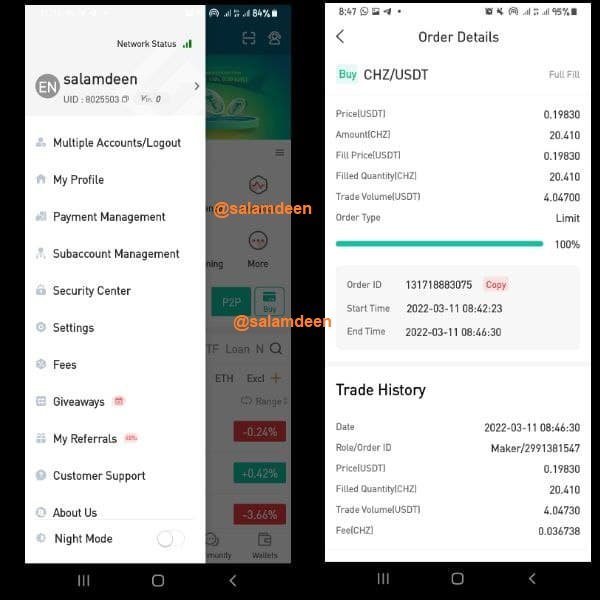
|Screenshot from Gate.io exchange
Conclusion
Professor @nane15 introduced us to some of the basics of the crypto trading which are very important. I have leant a lot about the basics through my research for this assignment even though the class was a long one and the assignment was a bit loaded and we were able to gain significant knowledge from the lecture. All thanks to professor @nane15 for this lecture, waiting patiently for the subsequent lectures.