EFFECTIVE TREADING STRATEGY USING LINE CHART, STEEMIT CRYPTO ACADEMY S6W1 HOME-WORK POST FOR @DILCHAMO.
INTRODUCTION

Trading overall in the Crypto space requires lots of professionalism by this cryptocurrency trading is very volatile, in the world today trading had taken center tole regarding the espanciation of money making online, although different countries around the world bound Crypto currency exchange using various designated exchanges but one good benefit of cryptocurrency is the it is basically decentralized, meaning it can't be controlled by anyone.
Crypto trading comes with lots of benefits considering Large number of persons acessing the market overall, first before trades are been carried out you have some bid ask spreads this are the prices you pay for buying or selling a Crypto tokens, and the charge the liquidity providers makes, by this I mean you pay some Price before executing your order.
Prices in the market are determined by charts which shows movements of prices in the market, this is triggered by candle-stick chats at which can be used to read movements of prices of an assets in the market overall, this brings us to today topic of discussion Line chart.
Define Line charts in your own words and Identify the uses of Line charts.
As a crypto trader we have various types of charts and line chart happens to be one among all, line chart to simply put is the basics among various types of Crypto chart it is basically used to achieving a basics of getting information that changes over time.
On how crypto close price depends on the viscocity of the line chart as it shows only closing price alone, it basically operates on double scale's which are the logarithmic and linear scales.
in the trading field you need good analysis to determine your Profit level of success for me I depends on analysis not forecasting, this has helped me over the years I advice you reading this post to follow suit.
Linear chart
Just as I stated earlier that line chart posesses two various scales, here I will highlight what linear Chart entails, here there is a bisection courtesy price scale into two equal halves scaled courtesy the moderlity of the changes, now let's say there is a change in two price they both will surely be represented using the same shift.
Using Linear chart one can easily see the speed at which price of an assets changes with time, but with the use of log charts trust me trends are seen very clearly in open terms, as a cryptocurrency trader I basically look at both Linear chart, and log chart, it assists me boost my Profit maximization.

Logarithmic chart
This type of chart assist you see the volume of price as it moves in the market below the down part of the Crypto chart, one thing to note about volume is that it identifies the total amount of coins officially been traded at a particular period of time.
When you consider volume it gives you a straight forward insight courtesy Crypto price phase thereby knowing the near exact point where price might retrace to, now let's say a particular price of a coin A, increases in volume, what it means is that various traders have gained intrest in the said coin and invested in it.

At that point coin A price will surely surge up, immediately the volume of coin A, becomes low then there will be a decrease always remember that not everyone buys and sells cryptocurrencies.
These are the two various types of charts we also have our very popular candle-stick charts but I won't go into that since it wasn't stated from the question.
Uses of line chart stated
Line chart is used in plotting the closing price of any selected Crypto pairs regarding the timeframe selected by the trader.
With line chart you can easily represent visually what happens to Crypto price regarding the trading session chosen, line chart shows only the closing price data, in here you can easily detect Trend.
Line chart is used to determine Support and resistance zones in a trending market, a zone where downtrend is assumed can thus become your support zone, this is triggered by demands and supply.
- Line chart is used to spot good trading opportunities as it doesn't require reading of candle-sticks, it gives a great Insight to determine strategic chart formations in the market overall.
How to Identify Support and Resistance levels using Line Charts (Demonstrate with screenshots)
When we talk about Support and resistance we are basically talking about Levels on a price chart at which market retraces to, Support and resistance levels limits market ranges in the market overall, the Support level seems to be at the down part while the resistance is at the top in a chart.
The both levels are in existence courtesy supply and demand let's say we have enough buyers than sellers at that point market will surely surge up, (bullish), vice versa, just as the question demand identifying Support and resistance levels using line chart, the steps will surely be demonstrated keep reading and see how it goes.

You will agree with me that price doesn't just go higher without little retracements, regarding the incoming chart formations, when price hits either the Support or resistance levels it makes it pretty reliable for price forcasting and Analysis.
The both levels of support and resistance has a massive potentials, looking at the Support level when price gets there you look for buying opportunities, and when price gets to the resistance level you look for selling opportunities.
The market overall is triggered by supply and demand, meaning when more people buys a market it tends to go bullish, now let's say market was buying from Support level when it gets to the resistance levels buyers begins to take their profits,
at this point at the resistance level you don't place a buy order again instead you sell, because buyers have begin to gets exhausted, sellers will surely take advantage. Things to consider in identifying key Support and resistance levels.
Identify previous Zones: Now identifying Support and resistance levels there are things you needs to know regarding this, first you need know your previous zones, they are very useful, the zones tells you the actual place that market will retrace to validating it as to been Support or resistance zones.
Knowing the previous zones gives the insight at to where you can make your entry and exit buys in the market, major Support and resistance levels are of an exact figures since market reverses it's difficult to reach the exact point as it did previously so identifying the zones for Analysis helps in determining strategic support and resistance levels.
Historical price data: historical price data gives you an insight as to previous market formations/patterns, when market is forming series of high's and lows gives you a clear indication where market is heading to big time.
Technical analysis believe that trends repeat itself in the market overall so in here history is seen as a Basic tool for determining trends.

The various retracements might be minimal sometimes too we see market consolidating after a while we have a breakout to Uptrend or Downtrend, all still boils down to market structures and formations, with this one can easily identify Support and resistance zones easily.
Differentiate between line charts and Candlestick charts.( Demonstrate with screenshots)
Both line chart and candle-stick charts are all basic concept on how market moves, looking at the various names line chart and candle-stick charts with the names you can easily get an insight on what the both charts actually means.
Candle-stick charts shows various formations with the aid of various candle-stick formations to determine the various moves in the market, by this I mean one can easily read various candle-stick and know what is about happening in the market overall.
Line chart gives you a line structure as to market shape trying to occur, along the process one can easily determine various Support and resistance levels in the market over a chosen period of time, here I will demonstrate using screenshot the difference that exists between line chart and candle-stick charts.


Difference between Line chart and candle-stick chart
Everything that is good basically has its various differences, here I will split out the various differences that exists between line chart and candle-stick charts.
| Line chart | Candle-stick charts. |
|---|---|
| Line chart creates room for representing asset's graphically by do doing there is a great changes over time. | Candle-stick chart enables traders to manage their emotions thereby reading the various candle-sticks to determine what happens next in the market overall. |
| Line chart gives room for immense changes courtesy prices of various securities, in here great values are seen represented in great dimension. | Candle-stick charts indicates four basic prices, which are the open, close, high, and low, through this traders can easily be specific as a result of their analysis. |
| Line graph provides great insight and information courtesy the technical field of analysis as trader's can easily Analyze market moves clearly. | Using candle-stick one can easily know the movement of assets in the market overall, as a result of previous charts formations. |
| In line graph one basic objective is connecting individual data point together at that point quantitative values are known/specified. | Candle-stick patter makes it very obvious to note the various market structures and leverage on the newly occuring patterns. |
Explain the other Suitable indicators that can be used with Line charts.(Demonstrate with screenshots)
Using an indicator with line chart is fantastic, with the aid of an indicator line Chart shows you the phase at which the market is heading to by so doing you can easily identify your support and resistance levels
At the time of writting this post you will agree with me that we have more than 300 types of Indicators in the trading field today, most Indicators are lagging Indicator's and provides wrong trading signals.
At this point I will categorically tell you that no Indicator is 100% sure, remember Indicator moves as price moves in the market overall, one major thing about an indicator is that it gives you the insight regarding executing your buy and sell orders.
With all what I have explained about an indicator I will add RSI Indicator to a line chart, let's see how this gesture unfolds, keep reading and enjoy how this works.


Looking at the both chart I added various Indicators to then, first one I added the RSI Indicator, the second one I added multiple Indicators that is confluence trading, just to making sure I have two Indicators to confirm trend.
Prove your Understanding of Bullish and Bearish Trading opportunities using Line charts. (Demonstrate with screenshots)
Trading has to do with buying and selling opportunities which is categorically been divided to Bullish and bearish which means uptrend and downtrend, one moderlity of trading is the ability to buy on a low and make Profit on a high by this you buy at the support zone after your analysis them price goes up.
The key thing here is how to identify bullish and bearish, which basically depends on Uptrend and downtrend, just as the question demands, using line chart I will surely detect Bullish and bearish trading opportunities and what happens in the end.
Bullish trading opportunity
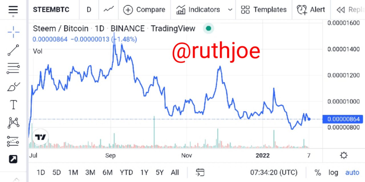
Determining bullish trading opportunity first we consider the occuring line chart formations, looking at the chart since lime chart represents assets graphically we have this below, take a look at it very well.

In simple terms I will say bull means buy and bear means sell, so looking to Proof this we determine bullish and bearish phase in a chart with the assistant of Support and resistance levels, when that is noted we move on to the chart representation graphically.
Now looking at the chart above you will agree with me that there are series of higher-highs, higher-lows formations, these formations are means that market are in bull phase, which officially is triggered by supply and demand.
Bearish trading opportunity
In this regard I see bear as sell, which means bearish phase shows us the selling aspect which is practically opposite of Bullish, we sell assets when market has hit high that is basically a resistance level, remember you don't buy at the resistance level reason been that many traders at that zone takes Profit at that point.

This is a pure bear phase which must be triggered with a sell options, looking at the chart price is in downtrend Bearish phase this creates room for massive sell options, back to what I said earlier, you do not buy at the resistance level, you look for sell options.
Buy and sell of any assets pairs are basically triggered by supply and demands, this means more people are selling the market that is why it is going down, you as a single entity can't drag the market up, at this the market is drastically represented graphically this made us understand more better.
With the trend-line it gives a clear view on when a trend will be over, despite the retracements, trend-line helps identify rising and falling wedge as seeing in the both examples given by me, when officially the trend-line is broken then a new trend is imminent.
Investigate the Advantages and Disadvantages of Line charts according to your Knowledge.
I have talked and analyzed massively about line chart at this point out people says anything that has advantage also have disadvantage, just as the question demands I will highlight the various Advantages and disadvantages of crypto line chart.
| Advantages | Disadvantages |
|---|---|
| With the use of line chart traders can easily identify trends since everything is represented graphically, by this line chart shows plethora of dated informations over a specific time interval. | Traders with emmerse Analysis at a point can get totally confused since the chart is represented graphically, this can lead to creating false signals with the help of a lagging Indicator in use at a specific time period. |
| With line charts traders can easily identify strategic formations in the market, by so doing key Support and resistance levels are discovered | Line chart only displays closing prices of an assets limiting traders the ability to access the open, close, high, and low, of a particular assets over a specified time intervals. |
| Line chart displays vital information that changes courtesy a designated time interval with the help of graphs associated with lines. | line chart connects various series in a straight line, but for trader's which Analysis alot will have obstruction since everything is graphically represented. |
According to my knowledge about lime chart I came to conclusions that biginers in the trading field should first start their practice with line chart as it will give then massive room for immerse Analysis before jumping to our popular Japanese candle-stick charts.
Note lime chart in this regard are basically constructed by hand, or with the use of software, in here Microsoft Excel can be used or Google sheet, when that fate has been Achieved it will thus improve the speed regarding the end product.
Conclusion.
Thank you very much professor @dilchamo for this wonderful lecture presented by you, I really appreciate you for this, in general I understood that line chart shows information that changes over time, you plot series of points connected with a line, by this line chart is represented graphically.
With line chart one can easily see changes overtime a specific time period, the horizontal axis in my own opinion is basically seen as a time scale, the types of line charts are as follows
Simple line chart, multiple line chart, and compound line chart, all showing closing prices of an assets.Thank you once again professor, please Note aside the screenshot sourced the other screenshot used courtesy the home-work task was the author's own work thank you for your understanding.
Cc;@dilchamo.