A Beginner's Guide to Candlestick Charts
I am Benedict Raphael!
Am a cryptocurrency trader and also an Ambassador of CoinEx Exchange.
As a successful trader, I want to impact some knowledge unto those that are beginner in the industry especially the new users of CoinEx. Today, I want us to emphasize more on candlestick charts. In this article, I will give a brief introduction of Candlestick, what Candlestick is all about, how Candlestick works, how to read Candlestick and everything we need to know as a newbie in the crypto market.
Introduction
Trading cryptocurrency is never an easy task as many could be thoughts. It takes a lot of time, knowledge and dedication to know how to trade cryptocurrency. One fact about trading cryptocurrency is that "it is either you win or you lose"; markets always move up and down,but if you have the basic knowledge about trading, you will mostly be on the winning side. No one will talk about crypto trading without talking of candlestick; the candlestick is the tool that shows the direction of how the market has gone so far and its possible future direction. However, reading crypto candlestick charts is not easy for the majority of the crypto traders, especially the newbies. So as a good Ambassador of CoinEx Exchange and for the love I have for those that will be joining a trading business, I will use this opportunity to share the basic knowledge about candlestick to you all. Please take your time to read this article very well because once you grab the knowledge and know how to read the candlestick chart, you will be a successful trader.
What is a candlestick chart?
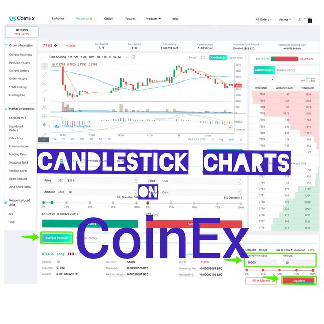
The candlestick chart is a financial graph showing the price movement of a digital asset at a given specific time. The candlestick charts are visually representing the movement of the price moves with different colors. The candlestick charts are useful for making trading decisions by considering its usual occurring patterns to analyze the direction of the price. It is what shows us how the price has gone so far at a given timeframe. Candlestick represents the virtual amount/price of an asset in a particular seconds, minutes, and years.
The idea of candlestick came into existence from a Japanese rice trader called Homma back then in the 17th century. Ever since then, the idea has been refined and modernized by some technical analysts to the recent candlestick chart of what we are seeing today. There are so many technical analysts that contributed to this development but one notable man among them is Charles Dow, popularly known as the fathers of modern technical analysis.
Candlestick charts could be used in analyzing the price of commodity or other data but currently, it is mostly used in analysing the financial markets. Candlestick charts are used by traders to measure and work on the probability outcomes of the price movement of an asset. The candlestick chart is now a tool used by traders to reckon their own idea of how the price movement of an asset at a particular time frame.
*Some Key Points of Candlestick Charts
The digital asset traders do use candlestick charts to forecast the possible price movement by actually considering the past patterns.
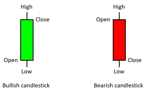
The candlestick chart shows us the open, close, low and high price of an asset within the timeframe the trader specifies.
The candlestick charts are useful for doing the technical analysis of the price movement of an asset. Many algorithms about an asset we do see today were extracted from the same price information gotten from the candlestick charts.
Components of Candlestick Charts
- Open
Open represent the first set down trading price of an asset within a particular timeframe
- High
High here is the highest recorded trading price of the asset for a certain timeframe.
- Low
Low is the lowest recorded trading price of the asset for a certain timeframe.
- Close
Close is the last recorded trading price of the asset within a certain timeframe.
Candlestick analysis
The 'Open', 'High', 'Low', and 'Close' are data they are collectively tagged as the OHLC values. The candlestick charts do take different shapes and these shapes are determined by the relationship between the open, high, low, and close (OHLC) values.
There are some other terms I want us to know
BODY: The body is the distance between the Open and Close points
UPPER SHADOW: This is the distance between the High and Close
LOWER SHADOW: This is the distance between the Open and Low
WICK: Is the distance between the body and the High/Low.
Generally, the distance between the High and Low is called the range of the candlestick.
HOW TO READ CANDLESTICK CHARTS
For anyone to be able to read the candlestick charts, he/she must first understand all those terms I listed above. Frankly speaking, candlestick charts might look simple at the sight but it is not easy to read. To read a candlestick chart is more of the conventional bar and line charts we do see. Once you master yourself with how to read candlestick charts, you will be able to glance at a chart and tell yourself what it represents and how the price has been moving.
Practically, the candlestick do display the battle between bulls and bears market for a certain timeframe. For the sake of beginners that might be reading this article, Bull is when the crypto market is going up (increasing in value), while bear is when the crypto market is coming down (decreasing in value). The 'Body' represents an intense buying or selling at a particular period. So if you see a long 'Body' of the candlestick, it means there is intensive buying or selling pressure for that certain timeframe. Meanwhile, if the wicks on the candle are short, the High or Low of the certain period was near the closing price.
For the modern candlestick, the green represents the bull market while the red represents the bear market.
If the "body of the candlestick" is green, it means the asset closed higher than it opened i.e the price moved up during the measure timeframe.
If the "body of the candlestick" is red, it means that the price moved down during the measured timeframe, so the close was lower than the open.
Basic Candlestick Patterns
There are so many candlestick patterns, it usually moves up, down or randomly in accordance with the price movement. Understanding the pattern will help a trader to analyze the direction of the price of the asset. The candlestick patterns are divided into bullish and bearish. The bullish patterns of a candlestick shows that there are tendencies that the price will likely rise, while bearish patterns of a candlestick shows that there are tendencies that the price is likely to fall.
Below are the patterns ...
- Bearish Engulfing Pattern
The bearish engulfing pattern occurs in an uptrend when the number of sellers is more than the number of buyers. A situation like this will gradually decline the price. It reflects on the chat with a long red body engulfing a small green body.
Let flashbacks to the law of demand and supply; once the supplier is greater than the people in demand, the suppliers won't have options than to sell cheap. This is exactly what happened on the bearish engulfing patterns.
- Bullish Engulfing Pattern
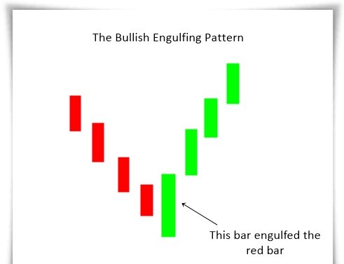
The bullish engulfing pattern occurs when the number of buyers is more than the number of sellers. Also, the Bullish engulfing pattern reflects in the chart by a long green body engulfing a small red body. The buyers do control the market at this stage and the price will likely go up.
- Bearish Evening Star
The bearish evening star pattern is a topping pattern. The bearish evening star is usually identified by the last candle in the pattern opening below the initial small body. The small body in this scenario can be either green or red. The candlestick chart here shows that there is a stalling of buyers while the sellers taking control of the market.
- Bearish Harami
The bearish harami of candlestick charts is the small red body inside the previous long green body. This scenario is telling us that there is still indecision on the buyer's side.
- Bullish Harami
The bullish harami candlestick is the opposite of bearish harami. It is the small green body inside the previous long red body. This a pausing period i.e price is not going up nor coming down. However, if the same scenario occurs in the following days, then we should expect the price to rise in the future.
- Bearish Harami Cross
The bearish harami cross of a candlestick occurs where an uptrend where a candlestick has a virtually equal open and close. The bearish harami cross has the same implication as that of bearish harami.
- Bullish Harami Cross
While the bearish harami cross occurs at uptrend, the bullish harami cross occurs in a downtrend. It occurs where a down candle is followed by where a candlestick has a virtually equal open and close (it is popularly known as doji). It also has the same implication as that of bullish harami.
- Bullish Rising Three
The bullish rising three pattern starts out with a "long white day." Then, after the 2nd, 3rd and 4th session of trading, a small body move the price lower, but the price will still stay within the range of the long white day. In this scenario, the price keep falling for 3 straight days, but the wise traders will be ready for the next move.
- Bearish Falling Three
The bearish falling pattern occurs after a long down day, then followed by three small bodies. This pattern shows that the sellers are back in control of the market price and there tendency that price might go down.
WHAT CANDLESTICK CHARTS DON'T TELL YOU
Some think the candlestick gives the full comprehensive analysis of the market, but that is wrong; rather the candlesticks only give the general idea of price action or movement. Have at the back of your mind that candlesticks don't show nor illustrate the occurrences that take place between the 'Open' and 'Close', rather it only shows the distance between the two points coupled with the highest and lowest prices.
Again, the "Wicks of the candlestick" does not tell us which happened first, rather it only tells us the high and low in a given timeframe.
CONCLUSION
As a cryptocurrency trader or investors, the candlestick charts are the most paramount fundamental tools you should take into consideration. The candlestick charts help to provide the visual representation of the price movement of an asset at a given timeframe. It also makes things flexible for traders to analyze the data of an asset at a different point of time.
If you want to have an edge in the crypto market, you need to extensively study the candlestick charts and its patterns. Once you master it, work a little bit on your emotion and mindset, then you will see yourself doing absolutely well while trading. Additionally, fundamental analysis is also important while talking of trading. Put all together and I promise you will excel in the crypto industry as a trader or investor.
Do you know that you can be enjoying all these knowledge free by being a CoinEx user,
Sign up on CoinEx and start enjoying those free knowledge
https://www.coinex.com
You can also join the CoinEx Telegram group for more interaction
https://t.me/CoinExOfficialENG

.jpeg)

.png)
.jpeg)

.png)
.png)
.png)
.jpeg)
.jpeg)
.png)