Effective Trading Strategy using Line Charts -Steemit Crypto Academy | S6W1 | Homework Post for @dilchamo
Hello Everyone,

Lets get started...
Question1
Define Line charts in your own words and Identify the uses of Line charts.
Line chart is a graphical representation of data over a continues time span. The data values are plotted on a graph which are connected in a line form. The line chart is an important tool for traders which helps to determine the reaction of supply and demand, and other details of an asset. It gives traders the opportunity to use past price movement to determine future prices using technical analysis.
One of the main reason why most traders prefer the line chart is its simplicity to read and understand. It doesn't contain other detailed and complex information which makes it easier for people with less knowledge and experience about technical analysis to read and understand what's happing in the market.
Uses Of The Line Chart
1. Simplicity
The most reason why its widely used is because how simple and easily the chart can be interpreted. It tends to avoid details like opening and closing price which interest the unexperienced traders to understand the price movement much better.
2. Identifying Resistance and Support
The line chart is one of the most easiest way to spot and identify support and resistance of an asset. It has no details that will interfere on the chart like the candle stick chart that has open and close price. Line charts give us better and clear understanding on what's happening in the market
Question 2
How to Identify Support and Resistance levels using Line Charts
Before you draw your support or resistance make sure to have at least two-price point to which your horizontal trendline will be placed on. These price point can be identified when an obvious swing high or swing low price movement occur. These swing highs and swing lows occur when there is a buying pressure and selling pressure. Support and resistance bounce back price movement but it then does the opposite in some cases thus gets broken.
Support and resistance can be easily be identified in a line chart if and when there are 2 or more swing high or swing low which hits the same spots horizontally, correlating to the current price.
Most traders tend to buy assets at the support level because price always tend to reverse in an uptrend at the support level. Mind you, the price of an asset doesn't always make a reverse turn in an uptrend sometimes it breaks the support and dip. Due to this, the support level is used as management risk by setting takeout profit just immediately below the support level. Below is an example of the support level in a line chart.

TradingView
From the chart SHIBUSD above, I used 1 hours chart and we can see that the support level was on $0.00000669 mark to which multiple price mark hit on and bounced back in an uptrend.
The resistance level is when they are more sellers than buyers in the market. The price of the asset reverse in a downtrend after hitting the resistance level but it also sometimes breakthrough the resistance level in an uptrend. This is because traders sell their assets to takeout their profits.

TradingView
We can see from the chart, the resistance level is in the $0.00000631 mark with about 3 price point hitting the horizontal line and bouncing back in a downtrend.
Question 3
Differentiate between line charts and Candlestick charts.
The Candlestick is a chart that shows the highs, lows, open and close of an asset in a given time period. This relevant information helps a trader to better understand the markets much better when performing technical analysis. It can be viewed in minutes, hourly, daily, monthly and yearly. The candlestick is originated from Japan years ago by traders to check on market prices on a daily basis. This candlestick is mostly used by the experienced trader to make a deeper technical analysis unlike the line chart which only shows the price only.

TradingView
From the image above, we see that each candle stick is represented by either green color or red color. The green represent a bullish trend while the red represent in a bearish trend. However in some platforms traders have the chance to change the color they wish to represent. Below is the detailed features of each candle stick in a candlestick chart.

Google
Since not all traders are experienced and can use the candle stick pattern, the line chart helps to understand the market. It is simply represented in a line form by omitting some asset price information. The line chart is formed by connecting the closing prices of an asset. Just like the candlestick charts, line chart can be viewed in minutes, hourly, daily etc.

Question 4
Explain the other Suitable indicators that can be used with Line charts.
The Relative Strength Index is a momentum indicator which is used in technical analysis. It is used to determine recent price changes to evaluate overbought or oversold and sometimes balanced market. The RSI indicator is read from 0 - 100 such that when price below 30 it is considered that the market is in oversold so therefore should expect a bullish reversal. Also the movement of price above 70 indicates that the asset in the market is overbought or overvalued so a bearish reversal should be expected. The RSI momentum indicator is not perfect or 100% efficient so its always advised to use with caution or use other indicators as well to confirm signals. Most indicators once in a while has the ability to give false signals.

The RSI indicator can be used in a line chart to make technical analysis. The RSI have to determine if the price of the asset is overbought or oversold. In oversold the price tend to break through the resistance level while in overbought the price breaks the support level. An overbought means there are more buyers in the market which makes the price move in an uptrend while oversold means there are more sellers in the market.
Question 5
Prove your Understanding of Bullish and Bearish Trading opportunities using Line charts.
It is important to determine the trend of the market ti which it id directed towards so that they can get to capitalize on it to make profit out of it. It doesn't really matter either uptrend or downtrend either ways trader can make profit out of them.
As discussed earlier, when a price of an asset is below 30, it means it's oversold and therefore should be expecting a trend reversal in an uptrend. Likewise when the price is above 70 which indicates the price is overbought and should be expecting a trend reversal thus in a downtrend.

TradingView
In the image above, I used the RSI indicator which shows that the price is oversold and therefore I should be expecting a price reversal. At this point, I placed my entry point and and also placed my takeout profit just below the resistance level. We should note that for a bullish trend to workout perfectly fine, there shouldn't be any breakout of price on the support level.
From the diagram below, we can see from the indicator the price of the asset has been overbought and so the next thing we would expect is a trend reversal which is going to be in a bearish trend. So therefore, is wise to set our stop loss immediately we see that indicator indicates an overbought and re-enter the market after the reversal to minimize our loss. Also note that for this to work, the price must not breakout the resistance level at any given point in recent price.

TradingView
Question 6
Advantages and Disadvantages of Line Chart
The line chart is easier to read and interpret . It is suitable for beginners since it has no complicated details attached to it.
The line chart makes it easier to determine our support and resistance level since is in a single line and can clearly see our high and low swing points.
The line chart uses only the closing point which tends to filter out noise for easy interpretation.
The line chart filter out details about the price of an asset which can used by the experience traders to make their analysis more accurate.
It is suitable for longer time frames and not suitable for short term trades when the market is too noisy.
It depends on indicators to make a proper technical analysis since it has no details of the price of the asset.
Both the candlestick and line chart are both good charts. Every trader have their preference and which of them suit his or her style of trading or how experience they are with any of the chart.
Personally, I use the line chart just to check on the price of an asset. For example when i'm in the class and i want check on how steem is performing. In the other hand i use candlestick chart when I want to analyze the price of an asset in the next hours or weeks.
@roma078 - you do not qualify for #club75 so do not include the tag.
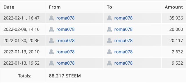
I according to the rules I am qualified. I haven’t made a transfer-out for the past month and powered up 88 steem. Matter of fact I am qualified for #club100. Please check again @steemcurator02
#club75 is set from 13th December to 13 February (two month period). And your power ups should be 3x your cashouts
Thank you 🙏.
Thanks a lot. Please can you get me the link to that rule ?