Data Visualization using Python's Matplotlib Library
Matplotlib is an open source Python plotting library. It is written by John D.Hunter and has an active development community.
Matplotlib produces publication quality figures in Python scripts, IPython shell, Jupyter notebook, web applications and several gui toolkits. Using this we can generate variety of charts like plots, histograms, barcharts, scatter plots, error plots etc.
One of the most popular used case of Matplotlib is for data analysis and visulation.
In this tutorial, I'll show how we can use Matplotlib for creating line charts, bar charts, pie charts and donut charts.
What this tutorial covers ?
Difficulty
- Basic
Installation
Matplotlib requires pyparsing, cycler, numpy and pytz libraries for installation. Matplotlib and all of its dependencies can be installed using pip.
pip install matplotlib
Verify if it is properly installed by importing matplotlib.
import matplotlib
Creating a Line Charts
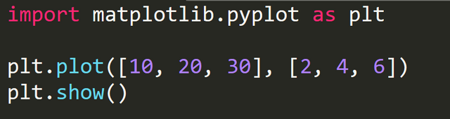
The below three line of code generates a simple line chart.
- In the above code we import
matplotlib.pyplotmodule aspltfor plotting the chart.
import matplotlib.pyplot as plt
The plt.plot(X, Y) plots the data to a canvas in the computer's memory.
In the above example:
X = [10, 20, 30]
Y = [2, 4, 6]
plt.plot([10, 20, 30], [2, 4, 6])
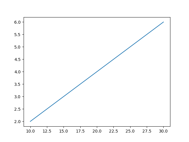
- The plt.plot(X, Y) plots the data and stores it in computer's memory. However, it is not yet displayed. The
plt.show()displays this plot on the screen.
plt.show()
Output
The chart window has several options :
To zoom on certain area of the chart click on
 icon and select the area to zoom. The X and Y values are displayed at the bottom-right corner.
To changes several aspects of chart like left, right, top and bottom padding, click on
 icon and use the slider to change the values.
To save the chart, click on
 icon and select the location to save the file.
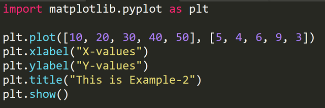
Adding Chart Title and labels
- To add a title to the chart, use
plt.title(<Title of the chart>).
plt.title("This is example-2")
- To add a label to X-axis, use
plt.xlabel(<x-axis label name>).
plt.xlabel("X-values")
- To add a label to Y-axis, use
plt.ylabel(<y-axis label name>).
plt.ylabel("Y-values")
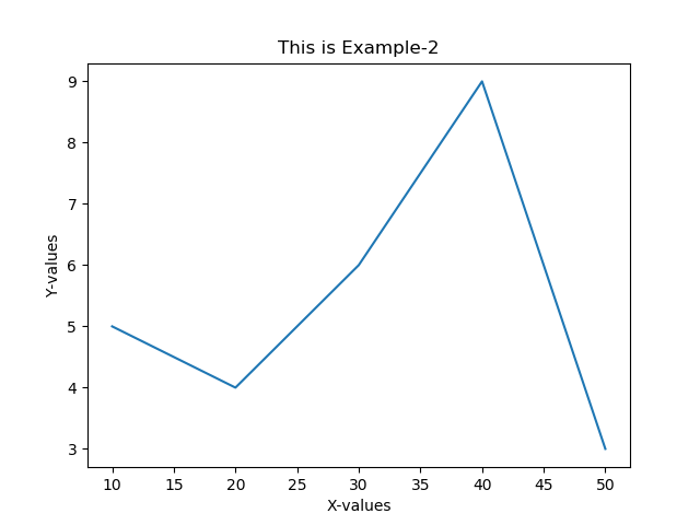
Code with X and Y labels and chart title
Output
Set Limits on X and Y axis
Use axis() function to set limit on x and y axis . The syntax is plt.axis(xmin, xmax, ymin, ymax).
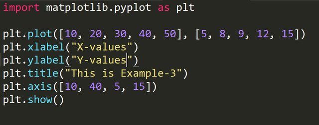
In above code we have set xmin = 10, xmax = 40, ymin = 5, ymax = 15
Output :
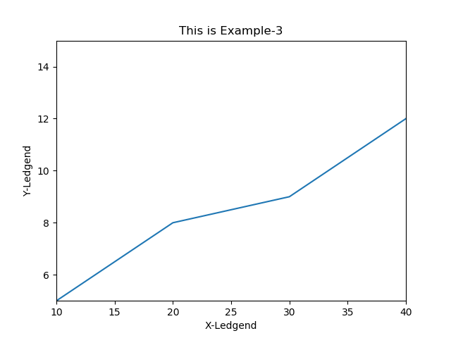
Notice since the max limit on x axis is set to 40, the value for x=50 is not plotted.
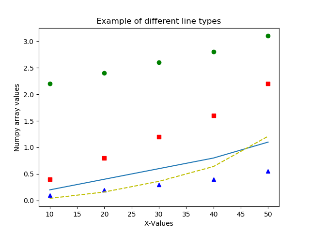
Changing line color and type
The plot() function accepts a third argument which represents the color and type. By default, it is represented by a solid blue line. The syntax is mentioned below :
plt.plot([X-values], [Y-values], 'b-'
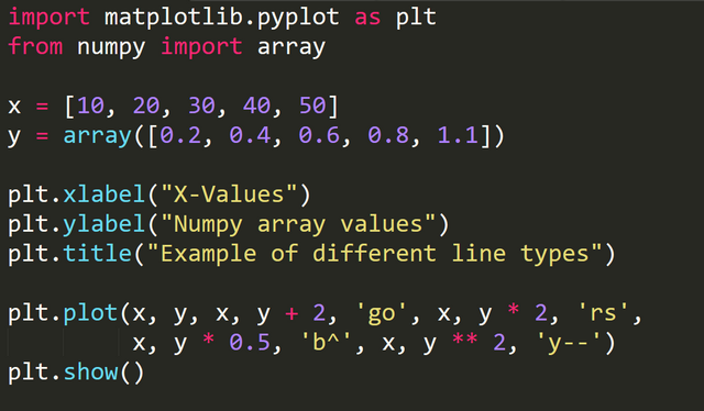
In the above code :
'go' represents a green dotted
'rs' represents a red square
'b^' represents a blue triange
'y--' represents a yellow dashes
Output:
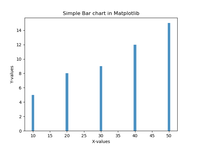
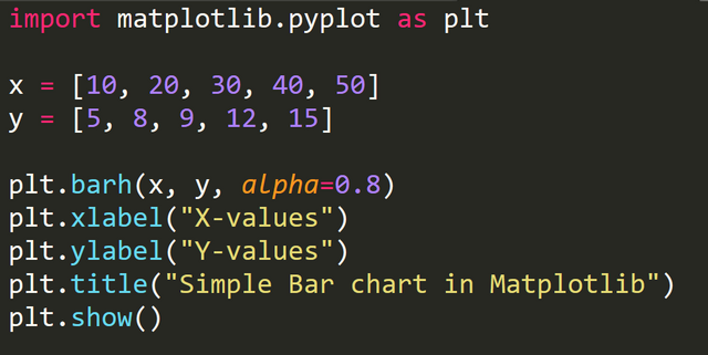
Creating Bar Charts
Bar charts are created using bar() function.
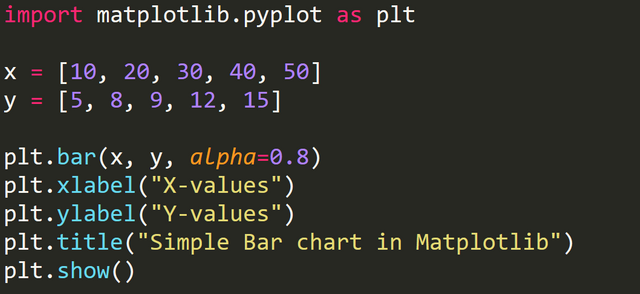
In the above code, the plt.bar(x, y, alpha=0.8) creates a bar chart based on values of x and y.
alpha=0.8 represents the opacity of the bar. The value of alpha ranges from 0 to 1.
Output
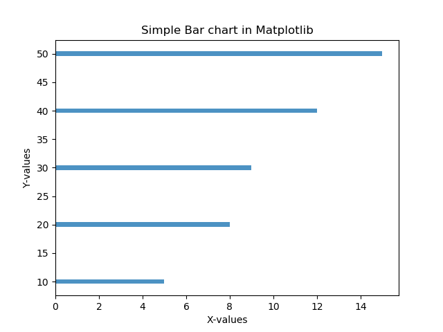
The barh() function creates a horizontal bar chart.
barh(x, y, alpha=0.8)
Output
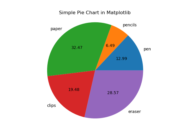
Creating Pie Charts
We can create pie chart using pie() function.
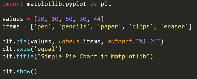
The above code, creates a pie chart based on the value of each items.
The area of whole chart represents 100% of data. The parts of the pie chart are called wedges. The area of wedges represents the percentage of each item with respect to the whole data.
By default the pie() function arranges the wedges in counter clockwise direction.
autopct parameter controls how the percentages are displayed in the wedges.
By default, the pie chart is in oval shape. To make it circular, we use plt.axis('equal').
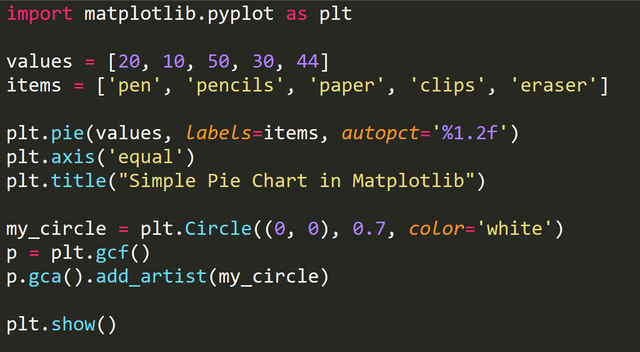
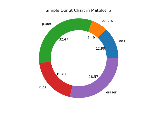
Creating Donut Charts
To create a donut chart, we first create a pie chart and impose a white circle on top of it which makes it look like a donut.
The below code creates a white circle.
my_circle = plt.Circle((0, 0), 0.7, color='white')
p = plt.gcf()
p.gca().add_artist(my_circle)
Full code to create a donut.
Output
I have covered few basic charts that can be created using Matplotlib. There are several advance charts that can be created with this awesome tool which are used for data analysis and machine learning.I'll cover few of them in my next Matplotlib tutorial.
Posted on Utopian.io - Rewarding Open Source Contributors
Thank you for the contribution. It has been approved.
You can contact us on Discord.
[utopian-moderator]
Thank you.
@originalworks
Hey @rohancmr I am @utopian-io. I have just upvoted you!
Achievements
Suggestions
Get Noticed!
Community-Driven Witness!
I am the first and only Steem Community-Driven Witness. Participate on Discord. Lets GROW TOGETHER!
Up-vote this comment to grow my power and help Open Source contributions like this one. Want to chat? Join me on Discord https://discord.gg/Pc8HG9x
Congratulations @rohancmr! You received a personal award!
Click here to view your Board
Congratulations @rohancmr! You received a personal award!
You can view your badges on your Steem Board and compare to others on the Steem Ranking
Vote for @Steemitboard as a witness to get one more award and increased upvotes!