Why logos are becoming more primitive
Absolutely everyone saw collections with the "evolution of logos". If you have not seen, then there is something like this:

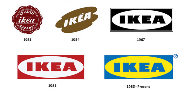
Ikea, by the way, is least indicative - the logo has not changed since 1967. But at first the dynamics are very obvious: from bizarre forms to laconism. At Adidas it is already more clear (interestingly, the name of Adolf on logo in 1949 somehow affected the conversion?):

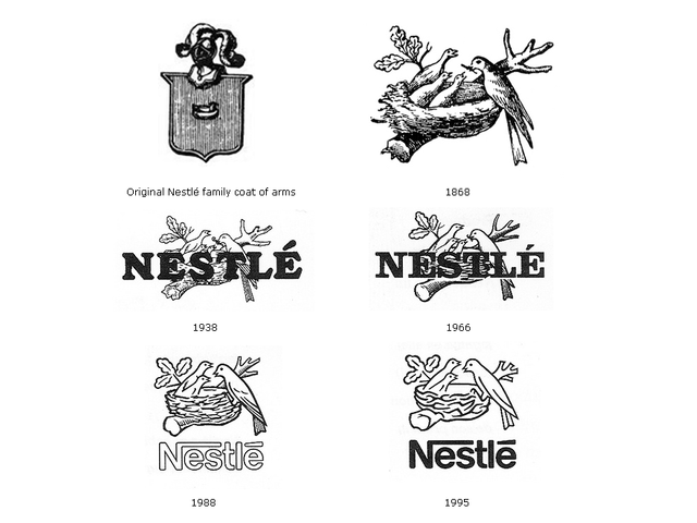
The essence is almost the same everywhere. The first variants of the beginning of the last century are complex, complex logos: several fonts, the sign itself is often a detailed realistic picture. Sometimes the origins of the logo are something that resembles a knightly coat of arms - like Nestle or Apple:

By the way, a funny detail about Nestle - in 1988, marketers conducted a study of American families and found that three children in the family - an extremely rare phenomenon. So one bird disappeared from the nest.

The Apple logo has a very revealing fate - the first qualitative leap occurred in 1977, when Rob Janov proposed the same apple. Since then the form has been preserved, only the style has changed: it is possible to trace the "glass boom" of the beginning of zero and minimalism of the modern sign.
Congratulations @robotchappie! You received a personal award!
Click here to view your Board
Congratulations @robotchappie! You received a personal award!
You can view your badges on your Steem Board and compare to others on the Steem Ranking
Vote for @Steemitboard as a witness to get one more award and increased upvotes!