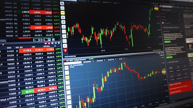
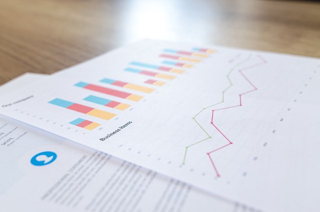
Japanese candle and normal statistical chart
Hi guys,
This is rana here and In my today’s blog I would like to talk about japanese candle and normal statistical graph. Actually I will writ about both about. will try to descrive so that people like my audience can understand the difference between both of them.
Let's have a begin...
Japanese candlesticks, also known as candlestick charts, are a popular form of technical analysis used in trading and investing. They usally gives valuable information about price movements and market sentiment over a given period of time. Candlestick charts originated in Japan in the 18th century and were used to analyze rice contracts.
Here is candles work....
Each candlestick represents a specific time period, such as 1 minute, 1 hour, or 1 day. The body of the candlestick is rectangular and represents the price range between the opening and closing prices during that period. The thin lines above and below the body are called "shadows" or "wicks" and represent the price range between the high and low prices.
Bullish and Bearish Candlesticks: Candlesticks can be classified as bullish or bearish, depending on their color. Traditionally, a bullish candlestick is represented by a white or green body, indicating that the closing price is higher than the opening price. A bearish candlestick is represented by a black or red body, indicating that the closing price is lower than the opening price.
The length of the upper and lower wicks provides information about the price range and market volatility. For example, longer upper wicks suggest that prices reached higher levels during the period but were rejected, while longer lower wicks suggest that prices reached lower levels but rebounded.
Candlestick patterns are formed by the arrangement of multiple candlesticks and can provide signals about potential trend reversals or continuations. Some common patterns include doji, hammer, shooting star, engulfing pattern, and spinning top. Traders often use these patterns in combination with other technical indicators to make trading decisions.
Candlestick charts can be viewed in various timeframes, such as minutes, hours, days, or weeks. Shorter timeframes provide more detailed information about intraday price movements, while longer timeframes show broader trends.
Japanese candlestick charts are widely used in technical analysis because they offer a visual representation of price action and help traders identify patterns and trends. However, it's important to note that candlestick analysis should be used in conjunction with other forms of analysis and risk management strategies for effective trading decisions.
There are several types of statistical graphs commonly used to represent data visually. Here are some of the most common ones:
A bar graph represents categorical data using rectangular bars. The height of each bar corresponds to the frequency or percentage of data in that category. Bar graphs are useful for comparing values between different categories.
A histogram is similar to a bar graph but is used for representing continuous data. The horizontal axis represents the range of values, divided into intervals called bins. The vertical axis represents the frequency or percentage of data falling into each bin. Histograms provide a visual representation of the distribution of data.
A line graph shows the relationship between two variables by connecting individual data points with line segments. It is often used to display trends over time or to compare multiple data series. The horizontal axis represents time or another independent variable, while the vertical axis represents the dependent variable.
A scatter plot displays the relationship between two continuous variables. Each data point is represented by a dot, and the position of the dot on the graph corresponds to the values of the variables. Scatter plots are useful for identifying patterns or correlations between variables.
A pie chart represents data as a circular graph, divided into sectors that represent different categories. The size of each sector corresponds to the proportion or percentage of data in that category. Pie charts are useful for showing the composition of a whole or comparing parts of a whole.
It displays the minimum and maximum values, the lower and upper quartiles, and the median. Box plots are useful for comparing distributions or identifying outliers.
A heatmap uses color-coding to represent the magnitude or density of data values across a two-dimensional grid. It is often used to visualize relationships or patterns in large datasets.
I have tried to describe it as my way, I think people who are reading this blog will be able to understand and I will be helpful for those persons who want to use those candle for their trading perpose.


Great article on the Japanese candle stick, love how you provided detailed explanation of this and even how the candles stick works.
You did good
Japanese candle and normal statistical chart is a great content.
This is an educational content on Japanese candlestick chart.
Thanks for sharing with us 😊👍