Logo for SwiftyConnect
Details
I have proposed a logo for the Swifty Connect application. It motivated me to make this logo because I think the application is good and because the logo used was one that had copyright.
SwiftyConnect is a Secure access to the Steem ecosystem via the OAuth Flow for iOS.
Benefits / Improvements
As I said above, the logo used was a copyrighted logo and could cause problems for the project. I think a logo created specifically for this application is welcome and completes the project from a visual point of view.
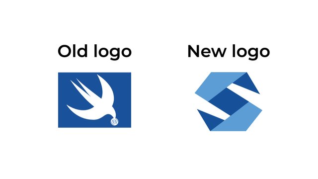
My proposal was accepted by the Project Owner and the new logo is already in use.
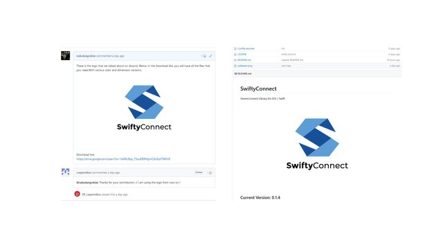
I mention that throughout the creative process I communicated with the Project Owner and presented several concepts. At the end of the discussions I stayed at the one presented.
Tools
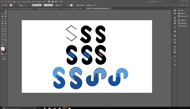
Throughout the execution I used the Adobe Illustrator program. The program is one that exports vectorial works. During the creation I was helped by the existing tools in the software.
Below I will attach screenshots to the key moments of the execution process.
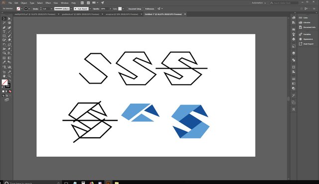
Original files
Below I will attach multiple versions of color and size, as well as the font and download link to editable files.
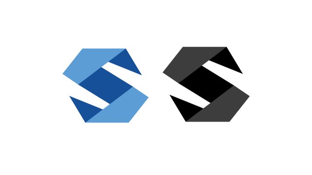
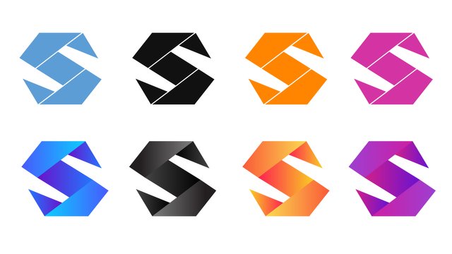
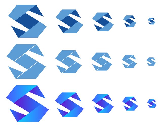
This work is licensed under a Creative Commons Attribution 4.0 International License.
Posted on Utopian.io - Rewarding Open Source Contributors
](https://steemitimages.com/640x0/https://res.cloudinary.com/hpiynhbhq/image/upload/v1521637811/rsjp4izpr6rp2fji43ir.png)
I love the redesign of the logo, the fact that you have followed the same idea of the bird as an analogy this time in the form of origami says a lot about how you conceptualize the designs. I like that you choose at the end the most neutral color palette, because the shadows removed the minimalism that characterizes your new idea. nothing more to say than
''simply, excellent ''
Thank you!
Thank you for the contribution. It has been approved.
You can contact us on Discord.
[utopian-moderator]
Thank you!
nice work! absolutely love the last gradient one with the vibrant colors. good luck!
Thank you! That's the final logo. It will be used in the project.
Yeah, the shadows in the last row of icons do make them appear more three dimensional and they look okay but I prefer the final selected design. I guess its the simplicity that I like. A flat design with the subtlety of two contrasting blues creates the illusion of depth without needing any gradient shadows. Very clever.
Hi @radudangratian
Thanks again for contacting me and creating the logos for me!
I absolutely love them ! (Especially the last one)
Hoping for a good and long connection :)
Thank you! I am glad to hear that!
Hey @radudangratian I am @utopian-io. I have just upvoted you!
Achievements
Community-Driven Witness!
I am the first and only Steem Community-Driven Witness. Participate on Discord. Lets GROW TOGETHER!
Up-vote this comment to grow my power and help Open Source contributions like this one. Want to chat? Join me on Discord https://discord.gg/Pc8HG9x
Very well done. I do like the folded paper design trend. The letter S icon part of the logo works well for the SwiftyConnect app as it looks like a bridge between two which is what the app does. You've done a good job. A huge improvement on the older one that's for sure.
Thank you!
A Origami :) i like, curious