Tutorial on Plotting by Using matplotlib Package and Giving an Example of FFT Analysis in Python #Tutorial-5
What Will I Learn?
This tutorial covers the topics on getting data from a file by using numpy package and plotting these data by using matplotlib package.
PS: If you read the tutorials which are given before, you will see that there is an importance of each tutorial and the aim will be a forming a package for Ultrafast Fiber Optics simulation.
- First of all you will learn matplotlib package and its methods such as .plot, .show, .xlabel, .ylabel, .title, .legend. These will be for line plotting. (Maybe you recognize that this is so similar to MATLAB program. If you know MATLAB, you wil understand this tutorial easily.)
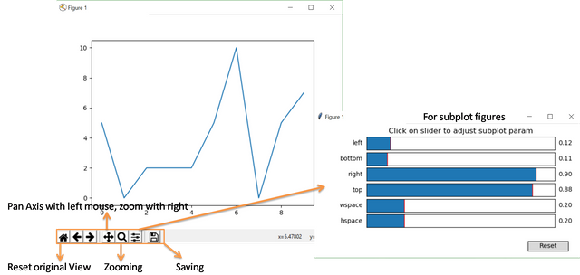
- Then you will learn usage of the bottom menu which will appear in the figure. You can easily design your fiigure.
- Then you will learn how to plot as scattering, bars and histogram briefly.
- Then you will learn how to get data from .txt
- Then you will learn usage of these data and plotting.
- At the end we will give an example of a analysis of a mathematical function which is sum of 4 different sin() and cos() functions and then we will try to analyse the frequency of each functions on a graph. To do that will use scipypackage which is a scientific program package.
Requirements
- Windows 8 or higher.
- Python 3.6.4.
- PyCharm Community Edition 2017.3.4 x64.
- Importing numpy, random2 (for Python2 you can use random package), matplotlib and scipy packages
Difficulty
This tutorial has an indermadiate level.
Tutorial Contents
Firstly, to work on numpy, matplotlib and scipy packages, we need to install these packages. To install the package we will use PyCharm Community Edition 2017.3.4 x64 and also you can find the installment of the packages in detailed in our previous tutorials (given in curriculum part).
We will start our code by importing the packages which will be used in the next parts.
import matplotlib.pyplot as plotting
import numpy as importing
from scipy.fftpack import fft
import random2
You see "as" function, this is for heritaging. It means that for each command we do not need to write matplotlib.pyplot or numpy, just we need to write plotting and importing modules respectively.
Now, we will try to explain the matplotlib package. This is a plotting package and you can plot your data in terms of line, scattering, bars and histogram. To show that we need to create two matrix (Mx1), one column is for x-axis and the other one will be for y-axis. Let's create it by using random function by using random2 package. For random number we will use .randint methods.
Yaxis=[]
for i in range(10):
    a=random2.randint(0,10)
    print(a)
    Yaxis.append(a)
.randint(a,b) where a and b is the boundaries of the random integers creates random integers.
Then we will create a Xaxis variable such as from 0 to 9 and linearly increasing;
Xaxis=[]
for i in range(10):
    a=i
    print(a)
    Xaxis.append(a)
Up to now, we just create our two (10x1) matrix now we will plot them and give title, axis name and legends.
Let's plot the data:
plotting.plot(Xaxis,Yaxis)
plotting.show()
As you see .plot method is just creating a plot but not seen. To see the plot we need to use .show method. Maybe you are confusing with plotting module. This module is just created for matplotlib.pyplot package. It helps us not to write long name. Ok, let's what we got after plotting.
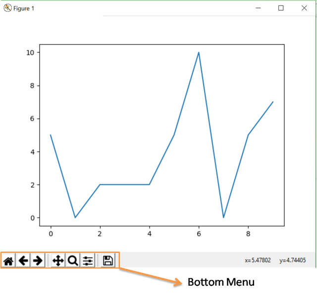
As you see we have random. Each time you will get different Yaxis values due to .randint method. Anyway, lets explain the bottom menu:
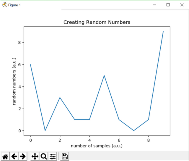
Let's move to giving title, axis name and legends. For axis names we will use .xlabel and .ylabel methods. For title we will use .title method and for legends we will use .legend() method. Let's see:
plotting.plot(Xaxis,Yaxis)
plotting.xlabel("number of samples (a.u.)")
plotting.ylabel("random numbers (a.u.)")
plotting.title("Creating Random Numbers")
plotting.show()
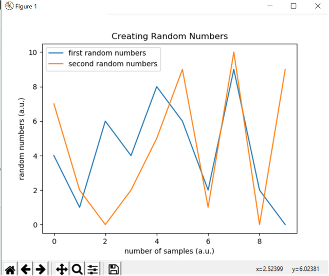
For .legend() method we can create a third matrix to understand much more. Because when we have a one row data we do not need any legend. Let's create second random matrix like before. To get legends we need to add label for our plots such that:
plotting.plot(Xaxis,Yaxis, label="first random numbers")
plotting.plot(Xaxis,Y2axis, label="second random numbers")
plotting.xlabel("number of samples (a.u.)")
plotting.ylabel("random numbers (a.u.)")
plotting.title("Creating Random Numbers")
plotting.legend()
plotting.show()
Up to now, we learnt how to plot line regime. Let's move other plotting options:
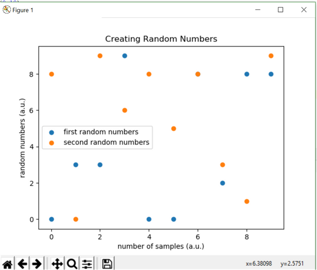
- Scattering Plot:
To do that we will use .scatter method such as;
plotting.scatter(Xaxis,Yaxis, label="first random numbers")
plotting.scatter(Xaxis,Y2axis, label="second random numbers")
plotting.xlabel("number of samples (a.u.)")
plotting.ylabel("random numbers (a.u.)")
plotting.title("Creating Random Numbers")
plotting.legend()
plotting.show()
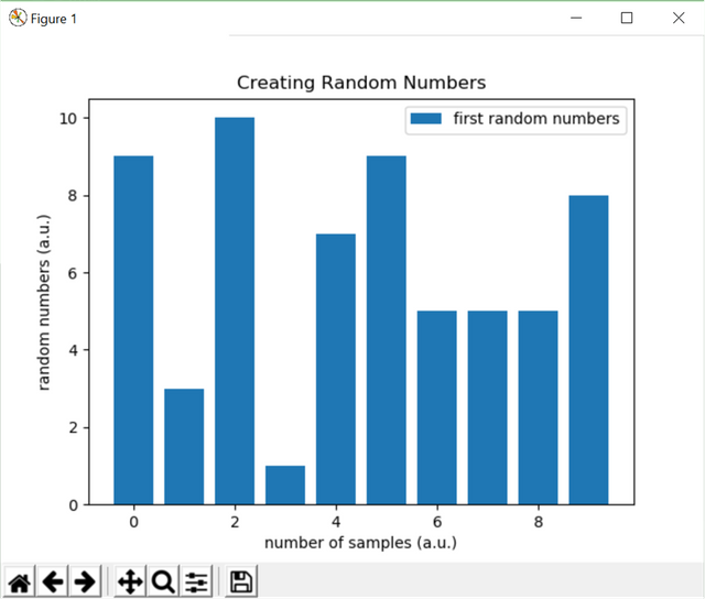
- Bars Plot:
For this plot actuall chart, we will use just one Yaxis data not to confuse such that:
plotting.bar(Xaxis,Yaxis, label="first random numbers")
#plotting.bar(Xaxis,Y2axis, label="second random numbers")
plotting.xlabel("number of samples (a.u.)")
plotting.ylabel("random numbers (a.u.)")
plotting.title("Creating Random Numbers")
plotting.legend()
plotting.show()
- Histogram Plot
For histogram, we need to give a brief information about histograms. Histograms show how many samples for each samples. For our example, we created random numbers, Yaxis, and we have a row which is increasing monotonically, Xaxis. For histograms we need a monotonically increasing row. Then we need to use this row as a Yaxis (this is not similar to line or scattering plot) because we wan to find how many samples in Yaxis for Xaxis data. Also to see the bars seperatly we give some command to .hist method such as rwidth=0.5 and you can choose your histogram type also by using histtype:
plotting.hist(Yaxis, Xaxis, histtype='bar',rwidth=0.5)
#plotting.bar(Xaxis,Y2axis, label="second random numbers")
plotting.xlabel("number of samples (a.u.)")
plotting.ylabel("random numbers (a.u.)")
plotting.title("Creating Random Numbers")
plotting.legend()
plotting.show()
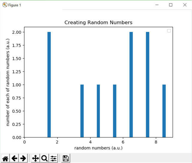
As you see the figure, there are 2 numbers between 2 and 1 which is 1 for our example, 1 number between 4 and 3 which is 3 for our example, 1 numbers between 4 and 5 which is 4 for our example, 1 numbers between 5 and 6 which is 5 for our example, 2 numbers between 6 and 7 which is 6 for our example, 2 numbers between 7 and 8 which is 7 for our example and 1 numbers between 8 and 9 which is 8 for our example. When you sum of # of numbers you will get 10 numbers.
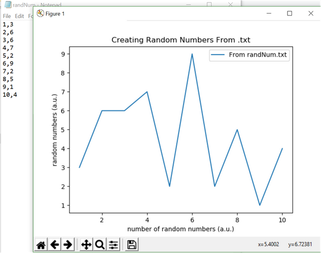
Now, let's learn how to get data from a .txt file and plot it. First of we need to create a .txt file. You can create whatever you want. Just you need to know the spacers such as "," or ":" or ";" etc. Because when yu call your function you need to tell the spacer charachter for the method.
Let's start. We created a a file which is called randNum.txt and the code is here:
Xaxis, Yaxis =importing.loadtxt('randNum.txt', delimiter=',', unpack=True)

plotting.plot(Xaxis, Yaxis, label='From randNum.txt')
plotting.xlabel("number of random numbers (a.u.)")
plotting.ylabel("random numbers (a.u.)")
plotting.title("Creating Random Numbers From .txt")
plotting.legend()
plotting.show()
To call .txt file we used .loadtxt method and we define delimiter and if we have more than one column than we need to use "unpack=True" command. Here is the result:
Now, let's create an example which will include these methods about a fft analysis. This example is can be useful if you are engineer and you can use this as a sound analysis.
For fft analysis, you can think like this. You have a time domain and if you want to convert it to frequency domain you need you need to use fft function and get some meaningful data. For example if you have a sin() function and if that function has a specific frequency you can easily get that specific frequency by using fft analysis. For this tutorial fft analysis will not explained but to get a fancy work we will use it. Next tutorials, we will examine this longly. Firstly we want to create a 4 signal which has a specific frequencies and we want to mix and then we will analyse it. To create our functions in time domain we will use .linspace method and .sin() functions and .pi method. The usage of .pi is needed because we want to create degree vaues such as 300, 600, etc. Firstly we need to know our number of points then we will create a time domain then we will sum up to functions such that:
import matplotlib.pyplot as plotting
import numpy as importing
from scipy.fftpack import fft
import random2
NP=1024 #number of points
Xaxis=importing.linspace(0,2*importing.pi,NP)
Ydata1=importing.sin(Xaxis*5)
Ydata2=importing.sin(Xaxis*10)
Ydata3=importing.sin(Xaxis*50)
Ydata4=importing.sin(Xaxis*200)

Ydata=Ydata1+Ydata2+Ydata3+Ydata4


plotting.plot(Xaxis, Ydata, label="sum of functions")
#plotting.bar(Xaxis,Y2axis, label="second random numbers")
plotting.xlabel("time (a.u.)")
plotting.ylabel("sum of functions (a.u.)")
plotting.title("Sum of Functions in Time Domain")
plotting.legend()
plotting.show()
Here is the result:
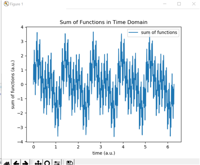
As you see, the figure seems a noisy data but it contains specific frequencies such as 5, 10, 50 and 200. To see the frequencies of each of them we will use .fft method and then we can sepereate our functions. To do that we need to seperate our time domain which means we want to digitize the time domain and then we will create our frequency domain. Then we will apply fft analysis to get the speicific frequencies such that (We need just half of our data because the fft analysis make a smmetrical analysis and the other half will be same for the first half period so we want to create a plot just first half of data)
import matplotlib.pyplot as plotting
import numpy as importing
from scipy.fftpack import fft, ifft
import random2
NP=1024 #number of points
Xaxis=importing.linspace(0,2*importing.pi,NP)
Ydata1=importing.sin(Xaxis*5)
Ydata2=importing.sin(Xaxis*10)
Ydata3=importing.sin(Xaxis*50)
Ydata4=importing.sin(Xaxis*200)

Ydata=Ydata1+Ydata2+Ydata3+Ydata4

plotting.plot(Xaxis, Ydata, label="sum of functions")
plotting.xlabel("time (a.u.)")
plotting.ylabel("sum of functions (a.u.)")
plotting.title("Sum of Functions in Time Domain")
plotting.legend()
plotting.show()

FreqSP=1/NP #spaces between time domain

XaxisFreq=importing.linspace(0,1/(2*FreqSP),NP/2)
YFreqData=fft(Ydata)
plotting.plot(XaxisFreq, (2/NP)*(importing.abs(YFreqData[0:512])), label="specific frequncies")
plotting.xlabel("frequency (a.u.)")
plotting.ylabel("amplitude (a.u.)")
plotting.title("Specific Frequencies in Frequency Domain")
plotting.legend()
plotting.show()
Here is the result:
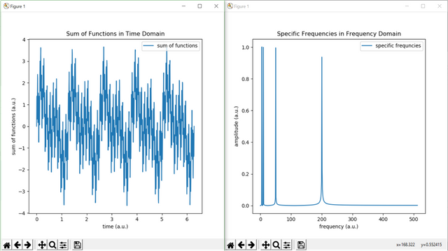
As you see the figure, we just find the peaks of the specific frequencies. For example, voice recognition program also use this method to understand what you said like "siri" for IPHONE.
Curriculum
Here is the list of related tutorials we have already shared on Utopian that make up a Course Curriculum.
- Tutorial on GUI (continues) and Example of Web Crawler by combining PyQt5 and BeautifulSoup package in Python #Tutorial-4
- Tutorial on GUI and Example of Simple Addition Calculator by using PyQt5 package in Python #Tutorial-3
- Creating Package and Subpackage in Python #Tutorial-2
- Example of Steemit Analysis by Using Python #Tutorial-1
Posted on Utopian.io - Rewarding Open Source Contributors
Perfection is not attainable, but if we chase perfection we can catch excellence.
Hey @onderakcaalan I am @utopian-io. I have just upvoted you!
Achievements
Utopian Witness!
Participate on Discord. Lets GROW TOGETHER!
Up-vote this comment to grow my power and help Open Source contributions like this one. Want to chat? Join me on Discord https://discord.gg/Pc8HG9x
Thanks to @utopian-io community...
This post has received a 0.28 % upvote from @drotto thanks to: @banjo.
Thanks to @banjo..
I have too many favorites to name.
Congratulations! This post has been upvoted from the communal account, @minnowsupport, by onderakcaalan from the Minnow Support Project. It's a witness project run by aggroed, ausbitbank, teamsteem, theprophet0, someguy123, neoxian, followbtcnews, and netuoso. The goal is to help Steemit grow by supporting Minnows. Please find us at the Peace, Abundance, and Liberty Network (PALnet) Discord Channel. It's a completely public and open space to all members of the Steemit community who voluntarily choose to be there.
If you would like to delegate to the Minnow Support Project you can do so by clicking on the following links: 50SP, 100SP, 250SP, 500SP, 1000SP, 5000SP.
Be sure to leave at least 50SP undelegated on your account.
Gracias por el tutorial amigo @onderakcaalan, saludos que tengas un lindo dia.
Ummmmmmmmmmmmmmmmmmah
Resteemed your article. This article was resteemed because you are part of the New Steemians project. You can learn more about it here: https://steemit.com/introduceyourself/@gaman/new-steemians-project-launch