"SEC20/WK1: Introduction to Graphic Design and Principles."
Over the periods I have been on Steemit, graphics has dealt with me for long and I have really been longing to learn the right way to carry out this task. It is true that I have been designing the ones I have been using in my publications but not in a professional way. I have even been planning to enroll in one of the learning centers off chain but thanks to this engagement challenge and thanks to @lhorgic for bringing this lesson on. Now, I can seat and learn in the comfort of my home. Time to learn what I left for a long time
I have been able to go through his tutorial for this first week and here I want to present what I have learnt.
Graphic design
Graphic design is that aspect of communication of ideas and messages through visual means. We all know that by communication, we seek to transmit information either orally or written. But in graphic design, visual means comes into play. Hence, it is an art which brings in ideas into light through visual and text. Our thinking is involved because we must have to think of the best way to present such ideas and information or message so that the recipient can deduce the information from what is designed. Hence, your design does the talking.
I was opportuned to work in a printing press as an accountant but I still had interest in what is done in the graphic design section. My boss then will always call me to his side if he wants to start any design of either logo, billboard, brochures and others. He will show me a design and ask me to explain what the design stands for. By that he wants to know if he had represented the clients request well. If it's a restaurant that he wants to design, I will deduce either food, or spoon, or plates or something relating to restaurant. Once I am able to interpret his design correctly, he will know that he is on the right track. So it goes with reasoning.
To achieve your aim in graphic designing, you will need to know exactly what you want to design, the message you want to pass across, the audience and the purpose. Then you make use of shapes, lines, colours, and other things available to you depending on the tools available to you in the app you are using to try to create something that will fully represent and communicate the idea to your audience without confusion.
Principles of graphic design
Graphic designing goes with principles just like other subjects. This has just reminded me of the principles of accounting. Principles have to do with pattern or rules to follow to achieve something. In graphic designing, it also goes with principles.
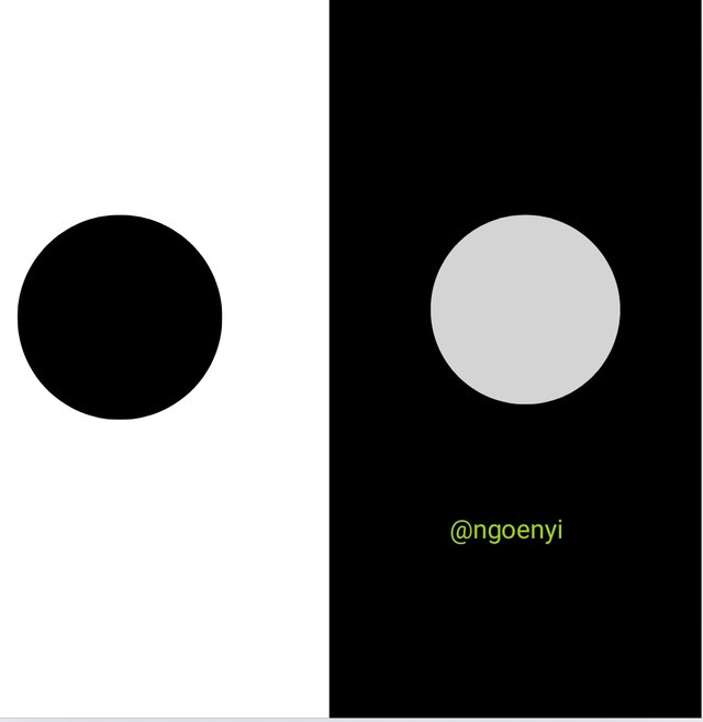
One of such principles which is also ranked first is contrast. As the name implies, it is making a difference. This happens when you have 2 elements that are the same, this principle helps to present these 2 elements in a way that you will easily notice the difference instead of presenting them to look the same. For instance, if you have two shapes that are the same, and you want to contrast or create a difference in your presentation, you can use a different background to present the two such that, even though the shape is the same or even the colour of the shape is the same, the different background will contrast them, helping the audience to clearly see the difference in both of them.
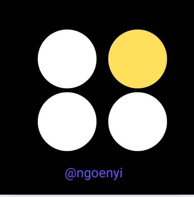
Another amazing principle is emphasis. As the name implies, you want to make an element stand out in a crowd such that the attention is drawn to it.
Yes, this principles means that in graphic designing, you should strive to represent information in a way that will make it stand out and the audience will see the difference and get the information without being confused of what you mean.
When trying to make a design, think of how you can present the information in a distinct way, free from ambiguity. Try to create a difference. Make the elements stand out from the crowd. Draw the audience attention by creating or presenting the elements in a way that it truly represent the information you are trying to pass across. Hence, there should be a noticeable difference that will draw the Audi attention to it.
This happens when you have the same shapes of elements and you are presenting them using the same background, then you can simply give one which you are trying to emphasis a different colour to be different from the others, that way, you have layed emphasis on that particular one and attentions will be drawn to it.
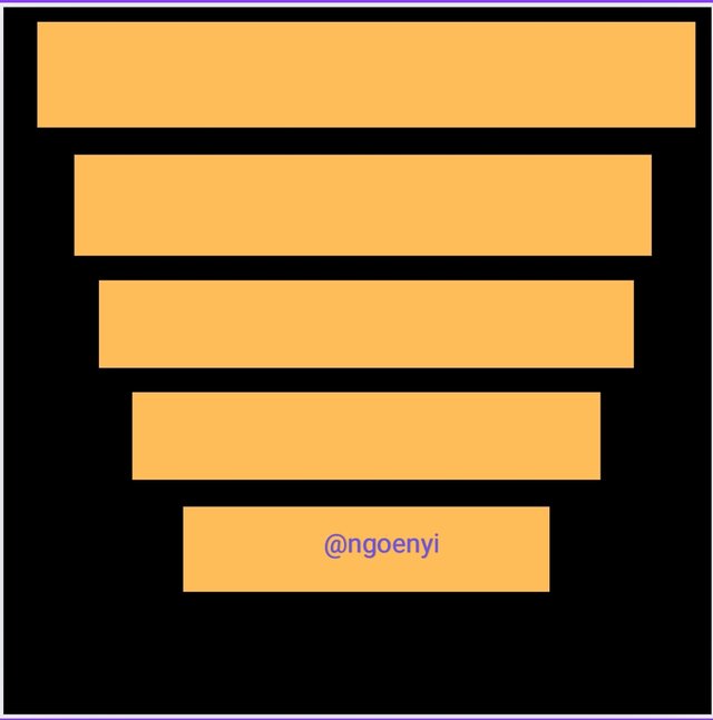
The next principle that I will like to talk about is Hierarchy. In English, hierarchy shows importance. It is often used to denote positions or ranks. Those who have the highest rank of position is usually make to have more importance than the others. In an organogram of an organisation, the highest is usually placed first or above and more enlarged than others.
To represent hierarchy in a visual means, a visual weight that surpasses others is given accordingly to be able to make the highest in hierarchy stand out. So, according to the rank, it could be from biggest to smallest or from smallest to biggest depending on your presentation.
How to make the practical design below
To make this design above, I launched my canva app. I just downloaded it because I haven't been making use of it. I found PicsArt more easy to use before now. But, I am beginning to learn new things in the right way.
| I then clicked on then clicked on the "+" sign | 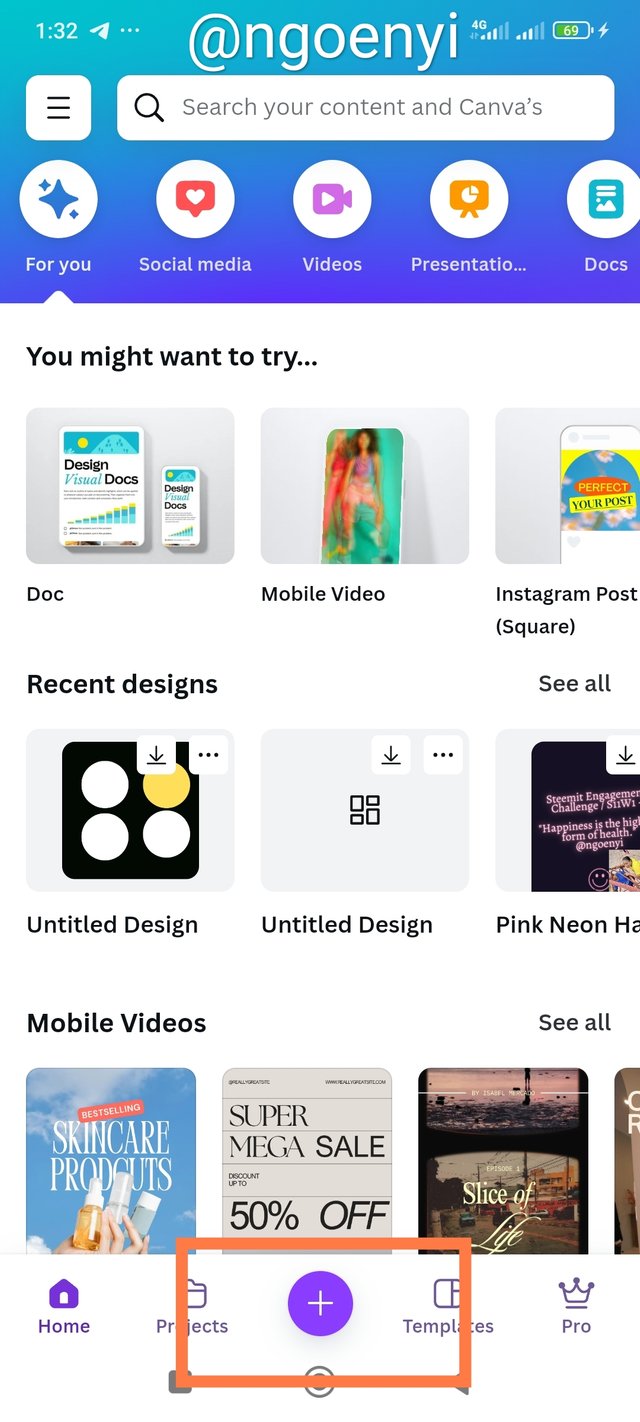 |
|---|
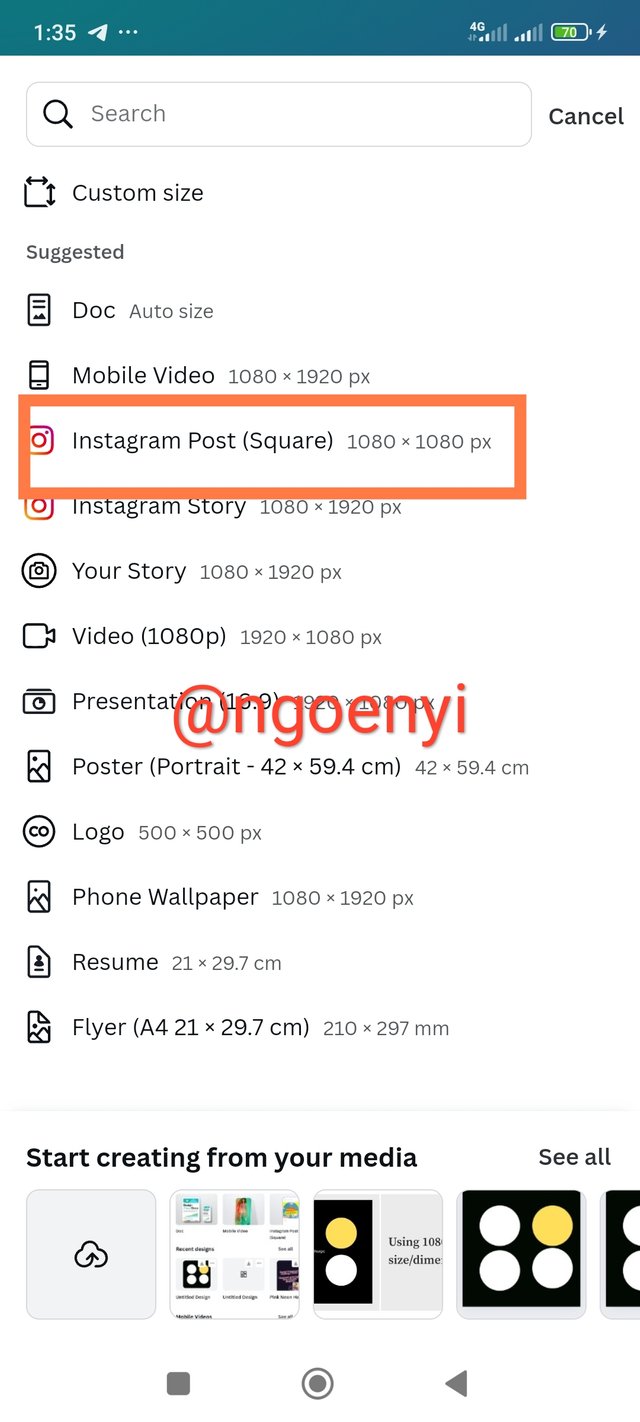 | next, I selected the size |
|---|
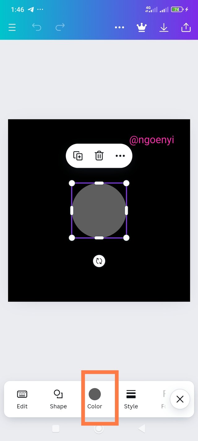
| I then tapped on the screen to be able to see the colour. To be frank, I found this step difficult at first but I had to ask questions to learn. Thankfully, I got it right after following the instructions. | 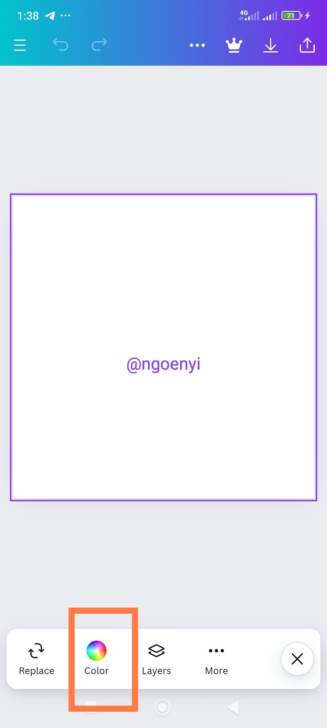 |
|---|
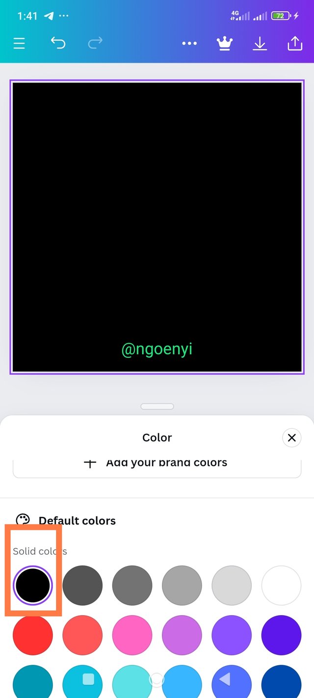 | I then dragged to see the colour palette from where I chose the colour which is black. That was how I changed the colour |
|---|
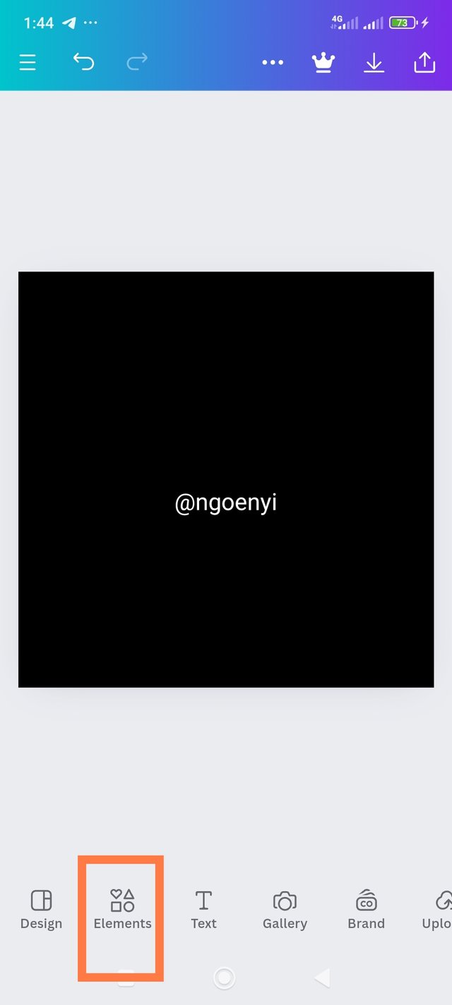
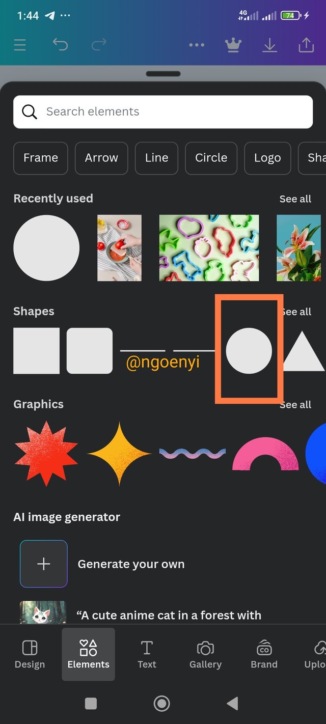
Having achieved the colouring, I clicked on the element. I didn't need to search for it because it was already displayed there as you can see on the screenshot below. Then I chose the circle shape
 |  |  |
|---|
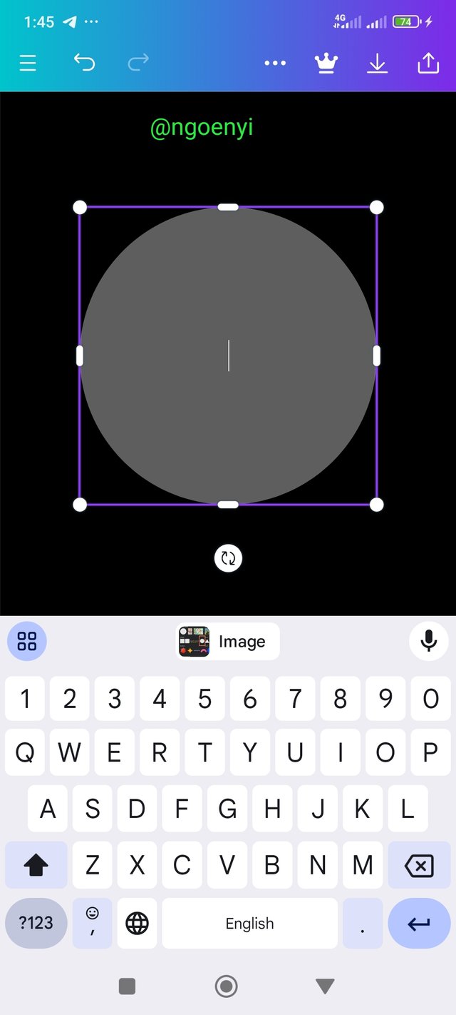
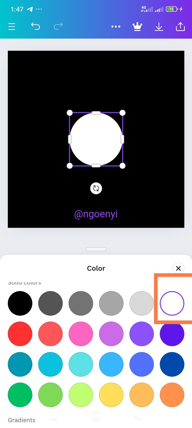
Next was to give it a white colour. I dragged to select white colour from the colour palette.
 |  |
|---|
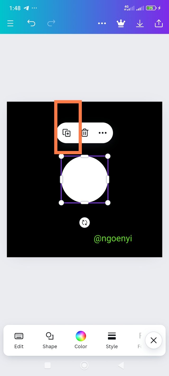
then I duplicated the circle by clicking on the icon as shown on the screenshot below
 |  |  |
|---|
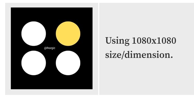
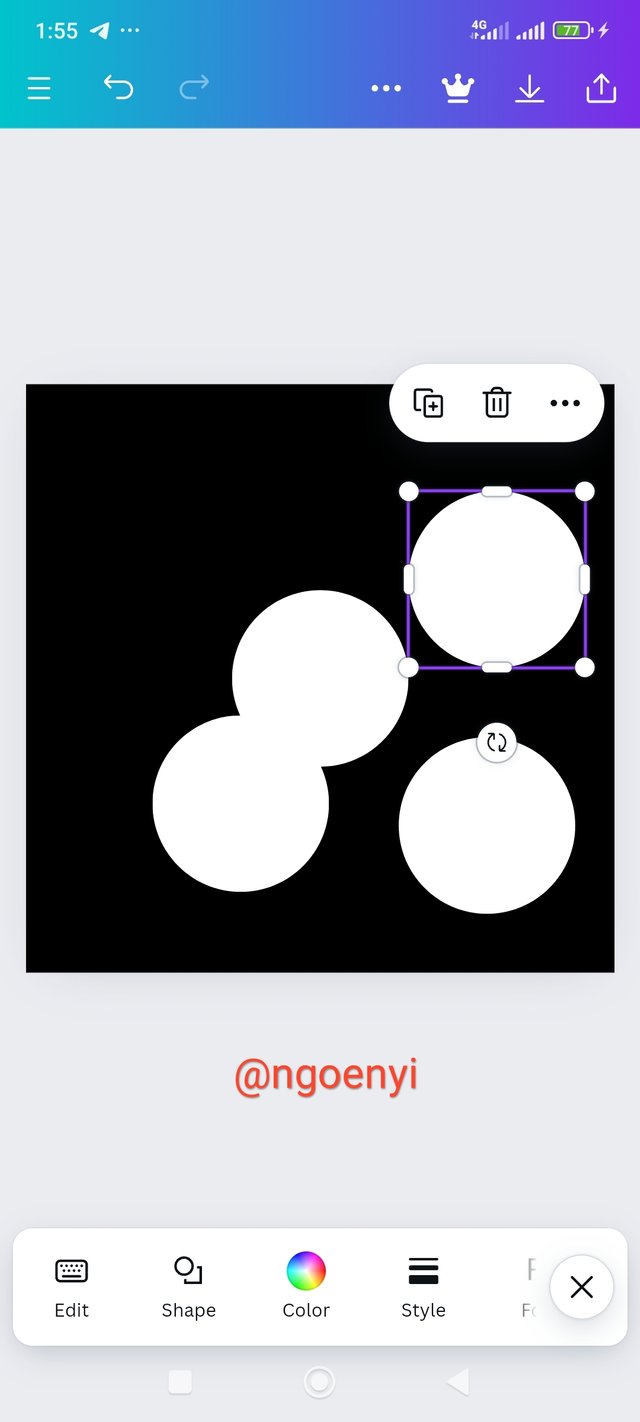
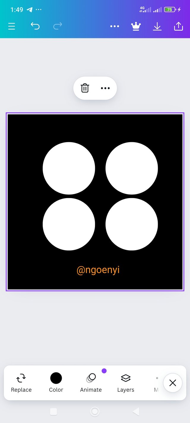
In order to show emphasis, I decided to give colour to one of the circles as shown below
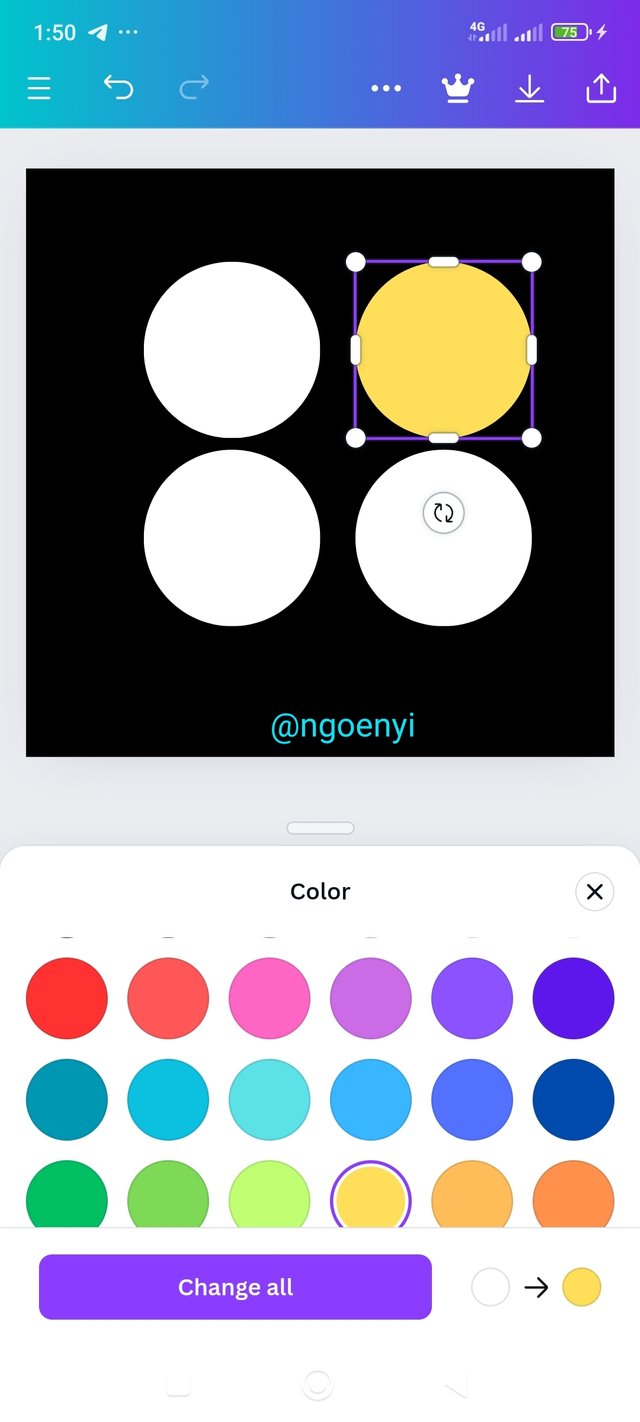 | 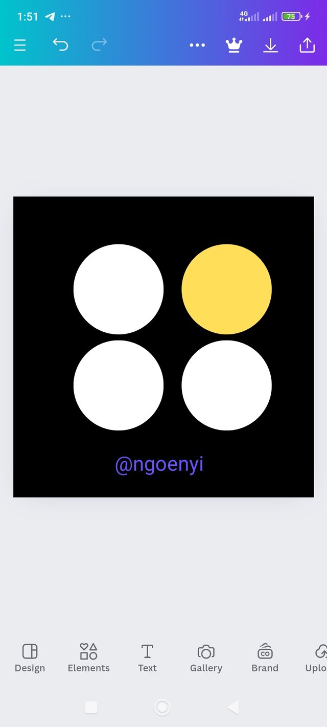 |
|---|
In conclusion, I have been able to learn and discussed what graphic design is according to my own understanding
I have demonstrated my understanding of the 3 selected principles of graphic design
I have also shown in practical ways how to design the image as requested.
Learning is a wise course to take and practicing what one learns is the right way to understand. Thank you @lhorgic for this tutorial. I therefore invite @drhira @patjewell and @impersonal to take part in this lesson. I wish you all the best.

This is my introductory post here
Upvoted. Thank You for sending some of your rewards to @null. It will make Steem stronger.
I'm really inspired to participate as I also feel to know the process properly and systematically. I'm also hounded by the invitation. Thank you for the detailed and methodical presentation. Greetings!
Hello @ngoenyi thank you for participating in this week's lesson. We have assessed your entry and we present the result of our assessment below.
Feedback:
• You have clearly defined Graphic design the way you best understand it, even with your personal experience, it shows you came prepared.
• Your selection on the principles of design is nice coupled with your comprehensive and well detailed explanation. It's also cool to see that you visually represented the principles.
• Finally, your practical is quite detailed and comprehensive, you must have poured in more than your all into this entry. Hope you keep up with the energy level. Weldone.
Regards
@lhorgic❤️
Well done!
I must admit, you are also inspiring me to take part.
Not only does it look exciting to learn, but I am sure we will get lots of opportunities to put what we are going to learn to the test and that is super important to me.
Best wishes!