[CO]Symbol for nTOPAZ

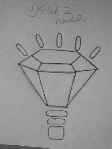
Greetings, dear friends, here I show you a second proposal for the symbol of nTOPAZ, the sketch I did previously with a pencil and it is my property.
Make a freehand sketch, without rules or measurements only my pencil and me. (the three sketches are made at the same time each one measures about 5 centimeters, they are quite small).
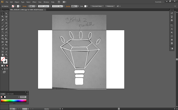
Then I began to vectorize the entire outline with the feather.
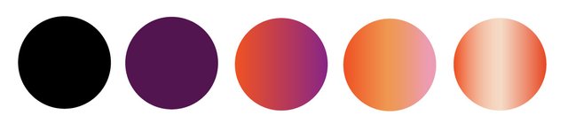
The colors used were taken as reference of the original logo of nTOPAZ. used as a fill with a degraded style.
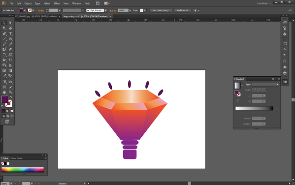
In the previous image put a few flashes of light but then decided to remove them because shrinking it would not look like a logo.

The first time I published my post through nTopaz, I did not have many clear things, this time I prepared myself better and wanted to show them a deeper and more organized work.
I have one final proposal for the symbol, I'm still thinking whether to do it or not because it's a pretty complicated design to do in Illustrator, and I have to confess that I'm a professional in this.
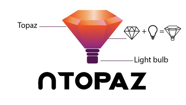
For my second proposal I went more in terms of light and brightness, if only the topaz generates brightness but a light bulb also generates light, so I joined the two elements and from there came this idea for its symbol.
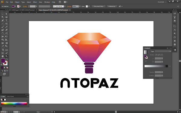
To make this symbol use the Adobe Illustrator CS6 program, I hope you like it.
PROCESS
Main idea
Color Variation.
Size Variation.
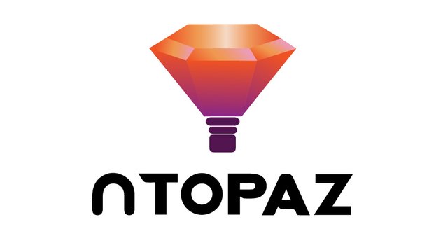
Final Result
Thank you very much everyone for the valuable support
Blessings
![[gickr.com]_f122d0d7-c11b-e164-619e-e715c8007ffd.gif](https://steemitimages.com/0x0/https://cdn.steemitimages.com/DQmb77sKszJW5S8EKVV2ZJczLPEaLuVeiRYCZuwYv4V95PH/[gickr.com]_f122d0d7-c11b-e164-619e-e715c8007ffd.gif)
Blessings
Cool... simplicity always makes things cool, and this simple logo is very cool :)
I hope your day good there and lot sun :)
I'm glad you liked it, have a nice day too;)
You are welcome :)
Nice and clean logo, nai !!! Good luck !! :D
Thank you very much @veryspider, It was very complicated but I am very satisfied with the result <33 ..