INTRODUCTION TO CANDLESTICKS
Reading charts can be difficult for newcomers to trading or investing. Some people invest based on their intuition and gut feelings. While this method may work in the short term in a positive market, it is unlikely to succeed long term.
Investing and trading are, at their core, probabilistic games with risk management. As a result, practically any investment technique requires the ability to understand candlestick charts. The purpose of this essay is to explain what candlestick charts are and how to interpret them.

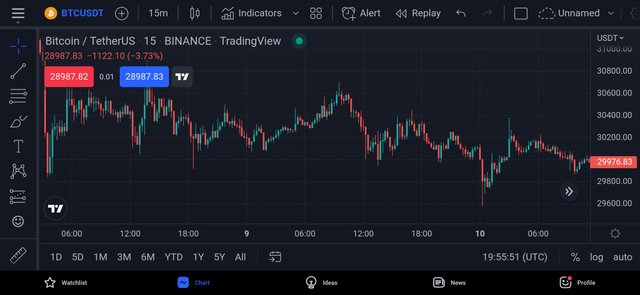
A candlestick chart is a sort of financial chart that graphically depicts an asset's price movements over time. It's made up of candlesticks that each signify a different length of time, as the name says. From seconds to years, the candlesticks can symbolize almost any time period.
Candlestick charts are a type of chart that has been around since the seventeenth century. A Japanese rice merchant named Homma is credited with developing them as a charting tool. His concepts are most likely what gave rise to the contemporary candlestick chart. Many people, including Charles Dow, one of the inventors of modern technical analysis, refined Homma's conclusions.
Candlestick charts can be used to evaluate any form of data, but they're most commonly utilized to help with financial market analysis. They're instruments that, when used properly, can aid traders in determining the likelihood of price movement outcomes. They're useful since they allow traders and investors to come up with their own ideas based on market analysis.
- OPEN
The asset's first ever documented trading price during that timeframe.
- HIGH
The asset's highest ever recorded trading price within that duration.
- LOW
The asset's lowest ever recorded trading price throughout that duration.
- CLOSE
The asset's most recent documented trade price within that timeframe.
The OHLC values are the name given to this collection of data. The look of the candlestick is determined by the relationship between the open, high, low, and close.
The wick or shadow is the distance between the open and close, whereas the body is the distance between the open and close. The candlestick's range refers to the distance between its peak and low points.
Despite the fact that they give similar information, many traders find candlestick charts to be easier to understand than traditional bar and line charts. Candlestick charts are quick to read and provide a straightforward depiction of price movement.
A candlestick, in practice, depicts the conflict between bulls and bears over a set length of time. The longer the body, the more powerful the purchasing or selling pressure was throughout the time period studied. If the candle's wicks are short, it indicates that the measured timeframe's high (or low) was close to the closing price.
With different charting tools, the color and settings may vary, but in general, if the body is green, the asset closed higher than it opened. The color red indicates that the price fell during the timeframe being measured, indicating that the close was lower than the open.
Black-and-white illustrations are preferred by some chartists. Instead of green and red, the charts use hollow candles to symbolize upward movement and black candles to represent downward movement.
While candlesticks are beneficial for getting a general picture of price action, they may not be sufficient for a thorough examination. Candlesticks, for example, do not represent what transpired in the time between the open and closure, merely the distance between the two points (along with the highest and lowest prices).
While the wicks of a candlestick can tell us the period's peak and low, they can't tell us which one happened first. Nonetheless, most charting programs allow traders to modify the timeframe, allowing them to zoom into lower timeframes for more data.
When charting shorter periods, candlestick charts can often have a lot of market noise. The candles might change rapidly, making it difficult to discern what is going on.
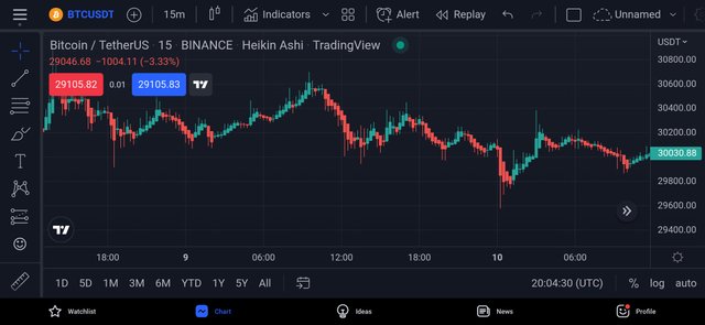
The Japanese candlestick chart has been our focus so far. Calculating candlesticks, however, can be done in a variety of ways. The Heikin-Ashi Technique is an example of this.
The Japanese phrase Heikin-Ashi literally translates to "average bar." A modified algorithm is used in candlestick charts with average price data. The main goal is to reduce market noise and smooth out price volatility. As a result, Heikin-Ashi candles can help spot market trends, pricing patterns, and possible reversals.
Heikin-Ashi candles are frequently used in conjunction with Japanese candlesticks by traders to avoid false signals and improve their chances of detecting market movements. Green Heikin-Ashi candles with no lower wicks usually signal a strong uptrend, and red candles with no upper wicks usually suggest a strong decline.
While Heikin-Ashi candlesticks are a great tool, they do have limitations, just like any other technical analysis technique. Patterns may take longer to form on these candles because the price data is averaged. They also don't indicate price gaps, which can make other price data difficult to discern.
The chart patten is the basics of technical analysis which makes it very necessary for traders and financial analysts to seek to understand it. The candlestick chart is by far the most used chart pattern because it provides a lot of information regarding price actions. In as much as this type of chart pattern is efficient, it doesn't entirely show all market informations which we have already discussed above.
10% to @Tron-Fan-Club
Tweeter link
https://twitter.com/SonOfMaaan/status/1535361960421863425?s=19
The good old candlestick still remains legend. I personally love to use it for my analysis.Thanks for sharing.
You are correct. It is still widely used by a lot of traders
You should consider using copyright-free images. The image you have used to explain low, high, close, open is not licence free.
I'm sorry.
I have removed the image. I do not know that it is licensed because there was no water mark on it.
Hello dearest friend @mondraye
Thank you very much for giving such an informative post.
I enjoyed going through your post and I hope to read more of your interesting post.
#steem-on 💙
Thank you for your comment
Please @fredquantum
I have corrected the mistake please.