#Graphic Designer on Steemit! : Portofolio showoff! But why?
Portofolio showoff! But why?
Greetings everybody!
The most important possesion of an artist besides his abilities and qualities is his portofolio. The portofolio is what the artist has to show in order to expose his creations and it also represents the most important hiring criterion.
I would like to introduce myself better to you by showing you a small part of the work I do daily. It is a fun ride and an interesting moment of knowledge for those who are attracted to graphic design.
I want to show my work gradually so that you can make me the pleasure and take from your time to look over my designs with attention rather than scrolling fast and possibly missing on the important details.
I want to provide description for each of them so that the contact between us is not only visual. I hope that sharing my thoughts about the designs is a pleasure for you as it is for me.
If you have any questions ,about any kind of subject, I would encourage you to feel free asking. :)
Dark Ravens
The design from below is a gaming related logo. The logo's attitude serves as an impactful way to overcome the difficulties that the e-sports team ( video games team) has to go through.
It was realised by combining the symbol of the raven with the blood. On the idea that we all fear a raven because its primar attributes: fearless, strong, ruthless, agil. The raven is a hunter and red ( the color of blood) is without a doubt his favourite color.
The raven which is looking away while standing on his bloody wings emphasises his dangerous character, he just commited a murder and he is ready , looking at its next target. Just like so the e-sports team should become more and more dangerous , winning more and more competitions and looking forward to "murder" their next competitor.

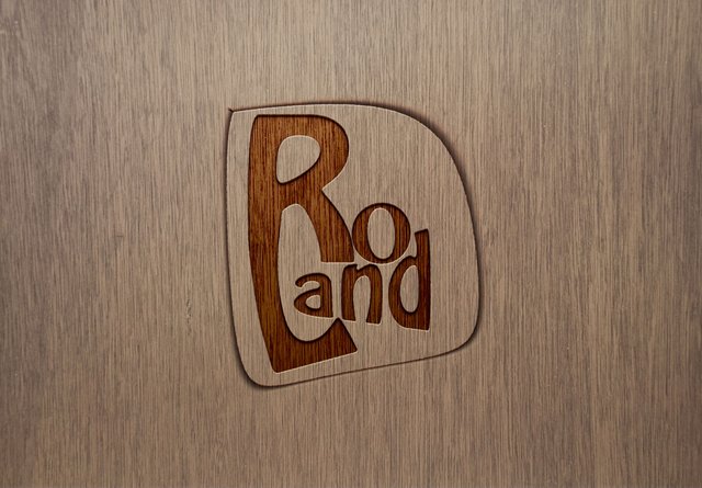
Roland
This logo presents the signature of an electro-house music producer entitled " Roland". The logo is minimalistic and eye-catchy. Its lines are curved and presents a good flow of the design. It is considered a writing logo and sometimes this is the best option to make yourself known in people's minds.

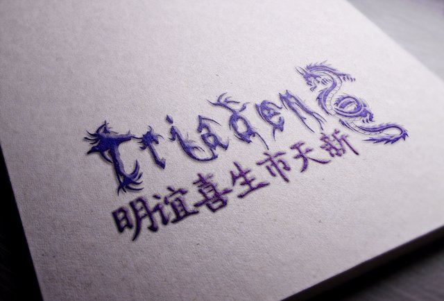
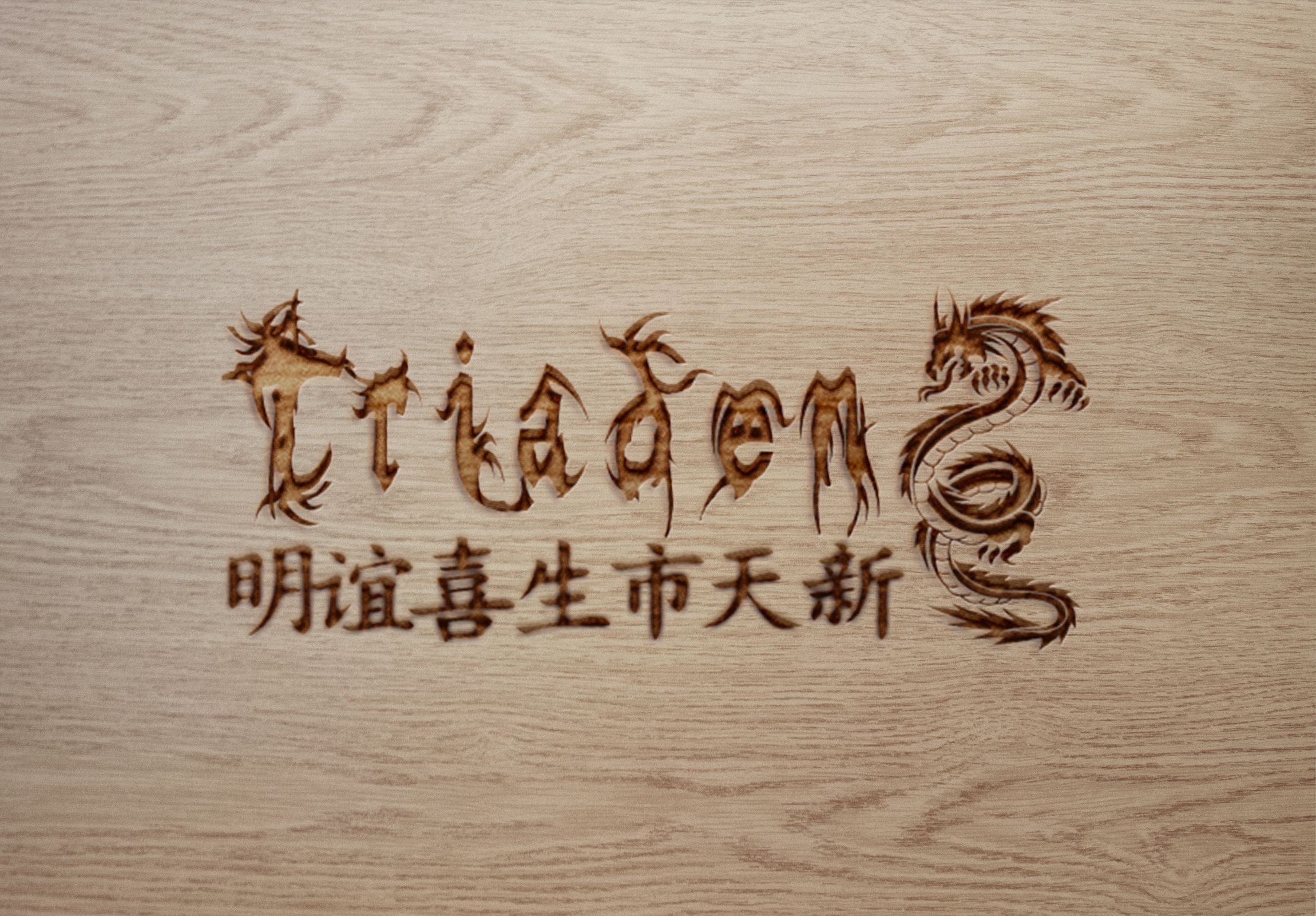
Triaden
The next design speaks for itself. It is a logo for a japanese retail company which merchandize out of their country. The logo is composed of its the key elements of the country. The dragon represents a strong spiritual creature in their culture and their typing characters are one of the most remarkable in the entire world. A combination between the most impactful symbols of the origins will always impress and will transmit trust towards the customers because once you have told something about you ( the provenience in our case) the customer has the feeling that you are opened towards it and it will encourage him to be opened towards you.
cant wait to see more.
Congratulations @mistermelody! You have completed some achievement on Steemit and have been rewarded with new badge(s) :
Click on any badge to view your own Board of Honor on SteemitBoard.
For more information about SteemitBoard, click here
If you no longer want to receive notifications, reply to this comment with the word
STOP