[ Effective Trading Strategy using Line Charts ]-Steemit Crypto Academy | S6W1 | Homework Post for @dilchamo
Good day everyone, today is an inspiring day as the homework is started again, and this one will be Season 6, week 1. And as I had participated in all previous seasons, I will also try to be active in this.
Today I invite you all to read my homework on Effective Trading Strategy using Line Charts, which is given by one of the professors of the Steemit Crypto Academy @dilchamo.
So let us continue with the homework.

Line Chart And Uses of Line Chart
We can say that the line chart is the basic chart to see or get an insight into the price changes in the market over some time. The line chart is straightforward as it has a simple chart pattern. The line chart shows the close price of the cryptocurrency.
The Line chart can be used for any time frame, but it is advisable for day-to-day time frames or price changes. The Line chart helps the traders see where a particular asset's price has moved over the period. We know that if we see the candle chart, it has so many noises, while the Line chart cancels the noises in the day trading for the traders.
The line chart is used to see the closing price of the asset and also to track the price changes over the period, whether in short or long., which helps the traders in getting profit as this chart is fundamental and easy to use, while it gets a little harder to gain profit as compared to the Line Chart. The Line chart reduces noise in the trading like open, high, and lows.
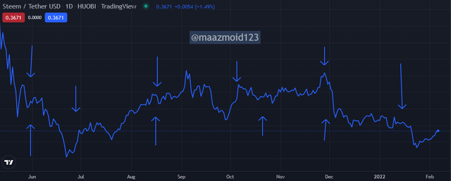
Support Level
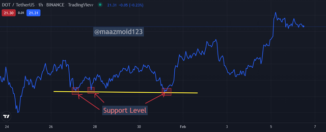
We know that the support level is one of the main components for the traders to see, as it is the area where the buying power is strong, and it happens when the resistance breaks and make a new support level. And if the support level broke, the asset price started moving in the downtrend.
As we can see in the above chart of DOT/USDT on the 1-day time frame, showing the Support Level. We mark the support level by seeing the previous asset price data and then mark the two or three or maybe more points in the straight Line showing that the asset's price is feeling hard to go more downward because of strong buying power.
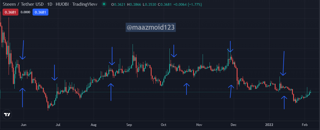
Resistance Level
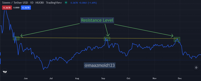
The resistance level is also one of the main components for the trader to see while trading, as it shows the high selling power, and it happens when the support level breaks and make a new resistance level.
When the resistance level broke, the asset price started moving in the downtrend.
As shown in the above chart of STEEM/USDT on the 1-day time frame, the Resistance Level. We mark the resistance level by seeing the previous data of the asset price and then mark the two or three or maybe more points in the straight Line showing that the price of the asset is feeling hard to go more upward because of strong selling power as the selling price of the asset is strong enough to stop the price from moving upward.
Difference Betweem Line Chart and Candlestick charts
So the main difference we can see in the Line chart and the candlestick charts is that the line chart minimizes a lot of noise in the candlestick chart.
If we see that the Japanese candlesticks or the candlestick charts show a lot more information of the price out of any other chart, and with advantages of that information there is also a lousy air for some traders who can not interpret that information and end up in loss. While in the Line chart, there is not much information on the price as it minimizes those noises as it connects the closing prices.
Line Chart is used in the high time frame because the traders who use the Line chart usually want to see the price direction and do not need to see all the details. Still, if we talk about the candlestick chart, it is generally used in a small time frame, as the traders used it to find the market's volatility. And it is also used when the traders have to use the Stop-loss and Stop-limit.
The above chart shows that we have chosen the line chart showing the single blue Line, with no noise, and only showing the closing price.
In the above picture, we can see that we have chosen the Candlestick chart there; we can see a lot of information as we can see the market volatility and the green and red candles showing the buying and selling of the asset or the volume of the asset.
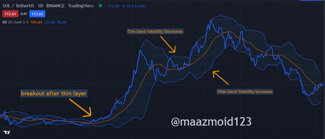
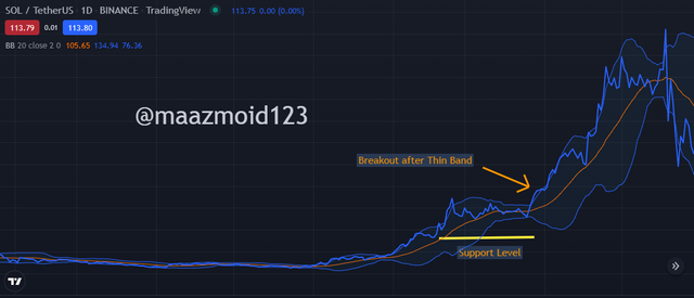
We can use the Bollinger bands Indicator with the Line chart to confirm the asset's price movement. The Bollinger band indicator is a technical indicator that shows the market volatility and the resistance and support level.
As we can see in the above screenshot of fig.6, so herewith the Bollinger bands, we saw some different trends, as the market always breakout after thin layer of the Band, the market goes in the volatility when the bands are wide, while in the bands are thin, the volatility decreases.
Keep in mind that we can see that the Bollinger band has three lines: upper, lower, and the basis(Middle). And we can see that when the Line of the line chart goes above the basis line, the price of the asset goes above, and when the Line of the line chart goes below the basis line, the asset's price goes down.
So it is suitable to use the Bollinger bands with the Line chart compared to the candlestick chart.
Bullish trend
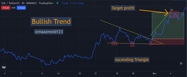
Finding the bullish trend in the line trend is easy as we have to see the Ascending triangle to find the bullish trend, as we can see in the above picture.
In the above SOL/USDT chart of the 1-day time frame, we have seen the bullish trend in the above screenshot, I have made the Ascending triangle, and there we saw some higher lows, which I also have highlighted, which made the bullish trend. Then we can see that the market goes upward and showed the bullish trend, where we have put the profit limit, which will be the resistance level.
Bearish trend
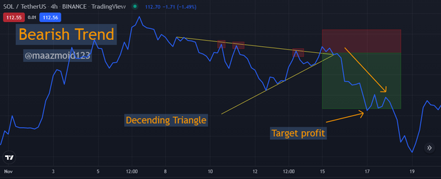
Like the Bullish trend, in the chart to find the bearish trend, we made the descending triangle which helps us find the bearish trend.
As we can see in the above screenshot, I have used the SOL/USDT for a 1-day time frame, where we have seen the bearish trend. I have made the descending triangle, and there we saw some lower highs, which I also have highlighted, which made the bearish trend. Then we can see that the market goes in the downtrend and showed a bearish trend.
The Advantages and Disadvantages of the line charts are:
| Advantages of Line charts | Disadvantages of Line charts |
|---|---|
| It is fundamental and easy to understand as it reduces the noise like high, low, and opens. | It can get messier if we add lines over the chart. |
| It helps see the rates clearly | It is hard to put many items on the chart as it makes it confusing and hard to understand. |
| It helps show the small or little information | It does not show the market volatility, so we can not use it in the small time frames. |
| It could help see the market trend and changes of the asset | Show false signals in the small time frame if we used it incorrectly |
Conclusion
The line chart is a straightforward and efficient chart that reduces the noise from the chart, which eliminates the open, high and low, which we can find in the other charts. It is reliable for a long time frame, as it only shows the close price of the asset and has made it easier for the traders to do the trading with this chart.
We can use many indicators with the line chart, from which I have told you above, and other than the Bollinger band, we can also use the EMA indicator to confirm the price movement of the asset.
The line chart has genuinely become an effective trading strategy for the traders, and I will also try that in my trading. And now that was all from my homework, it was an exciting topic, and I learned a lot.
regards,
@maazmoid123
@steemcurator02
@steemcurator01, I need some response, as I have given my hours for this homework. And then I got to know that I am not eligible for #club5050, but as I didn't power up the STEEM but still I had 2 posts who had 100% powerups so I guess that should count. And even I was using the #club100 because the only transfer was of 1 STEEM for a newcomer.
Looks great strategy thanks https://9blz.com/bollinger-bands-indicator-explained/