使用hcharts创建可变宽度柱形图/How to use hcharts to make a fluid-width bar chart
Summary:
Javascript has a lot of open source chart Libraries,Hcharts.js is one of them,today i will show you how to create a fluid-width bar chart by Hcharts.
Javascript 有很多开源图表库,Hcharts.js就是其中之一,今天教程将教大家如何使用Hcharts.js去绘制一张可变宽度柱形图。
- 兼容浏览器:IE, Chrome,Firefox等等
您能从本教程学到什么?
- 怎么调用hcharts.js
- 怎么设置图表画布大小和配置chart参数
- 怎么设置图表主副标题以及标题位置
- 怎么设置X轴各列名称以及标题
- 怎么设置数据列
- 怎么设置数据标签
- 怎么数据点属性
需要的准备条件
- 你需要一个代码编辑器,比如atom,EmEditor等等,当然因为是文本编辑,可以直接通过浏览器打开,typora这类文本编辑器也可以进行代码编辑。
- 你需要下载hcharts.js
本教程难度
相对来说比较简单,只需要对固定代码格式有些简单了解,就可以绘制可变宽度柱形图。
- 认识简单代码
- 认识简单英文
教程内容
下面请先看一个简单例子:
要点1:怎么调用hcharts.js
<script src="http://apps.bdimg.com/libs/jquery/2.1.4/jquery.min.js"></script>
<script src="http://code.highcharts.com/highcharts.js"></script>
如果本地没有hcharts.js库,可以使用其在线js资源,同时需要加载jquery.min.js。直接在head区域引用就可以了。
要点2:怎么设置图表画布大小以及配置chart
<div id="container" style="max-width:800px;height:400px"></div>
在body区域,编辑chartjs代码之前,需要先定义下图表的大小。上面代码定义,最大宽度为800px,高为400px。
在本样例中,并没有定义画布大小:
   chart: {
        type: 'variwide'
    },
需要设置的参数只有一个,type,图表类型。默认值为 "line"。这里是可变宽柱形图,所以设置为variwide。
要点3:怎么设置图表主副标题以及标题位置
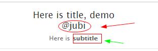
title: {
        text: 'Here is title, demo by @jubi'
    },
title:主标题,在text后面输入标题文本,使用单引号括起来。
subtitle: {
        text: 'Here is subtitle'
    },
subtitle:副标题,在text后面输入标题文本,使用单引号括起来。当然也支持使用html标签。如下:
要点4:怎么设置X轴各列名称以及标题
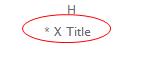
xAxis: {
        type: 'category',
        title: {
            text: '* X Title',
        }
    },
type:数据类型,使用cataegory,X轴将使用数据名称作为显示

title:X轴名称,显示在X轴下方
要点5:怎么设置数据列
数据列也是series下的属性,其结构是:
 series: [{
 data[
   [data1,data2,data3]
   ……
 ]
 }]
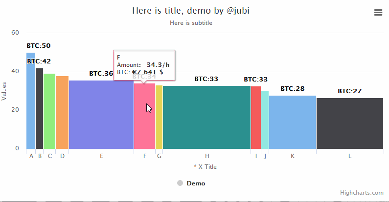
而我们设置可变宽度柱形图,需要3个数据,数据名称,数据具体值1,数据具体值2,也就是想xyz3个值。
data: [
            ['A', 50.2, 3304],
            ['B', 42, 2779],
            ['C', 39.2, 4211],
            ['D', 38, 4657],
            ['E', 35.6, 22857],
            ['F', 34.3, 7641],
            ['G', 33.2, 2615],
            ['H', 33.0, 31050],
            ['I', 32.7, 3494],
            ['J', 30.4, 2757],
            ['K', 27.8, 16738],
            ['L', 26.7, 23611]
        ],
宽度的大小取决于z的数值,数值越大,宽度越大。
要点6:怎么设置数据标签
   dataLabels: {
            enabled: true,
            format: 'BTC:{point.y:.0f}'
        },
dataLabels数据标签,显示在图表具体数据区域上方,用于输出数据名称。
enabled:是否显示。true显示,false不显示
format:输出样式,{point.y}这是输出数据的y值。 输出z值,替换y即可。“:.0f”,是取整数。
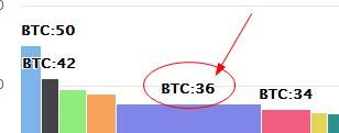
输出样式 format: 'BTC:{point.y:.0f}'显示结果:
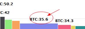
输出样式 format: 'BTC:{point.y}'显示结果:
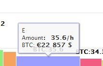
要点7:怎么数据点属性
 tooltip: {
            pointFormat: 'Amount: <b> {point.y}/h</b><br>' +
            'BTC: <b>€{point.z} $</b><br>'
        },
tooltip数据点,pointFormat 点击时候输出样式,使用单引号将内容括起来,也可以使用html标签。
其中point.y和point.z 是调用数据的y值和z值。
下面请看完整实例:
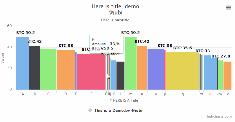
示例的完整代码如下:
Highcharts.chart('container', {
    chart: {
        type: 'variwide'
    },
    title: {
        text: 'Here is title, demo <br/> @jubi'
    },
    subtitle: {
        text: 'Here is<b> subtitle</b>'
    },
    xAxis: {
        type: 'category',
        title: {
            text: '* HERE IS A Title',
        }
    },
    series: [{
        name: 'This is a Demo,by @jubi',
        data: [
            ['A', 50.2, 334],
            ['B', 42, 279],
            ['C', 39.2, 421],
            ['D', 38, 467],
            ['E', 35.6, 47],
            ['F', 34.3, 741],
            ['G', 33.2, 25],
            ['H', 33.0,50],
            ['I', 32.7, 34],
            ['J', 30.4, 27],
            ['K', 27.8, 138],
            ['L', 26.7, 211],
            ['m', 50.2, 304],
            ['n', 42, 277],
            ['o', 39.2, 421],
            ['p', 38, 46],
            ['q', 35.6, 857],
            ['r', 34.3, 41],
            ['s', 33.2, 25],
            ['t', 33.0, 050],
            ['u', 32.7, 344],
            ['v', 30.4, 27],
            ['w', 27.8, 138],
            ['x', 26.7, 211]
        ],
        dataLabels: {
            enabled: true,
            format: 'BTC:{point.y}'
        },
        tooltip: {
            pointFormat: 'Amount: <b> {point.y}/h</b><br>' +
            'BTC: <b>€{point.z} $</b><br>'
        },
        colorByPoint: true
    }]
});
上述为关键代码,均为javascript语句。
本教程到此结束,感谢您的阅读。
系列教程列表
- 使用hcharts创建3D饼图/How to use hcharts to make a 3D Pie chart
- 使用hcharts创建扇形统计图/How to use hcharts to make a fan-shaped chart
- 使用hcharts创建工作进度(甘特)图/How to use hcharts to make a gantt chart
- 使用hcharts创建折线图/How to use hcharts to make a fold line chart
- 使用hcharts创建气泡图/How to use hcharts to make a bubble chart
- 使用hcharts创建堆叠条形图/How to use hcharts to make a stacked bar chart
- 使用hcharts创建金字塔图/How to use hcharts to make a pyramidal chart
Posted on Utopian.io - Rewarding Open Source Contributors
大神,有没有教程是关于输入数据,就可以生成柱状图的?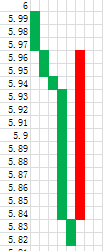
请看图:
我想找一个方法,绘制三线反转图
有一个在线应用就是基于hchrats的,网址为
https://www.itushuo.com/
可以直接录入数据,生成图表,没代码基础也可以实现
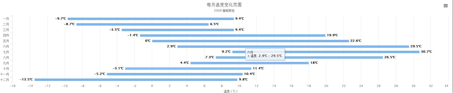
你提供的图片,我看是柱形范围图,这个hcharts是可以画出来的。
例子:
谢谢,我试试看
好久没用js了。不过之前用过ms的一个chart,看起来差不多。
基本都差不多的。:)
Thank you for the contribution. It has been approved.
You can contact us on Discord.
[utopian-moderator]
Hey @jubi I am @utopian-io. I have just upvoted you!
Achievements
Suggestions
Get Noticed!
Community-Driven Witness!
I am the first and only Steem Community-Driven Witness. Participate on Discord. Lets GROW TOGETHER!
Up-vote this comment to grow my power and help Open Source contributions like this one. Want to chat? Join me on Discord https://discord.gg/Pc8HG9x