"SEC20/WK6: Graphic Design Hands - On practical 3"
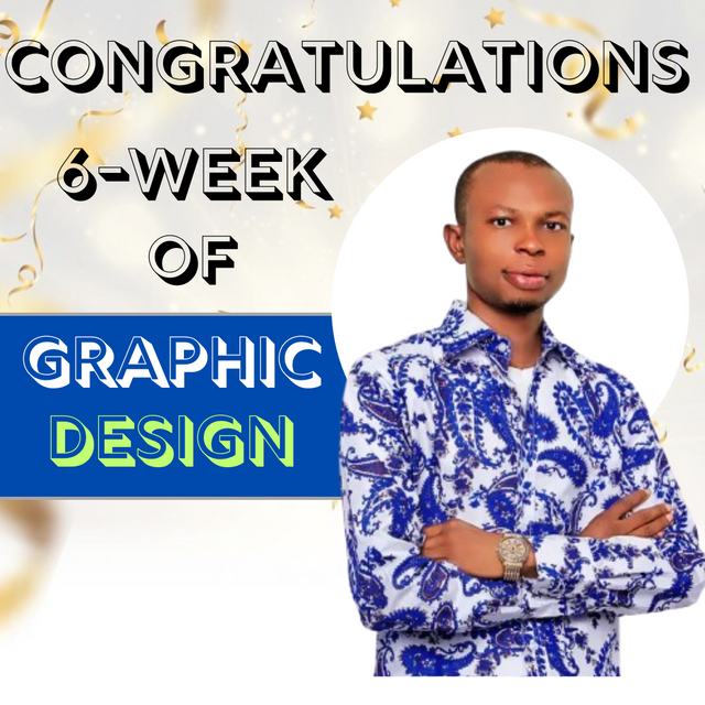
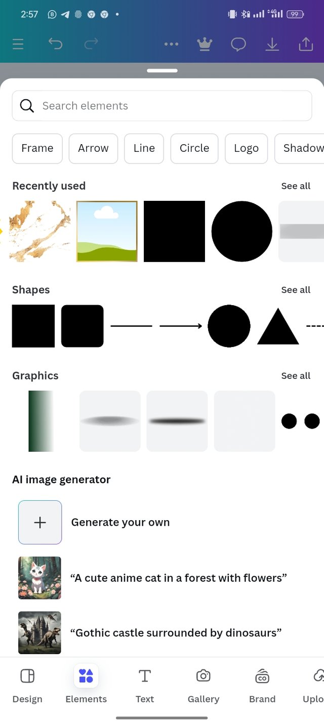
Here I will be sharing with you practically how I design the completion of my 6 weeks of graphic design which is part of the knowledge that I have gained so far. Below are the steps that I took in the design.
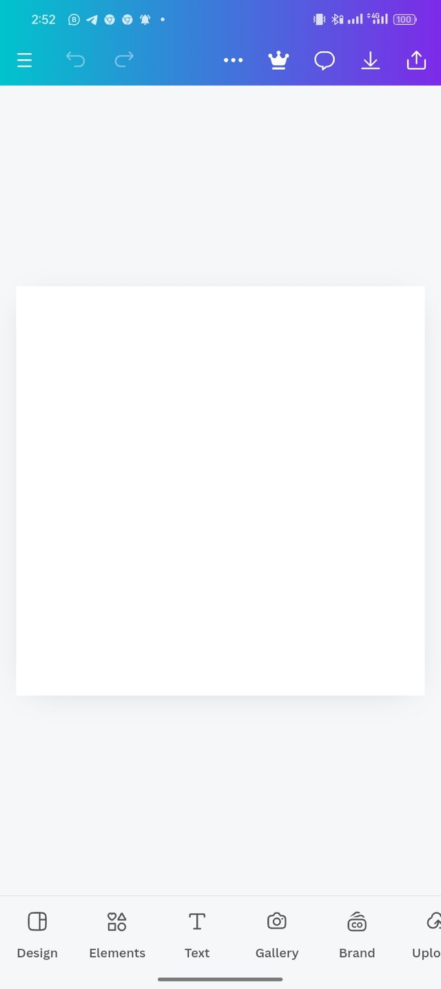
- Step: I launch my Canvas app, choose my dimensions, and set up my workplace.
 |  |  |
|---|
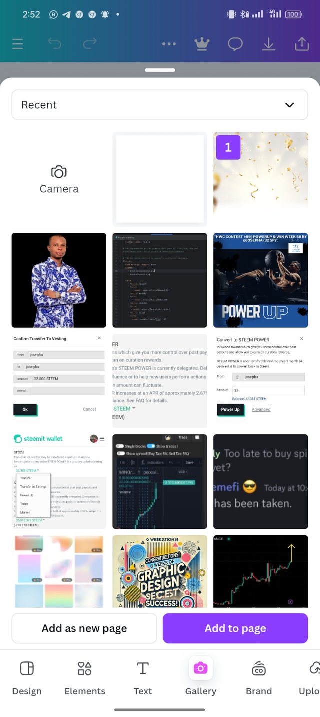
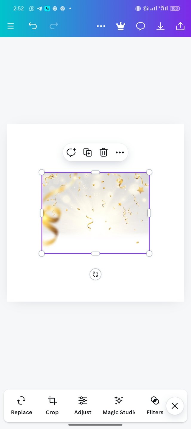
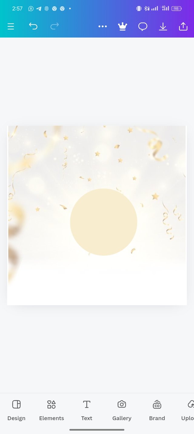
- Step 2: Now you can see my background is set, as shown in the image, which the next thing I did was to click on a gallery to choose my preferred background image, which is about celebration, and enlarge it to my taste.
 |  |  |
|---|
- Step 3: After setting my background image, I then select the Element icon and pick a square shape that you can see in the image. I change the color of the square shape to white.
 |  |  |
|---|
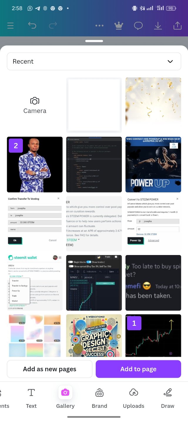
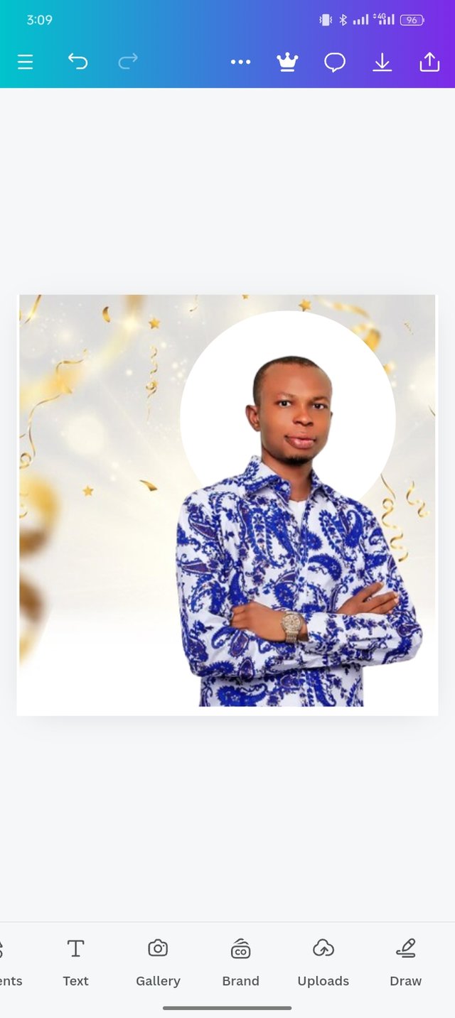
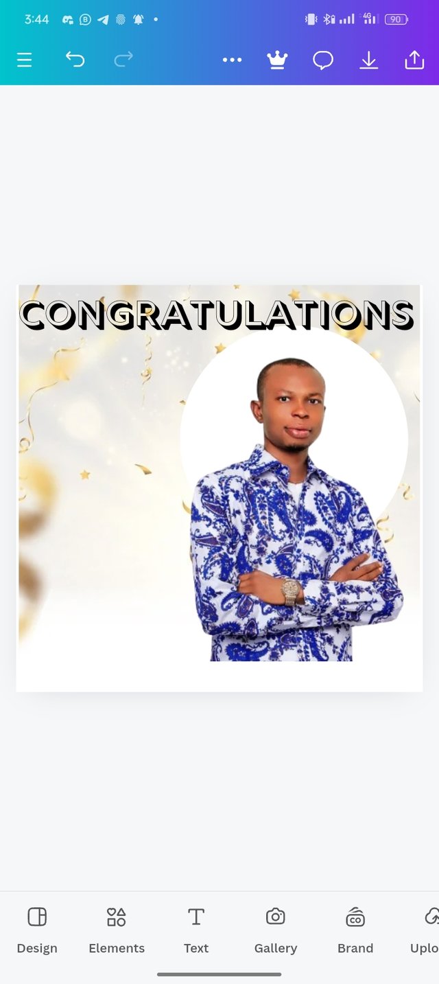
- Step 4: I then click on Gallery select my photo and click on "Add to page** and resize the image to my preferred size.
 |  |  |
|---|
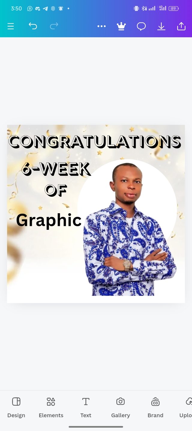
Step 5: I then click on the Text icon to write my first text as "Congratulations", and use "Rig Solid Medium Fill" as the font which you can see in the image that I have shared. I followed the same steps and wrote Week and Of and applied the principles of hierarchy to the text.
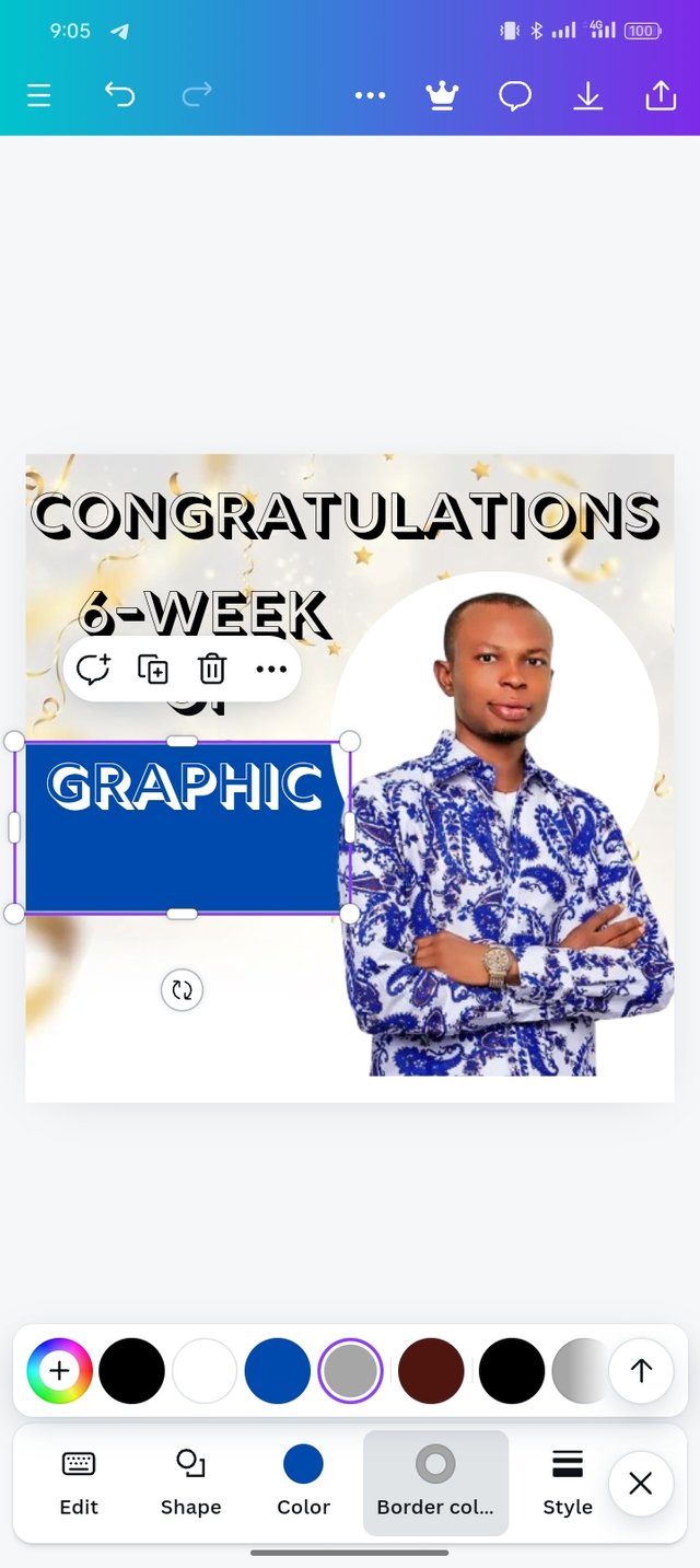
Step 6: The next thing that I did was to write Graphic and select the Element icon I picked a square shape gave it color and resized the shape.
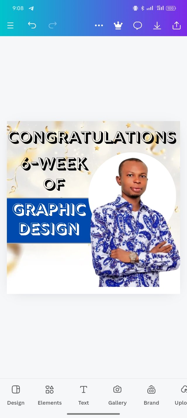
Step 7: I resized my square shape and positioned it below my text, and I then used the principle of emphasis on "Design" by changing its color.
 |
|---|
The principles that I used.
In designing the above which has been presented to you, I applied some key principles that make the design look appealing.
Balance: I applied this principle to make sure there is a composition of both text fonts and images I applied the best colors for the texts to make the work balanced as everything is equal at both left, right top, and bottom.
Emphasis: I applied this principle to draw attention and highlight important words. The emphasis word is the Graphic Design which is color in red.
Hierarchy: This is the principle that I applied to show some differences in the size of text where the first text is larger than the second.
Avoid Edge to Edge: This is the principle that I use and maintain a margin around the images and text. It makes the design to look nice instead of cramping.
I am inviting: @kuoba01, @simonnwigwe, and @ruthjoe
Cc:-
@lhorgic
Hello @josepha thank you for participating in this week's lesson. We have assessed your entry and we present the result of our assessment below.
Feedback:
Let me start by appreciating you for coming this far with me on this six weeks course and also commending you for the effort put into this practical, I love the outcome of your step, your design looks cool.
Your design is nice and of course there is always room for improvement based on what you have leant so far.
In addition, your element seems to be disjointed as there is no close relationship between them, closing the gaps between them will bring about a nice complement of elements.
In all, you did beautifully well and I must commend you for a job weldone. Thanks for staying through the whole process.
Regards
@lhorgic❤️
Upvoted. Thank You for sending some of your rewards to @null. It will make Steem stronger.
Thank you for publishing an article in the Steem4nigeria community today. We have assessed your entry and we present the result of our assessment below.
MODs Comment/Recommendation:
Your steps and design is very appealing. Thanks for sharing. This is very much appreciated.
Remember to always share your post on Twitter using these 3 main tags #steem #steemit $steem
Hi, Endeavor to join the #Nigeria-trail for more robust support in the community. Click the link Nigeria-trail
Guide to join
Designing is really great with detailed explanation of each step. Your creativity and talent is truly inspiring. Hope the graphic design course will come back again. Good luck for the contest.
Wow you really did a great job. I am so sure it must have cost you your time but you were still consistent