Learning to Draw episode 2 - High Contrast "My battle with photorealism"
Hi Guys,
Welcome to episode 2.
I decided to start drawing so that my mind could have a little break from reality. I am finding it extremely therapeutic and have a great sense of achievement from turning a blank page into something I can enjoy.
In this series you will see my skills progress and my confidence grow when putting pen to paper.
So I was sat there one day thinking how great the artist Prince was, I'm not into guys but I could appreciate his talent and beauty as a human. So obviously I decided to draw him.
In my previous episode I spoke about the journey from light to dark and the importance of layering.
I decided to start with a very light, basic outline so I could get the proportions correct.
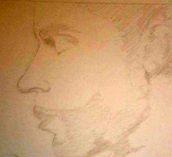
I felt this was a good start but I knew I was far from the finish line.
I found it quite difficult to resist rushing the drawing, I kept telling myself "this is not a race, take your time".
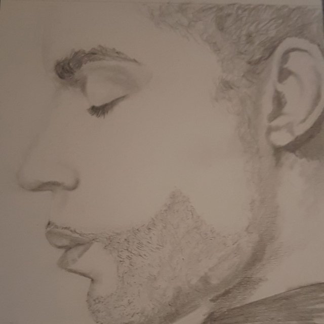
I worked on some details next, particularly the facial hair and his eyebrows/eye lashes.
I used a smudging stick to blend the pencil lines into the shadows to make the skin look smooth and young.
 .
.
I grew more confident with every pass of the pencil, building layer on layer of lead. It got to the point where I thought I was finished.....
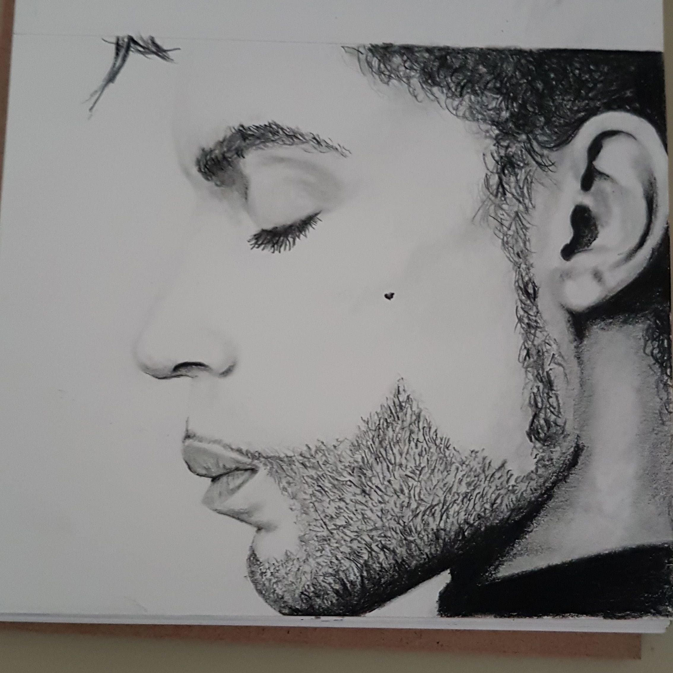
I decided to go bold on this one and break out the black prismacolour pencil. This gave much more depth and a higher contrast in the shadows and around the eye.
I also used a very fine black pen to create texture on the beard paying particular attention to the direction in which the hair grows.
The final step was highlighting. I used an eraser pencil to elevate the light parts around the cheek bones, lips and ear.
Below is the finished product, I'm very pleased with it. To be honest I can't believe I drew it.
Thanks for looking, again any tips or comments you have for me, please leave them below.
Jonny
So what advice would you have for starters, because your work is beautiful. I just downloaded the pic.@klynic
Hi @klynic thanks for commenting, I would recommend starting with a very light background, be liberal with the pencil and build your confidence slowly. Don't rush.
Draw from reference and look at where the dark parts are, get those in first but only very lightly and build on them.
I would also get some blending sticks, they are very cheap and incredibly easy to use. they are essentially a paper pencil that you use to smudge out your lines, you can also use them to add faint shadows once they have a bit of pencil on them.
Let me know if this helps, if you have any more specific questions please give me a shout.
Thanks